This chapter discuss the features and capabilities of Decision Table, and contains the following sections:
Sample configuration and data files have been provided to demonstrate Decision Table features and capabilities. These files are in the \examples directory under MineSet, in the location where MineSet was initially installed.
A decision table is a predictive modeling tool that performs classification (see Chapter 1, “Overview of Data Mining and MineSet Tools,” and Chapter 7, “Understanding Predictive Modeling,” for more information on classifiers and predictive modeling). It incorporates an inducer (an algorithm for generating decision table models), and a visualizer. Unlike the evidence model, the Decision Table model does not assume that the attributes are independent.
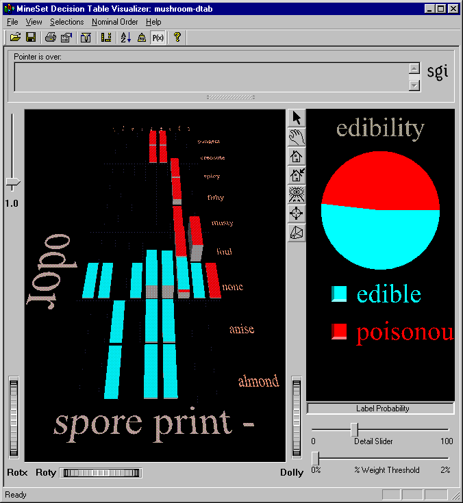
A decision table is a hierarchical breakdown of the data, with two attributes at each level of the hierarchy. The Decision Table inducer identifies the most important attributes (columns) for classifying the data, and the accompanying visualizer displays the resulting model graphically as a series of cake charts. Each cake in the visualization can in turn be divided into smaller cakes representing the next pair of most important attributes. Each visualization can contain several levels representing decreasingly important attributes. Figure 9-1 shows the top level of the Decision Table visualization for the mushroom dataset, where the two most important attributes for determining edibility are odor and spore print color.
The easiest way to create a Decision Table classifier is from the Tool Manager (see the MineSet Enterprise Edition Reference Guide for more options):
From the Tool Manager File menu, connect and log in to a server;
From the same menu choose Open New Data File and select or type in the desired filename.
In the Data Destinations pane, click the Mining Tools tab (Figure 9-2), and choose Classify from the lower row of tabs.
From the popup Mode menu, choose a mode. See Chapter 7, “Understanding Predictive Modeling,” for more information about the four modes.
From the popup Inducer menu, choose Decision Table Inducer.
From the popup Discrete Label menu, choose the attribute you wish to use for the label.
In the x-list and y-list pulldown menus (see Figure 9-2), specify the attributes you want to view. You can do this in three different ways:
You can let MineSet select the attributes automatically by checking the Suggest box. MineSet identifies the most useful attributes for predicting the class, and displays them.
You can manually select the attributes from the pulldown menus in the Data Destination pane. If you want a place to start, use Column Importance to find the most important attributes (see “Finding Important Columns” in Chapter 3).
You can select some of the attributes and let MineSet choose the rest. Select the attributes as described above, and check the Suggest box. MineSet maps the rest of the relevant attributes.
Click Go to start the Inducer.
The Status pane at the bottom of the Tool Manager window shows the progress and resulting statistics. You can also interrupt the automatic attribute suggestion process by clicking Cancel or Show Viz Now in the progress dialog. Clicking Show Viz Now stops the current server computation and uses the intermediate result to construct the decision table for the columns mapped so far.

| Note: See the “Decision Table” entry in the MineSet Enterprise Edition Reference Guide for information about other Decision Table inducer options. |
If you have the Viz Tool icon on your desktop, you can drag an existing MineSet visualization file icon and drop it on the Viz Tool icon. The visualization will then display in the Viz window.
You can also drag a visualization file into an open Viz Tool window. If you have your preferences set to Single Document mode, you must drop the file icon onto the title bar of the Viz window. If you have your preferences set to Multiple Document mode, you can drop the file icon anywhere within the window, and it will display.
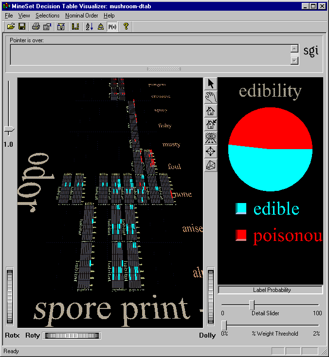
The Decision Table visualizer has two panes, the Decision Table pane on the left and the Label Probability pane on the right. Figure 9-3 shows a Decision Table visualization of the mushroom dataset with the first two levels of detail revealed.
The Decision Table pane on the left consists of cake charts which are square charts with colored slices representing the label probabilities for records with certain attribute values. The label probabilities represent the likelihood that a record with those values for the specified attributes will be in a certain class. For instance, in Figure 9-3, the Decision Table was run on the mushroom dataset. The resulting chart shows that the probability that a mushroom with a white spore print color and a fishy odor is poisonous is 100%. If the mushroom has a white spore print color, and no odor, however, the probability of it being poisonous is only 7.69%, and the probability of it being edible is 92.31%. To see these percentage values, select a cake on the left then place your mouse arrow over the colored box next to the label (edible or poisonous). The percentages are displayed in the area between the menu bar and the main window.
The elements in the Decision Table pane can be further subdivided into smaller and smaller cake charts by clicking with the right mouse button, in a process called drill-down. To examine the cake charts more closely:
To see the values of the two attributes at the current level of detail, place the mouse arrow (in select mode) over the desired cake chart. The attribute values and the weight of records represented are displayed between the menu bar and the main window. The height of the cake chart is proportional to the weight (see the Weight entry in the glossary).
To drill down to the next level of detail, place the mouse arrow over the desired cake chart and click the right mouse button, or click the background to drill down globally on all cakes. Figure 9-5 shows a close-up view of a subdivided cake for the mushroom dataset.
To drill back up through the levels, hold the Ctrl key while clicking the right mouse button (or use the middle mouse button). You can drill up for a single region, or globally by holding the Ctrl key while clicking the right mouse button (or use the middle mouse button) on the background.
To see the values for the two attributes for the cake one level higher in the hierarchy, as well as the weight of records, place the mouse arrow over the base (the gray block under the cake).
To see the values that define a particular cake chart, start by highlighting the base at the coarsest level of detail, and continue through the next most detailed base until you reach the base immediately below the cake chart of interest. The relevant value pair is displayed in the selection pane below the menu bar.
At each level of detail, one attribute's name is shown to the left of the array of cake charts, and it's values are shown to the right; the other attribute's name is shown at the bottom of the array, and it's values are shown at the top. If there is an odd total number of attributes, the lowest level shows only one attribute.
The Label Probability pane (on the right side of the Tool Manager window) shows a pie chart of the label probabilities for the entire dataset. A list of all class labels appears under the pie chart.
If you want to examine the label probabilities more closely do the following:
To see the label probabilities for a specific set of attributes, click the desired cake chart. The pie chart in the Label Probability pane shows the label probabilities for records with the set of attributes represented by that cake.
To see the label probabilities for a combination of attributes, Ctrl-click the desired cake charts. By Ctrl-clicking, you can select a number of cakes at different levels of detail in the scene. The Label Probability pane at the right of the visualizer window shows the label probabilities for the selected set of records.
To see the specific percentages and confidence levels for each label, place the mouse arrow over the colored box next to the desired label. The numbers are displayed between the menu bar and the Decision Table pane.
As an example of how to use Decision Table, say you want to figure out which mushrooms are safe to eat, and which are poisonous. To start, you might create a decision table from the mushroom dataset (see Figure 9-1). The left pane shows the top level of detail for the resulting decision table. Odor and spore print color were chosen for the top level because they were the top two attributes determined by the Column Importance algorithm. Only one top-level block has more than one class present, the block with odor equal to none and spore print color equal to white. When you drill down to the next level (by clicking the right mouse button over the chart), the attributes habitat and population are shown (see Figure 9-4). A close-up of this drilled-down region is shown in Figure 9-5. At this level, there are no mixed cakes. Therefore, if you find a mushroom that has a white spore print color and no odor, growing with several other mushrooms in the woods, you can be pretty sure it is poisonous.


Up to this point, this chapter has discussed classifying data with known outcomes (for instance, edible or poisonous), but Decision Table can be most useful for predicting unknown or future outcomes. You can build a model based on data where the class is known, and then use that model to classify new data where the class is unknown. See Chapter 7, “Understanding Predictive Modeling,” and Chapter 11, “Refining Predictive Modeling,” for more information about building and applying models.
For details of the menus, see the “Decision Table” entry in the MineSet Enterprise Edition Reference Guide .