This chapter discusses the features and capabilities of the Evidence Classifier and Visualizer, and contains the following sections:
Sample configuration and data files have been provided to demonstrate the Evidence Visualizer's features and capabilities. These files are in the \examples directory under MineSet, in the location where MineSet was initially installed.
The Evidence tool is a predictive modeling tool that performs classification (see Chapter 1, “Overview of Data Mining and MineSet Tools,” and Chapter 7, “Understanding Predictive Modeling,” for more information on classifiers and predictive modeling). It incorporates an inducer (an algorithm for generating Naive Bayes models) and a visualizer. Unlike the Decision Table model, the Evidence model assumes that the attributes are independent, although it still produces reasonable results even if they are not.
The Evidence Visualizer displays the information from the classifier as shown in Figure 10-1. The visualizer can help you understand the importance of specific attributes (columns) for classification.
Once the classifier is built, the results are displayed in the Evidence Visualizer window. Initially, the left pane contains rows of cake charts for each attribute used by the classifier (Figure 10-1). A cake chart resembles a pie chart in that it shows proportions, except that it is square with rectangular slices. You can toggle between the cake charts, which represent evidence, pie charts, which represent probabilities, and bar charts, which give more information on a selected label (see “Examining Your Results with the Evidence Visualizer” for more information).
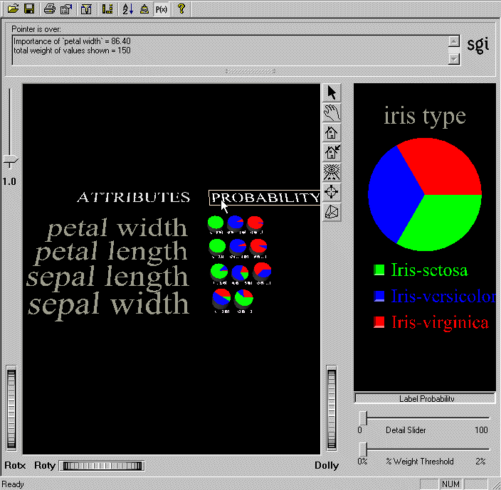
Figure 10-1 shows the evidence view, and Figure 10-2 shows the probability view.

The easiest way to start the Evidence tool is from the Tool Manager (see the MineSet Enterprise Edition Reference Guide for more options):
From the Tool Manager File menu, connect and log in to a server.
From the same menu choose Open New Data File and select or type in the desired filename.
In the Data Destinations pane, click the Mining Tools tab (Figure 10-3) and choose Classify from the lower row of tabs.
From the popup Mode menu, choose a mode. See Chapter 7, “Understanding Predictive Modeling,” for more information about the four modes.
From the popup Inducer menu, choose Evidence.
From the popup Discrete Label menu, choose the attribute you wish to use for the label. Edibility is a good one for the mushroom dataset.
Click Go to start the Inducer.
The Status pane at the bottom of the Tool Manager window shows the progress and resulting statistics.
 | Note: See the “Evidence Inducer Options” entry in the MineSet Enterprise Edition Reference Guide for information about other Evidence inducer options. |

If you have the Viz Tool icon on your desktop, you can drag an existing MineSet visualization file icon and drop it on the Viz Tool icon. The visualization will then display in the Viz window.
You can also drag a visualization file into an open Viz Tool window. If you have your preferences set to Single Document mode, you must drop the file icon onto the title bar of the Viz window. If you have your preferences set to Multiple Document mode, you can drop the file icon anywhere within the window, and it will display.
Once you have started the Evidence Visualizer, you can examine your results in several ways. In the left pane of the visualizer window, you can switch between evidence view, probability view, and bar view:
Evidence view shows cake charts, representing evidence (see “Evidence View”).
Probability view shows pie charts, representing probabilities (see “Probability View”).
Bar view shows bar charts (see “Bar View”), representing the evidence for and against a particular label.
The Label Probability pane (on the right side of the visualizer window) shows a pie chart representing the distribution of the label values across the entire database (see “Examining Probabilities in the Evidence View”). This pane is displayed for all three views in the left pane (evidence, probability, and bar).
When the Evidence Visualizer first launches, the main pane shows the evidence view (Figure 10-4).

The Evidence View shows one row of cake charts for each attribute or column in the dataset. Each row contains one cake for each discrete value of the attribute. If the values of the attributes are continuous rather than discrete, MineSet automatically breaks the values into ranges or bins (for instance 0 to 5, 5 to 10, and so on) in a way that maximizes the differences between adjacent cakes. A cake's height is proportional to the weight of records having that attribute value (see the entry for Weight in the glossary). If no weight attribute is set, the height represents the number of records.
In the cake charts, the size of a slice represents conditional probability (evidence), not straight probability. For instance, in the churn dataset, if a cake is half “yes” and half “no,” that means that a customer having the particular value of the attribute represented by that cake has the same probability of churning as the overall population. In other words, that value of the attribute has no predictive value whatsoever. In contrast, if a cake is 90% “yes” and 10% “no,” that means that a customer having that particular value of the attribute is considerably more likely to churn than the overall population. It does not mean, however, that the customer has a 90% chance of churning, because the overall probability can depend on many variables, not just this one. See the “Evidence Inducer” entry in the MineSet Enterprise Edition Reference Guide for a more detailed explanation.
The order of the rows indicates the relative importance of the attributes in predicting the label. Each attribute is assigned an importance value between 1 and 100. You can see this value by placing the mouse arrow over the attribute name in the scene. The information is displayed in the area between the menu bar and the visualizer pane. For instance, in the mushroom dataset shown in Figure 10-5, a mushroom's odor is extremely indicative of edibility, so the odor attribute is ranked at the top of the list, with an importance value of 90.69. In contrast, stalk shape is not at all indicative of edibility, so the stalk shape attribute is ranked at the bottom, with an importance value of .75.
The veil-color attribute presents an interesting case, too. It is ranked near the bottom in terms of importance because most mushrooms have white veils. Mushrooms with white veils are split almost evenly between edible and poisonous, which is very close to the prior probability (that is, the overall probability of any mushroom in the dataset being poisonous). Statistically, therefore, this attribute does not add much evidence to either class and is ranked near the bottom in importance. However, for veil colors of brown, orange, or yellow (the first, second, and fourth cakes in the veil color row), the picture is quite different. Of mushrooms with brown or orange veils, 100% are edible. Of mushrooms with yellow veils, 100% are poisonous. While this sounds persuasive, the number of mushrooms with non-white veils is so small that veil color does not make a good distinguishing characteristic.

When the Evidence Visualizer first opens, the Label Probability pane shows the label probabilities for the entire dataset. For instance, in Figure 10-4, using the churn dataset, the probability of a random record having a churned label of “yes” is 14.14%. If you place the mouse arrow over the colored box next to one of the labels, the probability and weight of that label are displayed in the upper left of the window.
If you wish to see the probability pie chart for records with a particular value for an attribute, click the cake for that value (the mouse must be in select mode to select attributes). The Probability Pane now shows the probability pie chart for just those records matching the selected value. To deselect the chart, click anywhere on the background of the main pane.
To see the probabilities for records with a certain combination of attributes, you can select several cakes by Ctrl-clicking them. The Probability Pane now shows the probability pie chart for the records with that combination of attributes. Because the probabilities for each attribute are computed as if that attribute were independent of the others, the combined probabilities may not be entirely accurate. A warning appears reminding you of this. Use them as an estimate. They are only completely accurate if the attributes are truly independent, which is rarely the case.
Sometimes while selecting a combination of attributes, you might select some that are mutually exclusive. In this case, the Label Probability pane shows a gray pie. This indicates that there are few or no records that have that particular combination of values.
To reset the Label Probability pane to show the prior probability, click anywhere in the background of the main pane.
Probability view (Figure 10-6) shows pie charts, representing probabilities, instead of cake charts. To access the probability view from the evidence view, click the word Evidence in the white-outlined box at the top of the chart, or toggle the “Show as evidence” check box in the visualizer View menu. To return to evidence view, click the word Probability or toggle the check box again.

Bar view shows the evidence in favor of (or against) a selected label value. To access the bar view, click the colored box next to the desired label in the Label Probability pane. The main window then displays bar charts (Figure 10-7). The height of each bar shows the evidence in favor of the selected label value. To exit bar view, click the colored box again.
By clicking the word “For” in the white-outlined box at the top of the bar view chart, you can switch to “evidence against” mode. To return to “evidence for” click the word “Against.”

“Evidence for” can be useful in determining which values are the most helpful in predicting a particular label value. “Evidence against” can be useful in determining the opposite, that is, which values are the most helpful in predicting when a label will not occur. For a more technical description of how these values are computed, see the “Evidence Inducer” entry in the MineSet Enterprise Edition Reference Guide .
The color of the bars can range from a fully saturated color to completely gray. The grayness of the bars is based on the 95% confidence interval. This, in turn, depends on the weight for that value. Therefore, bars that are nearly gray have low weight and a large confidence interval. The height of these bars is not likely to be accurate. Conversely, the height and corresponding evidence value for a fully saturated bar can be relied on because it is based on large weight, representing many records. The exact number of records (weight) is reflected in the text output line when that bar is highlighted.
Table 10-1 shows various actions you can take to better examine your results in the different views.
Table 10-1. Working with the Evidence Visualizer Views
To: | Do: |
|---|---|
Switch between cake charts (evidence) and pie charts (probability) | Click the white-outlined word “Evidence” or “Probability” or toggle View > Show As Evidence. |
Switch between cake or pie charts and bar charts | Click the colored square next to the desired label in the Label Probability pane. |
Switch between bar charts and cake or pie charts | Click the colored button next to the desired label in the Label Probability pane. |
Switch between “For” and “Against” in bar view | Click the white-outlined box around the word “For” or “Against.” |
Display attribute value and record weight for a particular cake or pie | Put the mouse arrow over the cake or pie. |
Display the label probability | Put the mouse arrow over the box next to the label in the Label Probability pane. |
Display (in the right pane) the expected distribution of labels for the new records having a certain attribute value | Click the cake for that value. |
Display attribute importance and total weight | Put the mouse arrow over the attribute name on the left. |
Get an estimated label probability distribution for records with a certain combination of attribute values | Select two or more cakes by Ctrl-clicking them and examine the pie chart in the Label Probability pane. |
Clear a selection | Click anywhere in the background area of the left pane. |
See all the records with the selected attribute values | Click on the cakes representing the desired combination of attribute values and choose Selection > Drill Through > Show original data in recordviewer. |
See all the records except those that have the selected attribute values | Choose Selection > Drill Through > Complement drill through. |
Exaggerate or diminish the height differences between the charts | Use the height slider on the left side of the main window. |
Reduce (or increase) the number of attribute rows shown, starting with the least (or most) predictive attributes | Use the detail slider. Removes attributes with importance less than the slider value. |
Filter out attribute values with low counts or weights | Use the weight threshold slider. Removes values whose weight is less than the percentage indicated by the slider. |
Predict a class label for a new record for which you know some of the attribute values | Click the charts corresponding to those attribute values. The largest slice in the pie chart on the right corresponds to the predicted class. |
So far, discussion has focused on using the Evidence Classifier and Visualizer to examine data where the label is already known. In actuality, this tool can be most useful in predicting the label in data where it is not known. In this case, you create a model using known data (see the “Training Set” entry in the MineSet Enterprise Edition Reference Guide ), save it, and then apply it to data with unknown labels. See the “Apply Model” entry in the MineSet Enterprise Edition Reference Guide .
For details about the visualizer menus, see the “Evidence Visualizer Menus” entry in the MineSet Enterprise Edition Reference Guide .