This chapter discusses the features and capabilities of the Splat Visualizer. It provides an overview of this database visualization tool, then explains the Splat Visualizer's functionality when working with the
main window
external controls
pulldown menus
Finally, it lists and describes the sample files provided for this tool.
The Splat Visualizer lets you visually analyze relationships among several variables (see Figure 8-1), either statically or by animation. It is particularly well-suited for application to datasets with large numbers of records. Choose the Scatter Visualizer if you want to see individual data points and do not have a large number of records. Data analysis is done using

The Splat Visualizer lets you visualize your data by mapping columns to axes, sliders, color, and opacity. The resulting three-dimensional landscape can be thought of as an approximation to a scatterplot in which every datapoint is drawn separately. It is not truly a scatterplot, because datapoints that are close together (fall in the same bin) are aggregated and drawn as a single splat.
Each numeric column that is mapped to an axis or slider first must be binned. If this binning step is skipped, the Tool Manager does it using automatic uniform binning (see “The Bin Columns Button” in Chapter 3). String columns can be mapped directly to axes. Any numeric column can be mapped to a color. The color of a splat is derived by averaging the value of the column mapped to color for all the data points that fall in a bin. The opacity of a splat is based on a weighting of the number of datapoints that fall in a bin. If nothing is mapped to opacity, record counts are used to determine it. The interactivity of the resulting visualization is independent of the number of data points represented; it depends only on the number of bins in the axis dimensions. If your dataset is very large, aggregate explicitly in the Tool Manager. This causes the server to perform the processing, rather than having the entire dataset sent to the client and aggregated there.
Up to two numeric columns can be mapped to the sliders in the animation control panel. The splats change their color and opacity during animation as the sliders in the animation panel are moved from point to point along the slider `s path. Unlike the Scatter Visualizer, neither the position nor the size of the splats change; they are at fixed, uniformly spaced positions. Only their color and opacity change, which can give the illusion of actual movement.
After creating a visualization of your data, the Splat Visualizer lets you analyze the data in various ways:
The animation control panel lets you note global shifts and trends in the data.
The three-dimensional landscape lets you orient the display to emphasize particular dimensions or a point of view.
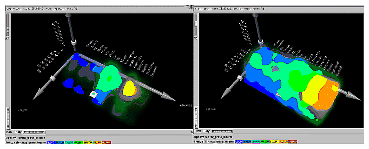
You can use the scale slider (located to the left of the Main Window) to lower the overall opacity of the splats, so only regions with dense data show up; conversely, you can increase the scale slider so all regions having any data become visible. The regions with dense data are likely to show less color variation, because the color is based on the average of many values (see Figure 8-3).
You can filter the display to show only those splats meeting certain criteria. You can filter on the columns corresponding to axes, sliders, weight, and color.
An opaque pick dragger lets you display textual information about individual splats in the volume.
A box selector lets you define a selected region for drilling through to the original data or for sending to the Tool Manager.
If a string column is mapped onto an axis, binning is defined to be the distinct values of that column. The order of the values along a string axis is automatically determined by sorting the distinct values by the average aggregate value of the column mapped to color. Looking at the color changes along a string-valued axis lets you see how well that column correlates with the column mapped to color. The left axis in Figure 8-1 shows occupations sorted by average income (the average income of everyone with that occupation) along an axis. The occupation, executive-managerial, listed at the end of the axis, has the highest average income. This ordering often presents a natural progression for the values. For example, the ordering for the values of education (the right axis in Figure 8-1) was generally from low to high; but, in a few cases, there were anomalies in the order. This unexpected ordering might be interesting because it points out places where the data does not agree with expectations.
The column mapped to opacity should be record count or a column used to weight record counts. A splat's opacity, α, is based on this column according to the following relation:
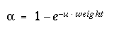 |
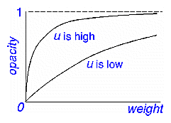
where count is the column mapped to opacity (or the record count if no such column was mapped to opacity). The shape of this function is such that the opacity asymptotically approaches 1 (totally opaque) as the value of weight becomes large. The variable u is what is scaled when you adjust the opacity scale slider. Figure 8-2 shows the shape of this function for low and high values of u. Figure 8-3 shows the same visualization with low and high values of u.
If nothing is mapped to opacity, the Splat Visualizer generates a column of ones to produce record counts when aggregating. This means all records are weighted equally. A sum aggregation is done on this column, and an average aggregation is done on the column mapped to color while grouping by all the axis and slider columns. All other columns are unnecessary and removed. You do not need to map anything to opacity unless you want each record to be weighted by something other than 1.
You can avoid processing on the client by aggregating in the Tool Manager. This also avoids having to transfer a large dataset to the client. This is done by
Binning the numeric columns which are to be used for axes and sliders.
Aggregating the column to be mapped to color by count and average while grouping by the axis and slider columns.
Mapping the resulting count aggregation to opacity.
Mapping the resulting average aggregation to color.
For example, using the adult94 data (provided with the distribution):
Bin age and hours_per_week.
Aggregate gross_income using count and average. Keep education, occupation, age_bin and hours_per_week_bin, in the group-by pane while removing all the other columns.
Map education, occupation, and hours_per_week_bin to the axes.
Map avg_gross_income to color, count_gross_income to opacity, and age_bin to a slider.
When you invoke the tool, note that all the processing is done on the server, and that the datafile, adult94.splatviz.data, contains rows that are aggregates of rows in the original data. This produces the same visualization as seen in Figure 8-1.
In some cases, you might have a column by which you want to weight the records. For example, if you have a dataset for which one column was population and another was average_salary (which you want to map to color), you can map population to opacity, and average_salary to color; then have the Splat Visualizer do the aggregation. Its aggregation groups-by the axis and slider columns, so that it sum aggregates the opacity column (which, in this case, is population). The new column is called sum_population. The average_salary column is revised, so that it is still average salary, but weighted by each row's population. In this way, the average salary column still shows the average salary for all the people it represents.
Alternatively, if you want to avoid client-side processing and storage because of the size of your dataset, you can perform the same aggregation in Tool Manager by doing the following:
Create a new column, defining temp = population*avg_income.
Perform an aggregation: group-by axis and slider columns, sum aggregate population, and sum aggregate temp.
create a new column, defining
avg_salary = sum_temp/sum_population
This creates the weighted average.Now you can map sum_population to opacity, and avg_salary to color.
Note that these steps are the ones taken by the Splat Visualizer if you do not explicitly do them in the Tool Manager.
The Splat Visualizer requires the following files:
A data file, consisting of rows of tab-separated fields. This file is easily created using the Tool Manager (see Chapter 3). If you are generating this file yourself, see Appendix E, “Creating Data and Configuration Files for the Splat Visualizer” for the required file format.
You can generate data files by extracting data from a source (such as a database) and formatting it specifically for use by the Splat Visualizer. Data files have user-defined extensions (the sample files provided with the Splat Visualizer have a .data extension).
A configuration file, describing the format of the input data and how it is to be displayed. The Tool Manager can create this file (see Chapter 3), or you can use an editor (such as jot, vi, or Emacs) to produce this file yourself (see Appendix E, “Creating Data and Configuration Files for the Splat Visualizer”).
Configuration files must have a .splatviz extension. When starting the Splat Visualizer, or when opening a file, you must specify the configuration file, not the data file.
There are five ways to start the Splat Visualizer:
Use the Tool Manager to configure and start the Splat Visualizer. (See Chapter 3 for details on most of the Tool Manager's functionality, which is common to all MineSet tools; see “Configuring the Splat Visualizer Using the Tool Manager” for details about using the Tool Manager in conjunction with the Splat Visualizer.)
Double-click the Splat Visualizer icon, which is in the MineSet page of the icon catalog (or on your Indigo Magic desktop). The icon is labeled splatviz. Since no configuration file is specified, the start-up screen requires you to select one by using File > Open.
Starting the Splat Visualizer without specifying a configuration file causes the main window to show the copyright notice and license agreement for this tool. Only the File and Help pulldown menus can be used. For the main window to be fully functional, open a configuration file by selecting File > Open.
If you know what configuration file you want to use, double-click the icon for that configuration file. This starts the Splat Visualizer and automatically loads the configuration file you specified. This works only if the configuration filename ends in .splatviz (which is always the case for configuration files created for the Splat Visualizer via the Tool Manager).
Drag the configuration file icon onto the Splat Visualizer icon.
Start the Splat Visualizer from the UNIX shell command line by entering this command at the prompt:
splatviz [ configFile ]
configFile is optional and specifies the name of the configuration file to use. If you don't specify a configuration file, you must use File >Open to specify one.
This section describes how the Splat Visualizer can be configured using the Tool Manager. Although the Tool Manager greatly simplifies the task of configuring the Splat Visualizer, you can construct a configuration file manually for this tool using a text editor (see Appendix E, “Creating Data and Configuration Files for the Splat Visualizer”).
The steps required to connect to a data source are described in Chapter 3.
Select the Viz Tools tab in the Data Destination panel of the Tool Manager's main screen (Figure 8-4). From the popup list of tools, select Splat Visualizer. The mapping requirements for the Splat Visualizer are displayed in the window on the right side of this panel. Items in the Visual Elements list that are preceded by an asterisk are optional.
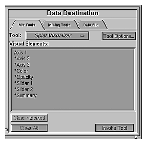
Axis 1, *Axis 2, *Axis 3 — determine which columns are assigned to the axes in the Splat Visualizer's main window. Assigning data to the first axis is required; however, this alone does not usually produce a useful display. By assigning data to Axis 2, you can create an XY chart. Assigning data to all three axes produces a 3-D chart.
*Color — Requires a numeric column used to determine the color of the splats.
If you have a two-valued string column, you can create a new numeric column using an expression such as:
('stringCol'==”value1”)? 1:0If nothing is mapped to color, the resulting scene is monochromatic.
*Opacity—the tool was designed to have the opacity based on a weighting of records. If you do not aggregate in the Tool Manager, this requirement need not be mapped; it will be determined automatically by the tool. If you do a count aggregation in the Tool Manager, or there is a column in the data that already is based on counts, use that column for this requirement.
*Sliders — the summary slider dimensions. They must be numeric or binned.
*Summary—this is the value to be shown in the summary slider. If no summary column is mapped, count is used by default. If a summary column is mapped, a weighted average value for that column is shown in the summary.
You can map requirements to columns by selecting a column name in the Current Columns window of the Table Processing panel, then selecting a category in the Visual Elements window.
To undo a specific mapping, select that mapping in the Requirements window, then click the Clear Selected button. To undo all mappings, click the Clear All button.
Clicking the Tool Options button causes a new dialog box to be displayed (Figure 8-5). This lets you change some of the default values of the Splat Visualizer options.
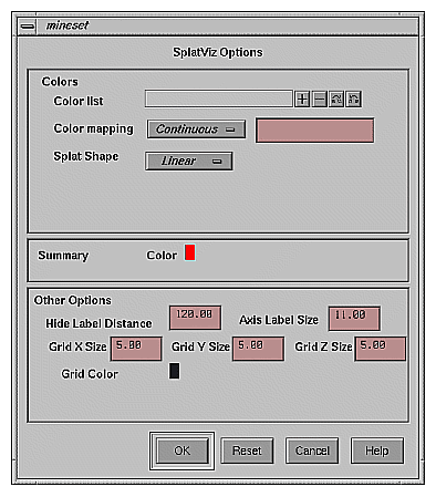
The Splat Visualizer's Options dialog box has three basic options blocks:
Splats
Summary
Other
This option lets you specify a number of characteristics for the Splats that the Splat Visualizer then graphically displays.
Splat Colors—lets you control the colors used for the splats. You can
specify the list of colors to use
specify the kind of mapping
map the list of colors to a list of values
Splat Shape—lets you choose one of the following methods for drawing splats: linear, gaussian, texture, sphere, cube, or diamond. See “Splat Type Menu” for a further explanation of each of these.
To use these Colors options, you must have mapped a column to the *color requirement of the Data Destination panel. If nothing is entered in the color list, the default colormap is used. The default colormap is a continuous spectrum from blue (lowest value) to red (highest value). See “Choosing Colors” and “Using the Color Browser” in Chapter 3 for a more detailed explanation of how to choose and change colors.
Color list—You can specify the color list using the + button next to the color list label. This brings up a color editor that lets you specify a color to be added to the list.
Color mapping—You can specify whether the color change that is shown in the graphic display is Continuous or Discrete. If you choose Continuous, the color values shift gradually between the colors entered in the Color list to use field as a function of the values that are mapped to those colors in the Color mapping field.
The field to the right of the popup button lets you enter specific values for mapping the colors. If you do not specify any mapping values, the range of values in the color column is used.
If you
used the Color Browser to apply red and green to the splats
selected Continuous for the Kind of mapping
entered the values 0 100
the display shows all splats with values less than or equal to 0 as completely red, those with values greater than or equal to 100 as completely green, and those between 0 and 100 have a color which results from a linear interpolation between red and green.
If you
used the Color Browser to apply red and green to the splats
selected Discrete for the Kind of mapping
entered the values 0 50
The display shows all splats with values of less than 50 in red, and all those with values greater than, or equal to, 50 in green.
Summary options let you specify what color to use for the Summary window. This is only applicable if you have mapped a column to the summary.
The Other Options, at the bottom of the dialog box, include the following fields:
Hide Label Distance — controls the distance at which axis tick labels (for string valued axes) become invisible. Increase this number to make the labels appear at further distances. The higher the number, the greater the distance at which labels are hidden.
Axis Label Size — this controls the size of the axis labels. A smaller number decreases the size, a larger one increases it.
Grid Color — lets you modify a grid color by clicking on it. This causes the Color Chooser dialog box to appear, which lets you implement your color changes.
Grid (X, Y, Z) Size — lets you specify the spacing between grid lines for the respective axis. A smaller number decreases the size, a larger one increases it. If the Size is set to 0, there are no grid lines in that dimension.
To see Splat Visualizer graphically represent your data, click Invoke Tool at the bottom of the Data Destination panel.
When you press Invoke Tool, The Tool Manager stores information for the Splat Visualizer in several files, all sharing the same prefix:
To save the entire session along with the current tool options, use one of these menu options from the File menu:
Save Current Session... where the default prefix is based on the data source
Save Current Session As... to specify your own prefix
The saved file is <prefix>.mineset, and contains all the information needed to return MineSet to its current state.
When you use Invoke Tool, the .data, .schema, and .splatviz files are updated, if necessary.
The Splat Visualizer uses special representations when fields with unknown data values, or nulls, are mapped to visual attributes. (For a discussion of null values, see Appendix J, “Nulls in MineSet.”) When every record in a bin has a null value for the column mapped to color, the resulting color for that splat is gray. If one or more records in the aggregate have non-null values for the column mapped to colors, then that value is (or those values are) used to compute the color. While the sum of a value and null is null, the average of a value and null is the value (that is, value + Null = Null; avg(val, Null) = val).
When a null value is displayed in the Pick Window, Selection Window or “Pointer is Over” area, it is shown as a question mark (?). (The Selection Window and “Pointer is Over” areas are discussed in the “Select Mode” section.)
For numeric columns containing nulls which are mapped to axes, there is a special null position below the range defined by the axis. This is to help show that the null value is discontinuous with the other values. The null positions for numeric axes can be turned off using the Show Null Positions option under the View Menu (see “The View Menu”). For string-valued columns mapped to axes, nulls (represented by a `?') are treated as just another value.
If you started the Splat Visualizer without specifying a configuration file, the main window shows the copyright notice and license agreement for the Splat Visualizer. Only the File and Help pulldown menus can be used. For the main window to show all menus and controls, open a configuration file. Use File > Open to see a list of configuration files.
When a valid configuration file has been selected, the 3-D landscape it specifies is visible.
The two modes of viewing are grasp and select. To toggle between these modes, press Esc, or click the appropriate cursor button adjacent to the top-right of the viewing area.
In grasp mode, the cursor appears as a hand. This mode supports panning, rotating, and scaling the scene's size in the main window.
To pan the display, press the middle mouse button and drag it in the direction you want the display panned.
To rotate the display, press the left mouse button and move the mouse in the direction you want to rotate. (Also see the thumbwheel controls Rotx and Roty, described in “Thumbwheels” in Chapter 6.)
To move the viewpoint forward, press the left and middle mouse buttons simultaneously and move the mouse downwards. To move the viewpoint backward, press the left and middle mouse buttons simultaneously and move the mouse upwards. This is equivalent to the functions provided by the Dolly thumbwheel.
In select mode, you can move a 3-D pick dragger through the volume in order to display information about regions in the scene. This pick dragger is composed of a cylinder and a square. If you pick on the cylinder and drag, motion is constrained to be parallel to the cylinder's axis. If you pick on the square and drag, motion is constrained to the plane defined by the square. You can cycle through the three possible orientations of the pick dragger by pressing the Control key with the cursor over the dragger. (You need not press the mouse button.) In the case of dragging the square portion of the dragger, you can use the Shift key to constrain the motion along one of the two axes within the plane. Alternatively, each axis has a disk that aligns with the pick dragger position. Moving the disk on an axis moves the dragger, and vice-versa.
The dragger lets you pick within a dense cloud of points, freeing you from the limitation of having to pick regions on the surface.
When the pick dragger is over data, the cylinder changes its color to that of the splat under it, and information about that region appears at the top of the view area (Figure 8-6). If no data is present, the cylinder remains light gray, and information about its position is displayed at the top of the render area for aid in navigation.
When you are finished dragging, and have released the mouse button, the message for the splat you are currently over is shown in the Pick Window at the top. This pick information is updated if the animation slider is moved. Using the mouse, you can cut and paste this selection information into other applications, such as reports or databases.
The pick dragger may be removed from the scene by unchecking Selection > Show Pick Dragger.

The information is displayed when the pick dragger is over the object.
 | Note: Users familiar with Open Inventor can configure the Splat Visualizer so that the right mouse button brings up the standard Inventor Menu. This provides additional functions, such as stereo viewing and spin animation. These functions are provided by the Open Inventor library. To enable the Open Inventor Menu, add the line *minesetInventorMenu:TRUE to your .Xdefaults file. |
Several external controls surround the main window, including buttons and thumbwheels. (These and the rest of the buttons are substantially the same as the other MineSet visualization tools and are described in “Buttons” in Chapter 6, and “Thumbwheels” in Chapter 6).
The animation control panel, which appears to the right of the main window, consists of a summary window, with up to two adjacent sliders, an information field, animation buttons, and animation sliders.
The number of sliders appearing adjacent to the summary window is dependent on the slider mappings specified in the configuration file. Datasets can have two, one, or no independent dimensions.
If the dataset has two dimensions of independently varying data (such as adultJobs2.splatviz), the controls to the right of the main graphics window become visible (see Figure 8-7).

To the right of the main window are the 2-D summary window and slider controls. The summary window has a horizontal slider below it for selecting data points of the first independent dimension, and a vertical slider to the left for selecting data points of the second independent dimension. The horizontal slider's dimension is identified by a label below it. The vertical slider's dimension is identified by a label above it.
For datasets with one independent dimension (such as adultJobs.splatviz), only the slider below the summary window appears, and the summary window is compressed (see Figure 8-1). This slider's dimension is identified by a label below it.
For datasets with no independent dimensions (such as mushroom.splatviz), no slider control appears (see Figure 8-8). In this example, the splats that are neither completely red nor completely blue indicate that both poisonous and edible mushrooms are plotted at that location.

The summary window provides a 2-D representation of the aggregation of values that the main window displays in 3-D. The whiter the areas of the summary window, the lower the summary value represented by the splats in the main window. The greater the color density in areas of the summary window, the higher the summary values. The summary value is either the total weight of data at that slider position, or the weighted average of the column that was mapped to summary. The density of these colors in the summary window provides a summary of the data across the one or two independent dimensions in the dataset. If no column is explicitly mapped to summary, count is used to show which positions on the slider represent the most data.
By default, the summary window also contains a set of black dots, evenly spaced across the one or two dimensions of data. These dots indicate the precise positions of the discrete datapoints. You can turn off these black dots by unchecking the box at the bottom of the summary slider window. Slider positions between these positions use interpolation of the underlying data to produce an image.
After opening the adultJobs.splatviz file, for example, the 2-D summary window shows a color range from white (on the left) to red (in the middle) to white (on the right). Red represents more records (12,838 in this case), while white represents fewer records (3,606). In this example, the greater the density of red in the middle of the slider, means the highest concentration of people are in the 20-50 age range.
If the dataset loaded into the Splat Visualizer has at least one independent dimension, it is possible to view all or any part of that dataset via animation. This is done by first creating a path in the summary window (this path connects a sequence of data points), then activating the animation controls described in the next section.
The three ways to draw a path in the summary window are:
Define a starting point by clicking and holding down the left mouse button, then draw a path by dragging the cursor over the window. End the path by releasing the left mouse button.
Define a starting point by clicking the left mouse button, then define an endpoint by moving the cursor to another part of the window and clicking the middle mouse button. A path appears between those two endpoints. To add more line segments, continue with repeated middle mouse clicks.
Define a starting point by clicking the left mouse button, then drag one of the independent dimension sliders, thus drawing a straight line along this dimension. If there are two sliders, use of the second slider causes a straight line to be drawn along the axis controlled by this second slider.
The animation panel is identical to that of the Map Visualizer, see “Animation Buttons and Sliders” in Chapter 6. The following section is different, however.
As animation proceeds, the size and color of the splats change smoothly. The information displayed in the message box field shows the interpolated data values. When the slider motion stops, the slider position snaps to the nearest discrete data position where interpolated data values are not used.
There is a table for each binned position on the summary slider. Each row in one of these tables (which is an aggregate of original data) defines a splat in the scene. Tables corresponding to adjacent bins on the summary need not have the same number of rows because of the differences in data distribution from one position to the next. For example, if we change the visualization in Figure 8-1 from showing 40-50 year-olds to one showing 50-60 year-olds by moving the slider one notch to the right (see Figure 8-9), some positions might show splats where there were none before, and vice versa.
Figure 8-9. Changed Visualization as a Result of Moving the Slider (Compare to Figure 8-1)
 |
For interpolation on a one dimensional slider, two adjacent tables are merged, then aggregated using the spatial columns as unique keys. The count is simply interpolated (0 count is assumed if one of the tables lacks a particular row). The average value used for color is also interpolated, but weighted by the count.
(This example describes technical details of the interpolation process.) Suppose we want to show an image that represents an interpolation between the tables for the 40-50 year-olds and the 50-60 year-olds on the external slider. Let Table 8-1 and Table 8-2 be the tables for age=40-50 and age=50-60, respectively, for the two slider positions.
education | occupation | hours_worked | income | count |
|---|---|---|---|---|
HS-grad HS-grad Masters | Exec-Man. Mach-op Technician | 15-25 15-25 25-35 | 25000 30000 35000 | 2 1 3 |
education | occupation | hours_worked | income | count |
|---|---|---|---|---|
HS-grad Vocational | Exec-Man. Mach-op | 15-25 35-45 | 70000 40000 | 1 2 |
This is how the Splat Visualizer performs the interpolation. For Table 8-1, a new count column equal to (1-t)count and a new weighted value column equal to (1-t) (count) (value) are added. For Table 2, a new count column equal to (t)(count), and a new weighted value column equal to (t) (count) (value) are added. The two tables are merged together.
The merged table is aggregated using the spatial axes columns as keys, and sum aggregating the two new columns. This ensures that no two rows have the same binned values for all the spatial axes. Finally, divide the summed value by the summed count to get the interpolated values. In this case, the interpolated values are for income. If t=.5, the resulting table would be Table 8-3.
Table 8-3. Interpolation Midway Between Table 1 and Table 2
education | occupation | hours_worked | income | count |
|---|---|---|---|---|
HS-grad HS-grad Masters Vocational | Exec-Man. Mach-op Technician Mach-op | 15-25 15-25 25-35 35-45 | 40000 30000 35000 40000 | 1.5 .5 1.5 1 |
If the external query slider has two dimensions, bilinear interpolation is used.
This census dataset contains nearly 150,000 rows. The purpose of the external slider is to allow navigation through, and show summary info for additional dimensions in the data. The red regions represent places where the summary value is high; white shows areas where it is low. When the slider is positioned over a black point, the image shows uninterpolated data. One can trace a path on the slider and animate it using the VCR control panel below the slider.
To show how animation is produced, assume you have data for 8 years, 1990-1997 (that is, eight data points in the summary window). Lets examine how one splat changes as the slider is moved from one year to the next. Assume that in 1990 a splat at a given position has value of 20 (to be mapped to color) and a count of 2. Assume further that in 1991 that same splat has a value of 40 and a count of 200. The splat in year 1991 is much more opaque than the one in 1990 because it represents an aggregation of many more records (or of much more heavily weighted records). As you move the year slider from 1990 to 1991, the count changes by being linearly interpolated between 2 and 200. The value is computed by taking an average of the two values weighted by records counts (or weights). For example, midway between 1990 and 1991, the count is 101, and the value is ((1-.5)*2*20+.5*200*40)/((1-.5)*2+.5*200) = 39.8. As you approach 1992, the size approaches 40. You cannot stop an animation between discrete data points, and you cannot drag the Path slider to a stationary position between discrete data points.
The data points in the summary window represent the slider positions corresponding to the actual data from the data file. For example, values 20 and 40 represent aggregations of actual data, but the value 39.8 does not.
Five pulldown menus let you access additional Splat Visualizer functions. These are labeled File, View, Selection, Splat Type, and Help. If you start the Splat Visualizer without specifying a configuration file, only the File and the Help menus are available. The File and Help menus are the same as found in other MineSet visualization tools. For a description see “The File Menu” in Chapter 5, and “The Help Menu” in Chapter 5.
The View menu lets you control certain aspects of what is shown in the Splat Visualizer window.

Show Window Decoration lets you hide or show the external controls around the main window.
Show Null Positions lets you hide or show splats that have null or unknown position values along one or more axes.
Show Animation Panel lets you show or hide the animation control panel. This menu item is disabled for datasets with no independent dimension.
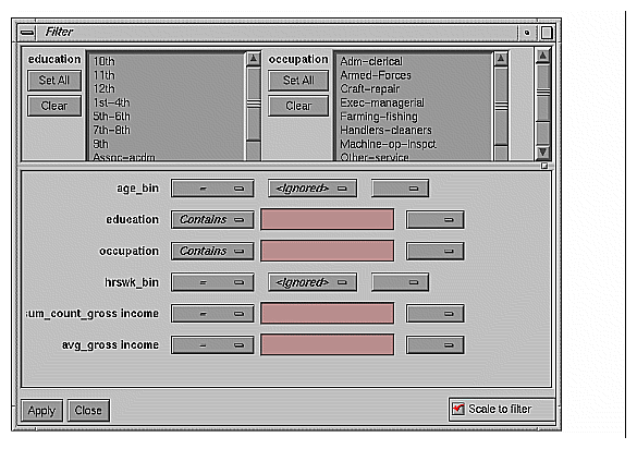
Show Filter Menu brings up a filter panel (Figure 8-11) that lets you reduce the number of splats displayed in the main viewing area, based on one or more criteria. You can use the filter panel to fine-tune the display, emphasize specific information, or simply shrink the amount of information displayed. Columns other than those mapped to axes, sliders, opacity, and color are not available for filtering because they are removed during aggregation. The Scale to filter checkbox, which appears in the lower right of the filter panel, lets you specify whether the landscape in the main window covers the entire dataset or just the filtered data.
Set Background Color brings up a color chooser to let you specify a new background color.
The Filter panel has two panes. The top pane lets you filter based on string columns. To select all values of a column, click Set All. To clear the current selections, click Clear. To select a value, click it. To deselect a value, simply click it again.
The bottom pane lets you filter based on the values of both string and numeric columns.
To filter numeric values, enter the value, and select a relational operation (=, !=, >, <, >=, <=). To filter alphanumeric values, enter the string. You can use any of three types of string comparisons:
For example, California matches Cal*, Cal?fornia, and Cal[a-z]fornia.
For columns which were binned, an option menu of values appears, instead of a text field. To ignore that column, select Ignored in the Option menu. You can use relational operators, such as >=, with these options. This means that the specified value as well as subsequent ones are selected.
In addition to numeric and string comparison operations, you can specify Is Null, which is true if the value is null.
To the right of each field is an additional option menu that lets you specify “And” or “Or” options. For example, you could specify “sales > 20 And < 40.” You can have any number of And or Or clauses for a given column, but cannot mix And and Or in a single column.
Scale to Filter lets you specify whether the filtered landscape is rescaled to the size of the filtered data or remains the size of the entire data set.
Click the Filter button to start filtering. If you press Enter while the panel is active, filtering starts automatically.
Click the Close button to close the panel.
The Selection menu (Figure 8-12) lets you drill through to the underlying data. The menu has six items.
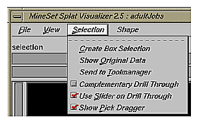
Create Box Selection creates a 3-D box selector that can be stretched and translated to select regions of the volume. While the box selector is active, a window in Record Viewer format is opened showing information about all of the aggregated data that is represented by the splats within it (see top of Figure 8-13). Closing this window clears the current box selection(s). Selecting this option again creates a new box selection, making the previous selection fixed. The fixed-selection boxes are gray, while the active one is light yellow (see Figure 8-13). The selected bins, shown in the selection window, are the bins enclosed by the union of all the selection boxes.
To translate the active selection box, click on one of the faces with the left mouse button, and drag it in the desired direction. Holding the Shift key while dragging constrains the motion to the axis to which the drag motion is closest. To change the extent of the selection box, drag one of the gray scale tabs in the desired direction. Trying to resize or translate beyond the bounds of the volume is not permitted. The gray scale tabs constantly resize to maintain constant screen size. If at any time they appear too big, you can zoom in closer, and they reduce their size relative to the box.
Show Original Data retrieves and displays the records corresponding to what has been selected via Box Selection(s). The resulting records are shown in a table viewer.
Send To Tool Manager inserts a filter operation, based on the current box selection(s), at the beginning of the Tool Manager history. The actual expression used to do the drill through is determined by extents of the current box selection(s). If nothing is selected, a warning message appears.
Use Slider On Drill-Through determines whether or not to use the slider position when creating the drill-through expression. If checked (default), an additional term is added to the drill-through expression, limiting the drill-through to those records defined by the slider's position. If this option is not checked, no such limiting term is added.
Complementary Drill Through causes the Show Original Data and Send To Tool Manager selections, when used, to fetch all the data that are not selected.
Show Pick Dragger toggles the visibility of the pick dragger (on by default). The pick dragger is removed when a box selection is started, but it can be made active at the same time that a box selection is active.

For further details on drill-through, see Chapter 18, “Selection and Drill-Through.”
Splats are used in this tool to model clouds of small points (see Lee Westover, “Footprint Evaluation for Volume Rendering” in Proceedings of SIGGRAPH `90, Vol. 24, No. 4, pages 367-376).
The Splat Type menu lets you change the method for drawing the splats. You can choose to exchange accuracy for interactivity. Texture splats are the most accurate representation of ideal Gaussian density that is approximated in every approach. Since most computers support hardware-assisted texturing well, the texture splat is usually the best choice. Among SGI platforms, only the Indy or earlier systems are restricted to the slower software implementation. The three splat types are:
Linear draws a small set of triangles to give a linear approximation to a Gaussian splat.
Gaussian draws a large set of triangles to approximate a Gaussian splat.
Texture uses a texture mapped rectangle to give the most accurate representation. This can be very slow on machines that don't support hardware-assisted texture mapping.
Alternatively, the following opaque primitives are allowed.
Sphere draws an opaque sphere, the radius for which varies with the cube root of the
count (or weight).Cube draws a large set of triangles to approximate a Gaussian splat.
Diamond uses a texture-mapped rectangle to give the most accurate representation. This can be very slow on machines that don't support hardware-assisted texture mapping.
The provided sample data and configuration files demonstrate the Splat Visualizer's features and capabilities. The following files are in the /usr/lib/MineSet/splatviz/examples directory:
mushroom
The mushroom.data file contains pre-aggregated data concerning more than 5,000 mushrooms. The group by columns were: odor, gill_color, and cap_color. For every combination of these three columns in the original data, there is a count and an average edibility, where 0 is edible, and 1 is poisonous. An average edibility between 0 and 1 means some of the mushrooms in that aggregate are edible and some are poisonous, since mushrooms can not be partially poisonous.The visualization (Figure 8-8) shows that the unique values for each of these columns have been sorted along the axes according to average edibility. Odor is clearly the best determinant of edibility. Also note that most splats are either all 0 or all 1, meaning these three columns are useful in segmenting the two classes of mushrooms. Lower the opacity slider to determine which splats have the highest counts. The most opaque splat represents 288 mushrooms having common values for odor, gill_color, and cap_color. To confirm this try filtering based on sum_count_poison>280 and picking on the remaining splats to see their counts. Note that all mushrooms with gill_color=buff are poisonous.
adultJobs
The adultJobs.data file was derived from adult94, a dataset provided with the distribution. It was created using an aggregation that grouped by education, occupation, hrs_worked_per_week(binned), and age (binned). The gross_income column was aggregated by count and average. For a display using the Splat Visualizer (Figure 8-1), age_bin was mapped to a slider, while the other group-by columns were mapped to axes. The count_gross_income column was mapped to opacity, and avg_gross_income was mapped to color.When the slider is in the left-most position, the color of the plot is almost entirely blue. This means that regardless of occupation, education, or number of hours worked, people younger than 20 have low incomes. Move the slider to the right, and note how incomes rise faster for higher education and occupations toward the end of the axis. By the opacity variation you can see that the most common types of education are HS, some college and Bachelors degree.
Moving the Summary slider shows how the distribution of income changes with respect to the axis columns as people age.
adultJobs2
The adultJobs2 file is also based on the adult94 dataset. Here, the axis columns are working_class, education, and occupation. The two columns mapped to sliders are age(binned) and hours_worked_per_week(binned). Again, income was aggregated by count and average for use with opacity and color, respectively. Since there are more positions on the 2D slider, there are fewer records represented by each position. This causes greater variation of color and opacity. The red region in the center of the hrs_per_week dimension of the Summary slider shows that nearly everyone works between 35 and 45 hours per week (see Figure 8-7). Note that some occupations are aligned with specific working classes. For example, everyone in the Armed-forces has Fed-Government for their working class.censusIncome
This example is based on a dataset similar to adult94, but was not included with the distribution because of its size. In attempt to understand the differences between gross income and total income, gross_income, total_income, and hrs_per_week have been mapped to axes. Color shows age. By studying the image we can learn that there are many records where total_income=gross_income, but there are also a larger portion of records with high total_income, but 0 gross_income. It is surprising that in many cases gross_income is greater that total_income.Note where the people of different ages are concentrated. Many old people (yellow) are in the hrs_per_wk=0 plane. They are probably retirees. Many children and young adults (blue) are in the line gross_income=total_income=0. Note the fairly opaque splats near the outside edges of the volume. These positions include all points that fell in the maximum bin shown for an axis. For example, the highest bin for total_income is 70300+. Any point higher than 70300 goes in this bin.
To better see the varying density, adjust the opacity slider. At low opacity scales, the diagonal lines show that for most people gross_income=total_income, or they have just total_income and no gross_income. As you raise the scale, you can see that almost the entire volume contains data. This dataset contains 150,000 records.
churn
Churn is when a customer leaves one company for another. This example shows customer churn for a telephone company. The data used to generate this example is in /usr/lib/MineSet/data/churn.schema.Using column importance, we found that total_day_charge, number_customer_service_calls, and international_plan were important discriminators. These columns were mapped to axes. We then created a new numeric column, churn, which equals churned==Yes, and mapped it to color.
In the resulting visualization, red areas of the volume indicate high churn. The area corresponding to three or more customer service calls and low total_day charge corresponds to high churn. You might want to weight big-spending customers more heavily than others. To do this, create a new column, total_charge, equal to
`total_day_charge`+`total_eve_charge`+`total_night_charge`
or some power of this sum. Then map this total_charge column to opacity. This means every record is weighted by total_charge. Now the visualization shows additional areas of interest near the high end of the total_day_charge axis.