This chapter discusses the features and capabilities of the Scatter Visualizer. It provides an overview of this database visualization tool, then explains the Scatter Visualizer's functionality when working with the
main window
external controls
pulldown menus
Finally, it lists and describes the sample files provided for this tool.
The Scatter Visualizer lets you visually analyze relationships among several variables (see Figure 7-1), either statically or by animation. It is particularly useful for seeing individual data points when you do not have a large number of records. If your dataset has a very large number of records consider using the Splat Visualizer. Analysis in the Scatter Visualizer is done using
a three-dimensional landscape
an animation control panel that includes a two-dimensional slider
graphical objects, called entities, that can be animated in the three-dimensional landscape

The Scatter Visualizer lets you visualize your data by mapping each record, or row, in the dataset to an entity in the three-dimensional landscape. Variables in the data can be mapped to the sizes, colors, and positions of the entities. Also, you can map one or two numeric variables to the sliders in the animation control panel. If the variables mapped to sizes, colors, or positions of the entities depend on the variables mapped to sliders, the sliders can be used to drive an animation. For example, the data might represent the sales of several companies over time. If the time variable is mapped to a slider and the sales variable is mapped to size, then the entities grow or shrink as the time slider is animated.
After you create a visualization of your data, the Scatter Visualizer lets you analyze the data in various ways. The animation control panel lets you trace animation paths in one or two dimensions. By playing back the path you created, you can watch the size, color, and motion of the entities for trends or anomalies. In the three-dimensional landscape, you can orient the display to emphasize particular dimensions or a point of view. The Scatter Visualizer lets you scale the values of variables to give them greater emphasis. Also, you can filter the display to show only those entities meeting certain criteria.
The Scatter Visualizer requires the following files:
A data file, consisting of rows of tab-separated fields. This file is easily created using the Tool Manager (see Chapter 3). If you are generating this file yourself, see Appendix D, “Creating Data and Configuration Files for the Scatter Visualizer” for the required file format.
You can generate data files by extracting data from a source (such as a database) and formatting it specifically for use by the Scatter Visualizer. Data files have user-defined extensions (the sample files provided with the Scatter Visualizer have a .data extension).
A configuration file, describing the format of the input data and how it is to be displayed. The Tool Manager can create this file (see Chapter 3), or you can use an editor (such as jot, vi, or Emacs) to produce this file yourself (see Appendix D, “Creating Data and Configuration Files for the Scatter Visualizer”).
Configuration files must have a .scatterviz extension. When starting the Scatter Visualizer, or when opening a file, you must specify the configuration file, not the data file.
There are a two options that affect how this tool is invoked:
-warnexecute indicates that if you attempt to execute a command specified in an execute statement, a warning is displayed and you are given the option to execute the command or not. This is intended for an insecure environment, such as files obtained from the Web, and is used automatically when commands are executed via mtr files.
You can enable this option permanently by adding the line
*minesetWarnExecute:TRUE
to your .Xdefaults file, or by setting the environment variable
MINESET_WARN_EXECUTE
-quiet eliminates the dialogs that popup to indicate progress. You can enable this option permanently by adding the line
*minesetQuiet:TRUE
to your .Xdefaults file.
There are five ways to start the Scatter Visualizer:
Use the Tool Manager to configure and start the Scatter Visualizer. (See Chapter 3 for details on most of the Tool Manager's functionality, which is common to all MineSet tools; see “Configuring the Scatter Visualizer Using the Tool Manager” for details about using the Tool Manager in conjunction with the Scatter Visualizer.)
Double-click the Scatter Visualizer icon, which is in the MineSet page of the icon catalog. The icon is labeled scatterviz. Since no configuration file is specified, the start-up screen requires you to select one by using File > Open.
Starting the Scatter Visualizer without specifying a configuration file causes the main window to show the copyright notice and license agreement for this tool. Only the File and Help pulldown menus can be used. For the main window to be fully functional, open a configuration file by selecting File > Open.
If you know which configuration file you want to use, double-click the icon for that configuration file. This starts the Scatter Visualizer and automatically loads the configuration file you specified. This works only if the configuration filename ends in .scatterviz (which is always the case for configuration files created for the Scatter Visualizer using the Tool Manager).
Drag the configuration file icon onto the Scatter Visualizer icon. This starts the Scatter Visualizer and automatically loads the configuration file you specified.
Start the Scatter Visualizer from the UNIX shell command line by entering this command at the prompt:
scatterviz [ configFile ]
configFile is optional and specifies the name of the configuration file to use. If you don't specify a configuration file, you must use File > Open to specify one (see Figure 7-2).

This section describes how the Scatter Visualizer can be configured using the Tool Manager. Although the Tool Manager greatly simplifies the task of configuring the Scatter Visualizer, you can construct a configuration file manually for this tool using a text editor (see Appendix D, “Creating Data and Configuration Files for the Scatter Visualizer”).
The steps required to connect to a data source are described in Chapter 3.
Select the Viz Tools tab in the Data Destination panel of the Tool Manager's main screen (Figure 7-3). From the popup list of tools, select Scatter Visualizer. The mapping requirements for the Scatter Visualizer are displayed in the window on the right side of this panel. Items in the Visual Elements list that are preceded by an asterisk are optional.

Axis 1, *Axis 2, *Axis 3 let you assign to the axes in the Scatter Visualizer's main window the data you want represented. Assigning data to Axis1 is required. However, this alone does not produce a useful display. By assigning data to Axis 2, you can create an XY chart. Assigning data to all three axes produces a 3-D chart.
*Entity-size, *Entity-color, *Entity-label let you assign size, color, and label to the entities appearing in the Scatter Visualizer's main window.
*Summary is the value mapped to the summary column, if you have a slider. It determines the color of the slider's background.
*Slider1 and *Slider2 let you map columns directly to one or two animation Sliders (see “Slider Creation for Scatterviz,” below).
You can map requirements to columns by selecting a column name in the Current Columns window of the Table Processing panel, then selecting a category in the Visual Elements window.
To undo a specific mapping, select that mapping in the Visual Elements window, then click the Clear Selected button. To undo all mappings, click the Clear All button.
Sliders can be created manually or automatically. The following subsections describe these methods.
Tool Manager generates sliders whenever there is an array column present in the current table. The sliders correspond to the indices of the array columns. If the column has one index (one-dimensional array), only one slider is created, but if the column has two indices (two-dimensional array), both an X and a Y slider are created. The current slider indices are indicated in the Tool Options dialog box from the Tool Manager. Array columns can be created using the “index by” menus in the Tool Manager aggregation panel (see “Aggregation” in Chapter 3).
Note that for a slider to be created, all array columns in the current table must have the same indices. If array columns with differing indices exist in the current table, no sliders are created.
If no arrayed columns are in the current table, Tool Manager can automatically generate sliders by use of the Slider1 and Slider2 mappings. Sliders are created through a combination of automatic binning and aggregation. These automatic operations occur after clicking Invoke Tool in the Data Destination Panel. The operations do not affect the current history operations of Tool Manager, but they do appear in the configuration files for the tool.
Columns mapped to Slider1 and Slider2 eventually form the indices for the sliders. These columns must be either numeric (int, float, double) or binned. If a column mapped to a slider is already binned, no automatic binning is needed for this column, and this column is used as an index for a slider. However, if the column is not binned, a binned column is created using the automatic binning options in the Tool Options dialog box.
The three methods of binning are:
Selecting All Distinct Values creates a bin for every unique value of the column.
Specify the number of bins you want to create. The thresholds for the bins are determined using the Uniform Range approach.
Selecting Automatic automatically determines the number of bins to create and determines the bin thresholds using the Uniform Range approach.
(See “The Bin Columns Button” in Chapter 3 for more information about binning.) The column used in forming the automatic bins is deleted from the current table.
The binned columns now form the indices of array columns. Note that if you want to create only one slider, the index must be mapped to Slider1. Attempting to create only one slider with a mapping to Slider2 is not allowed and generates a Tool Manager error. Also, a column mapped to a slider cannot be mapped to any other mapping, since it is removed during the aggregation process.
Once the slider indices are formed, the arrayed columns are created. This is done using automatic aggregation. Any numeric columns mapped to Axis 1, Axis 2, Axis 3, Entity-size, Entity-color, Entity-label, or Summary are aggregated using the automatic aggregation options in the Tool Options dialog box. You can either specify aggregating by Sum or by Average. The binned columns created from the slider mappings form the indices for the aggregation, and any remaining columns in the table are Group-By columns. (See “Aggregation” in Chapter 3 for a description of the aggregation process.) Be sure to remove any columns you do not wish to use in the grouping process. If you need different types of aggregates for different mappings, you must aggregate manually.
The aggregation step automatically forms the arrayed columns used for sliders. These arrayed columns form the new tool mappings. For example, if the column “mpg” were mapped to Axis 1, a new column “avg_mpg[]” is formed and remapped to Axis 1. The progress of the automatic slider generation is displayed in the Tool Manager status window.
Clicking the Tool Options button causes a new dialog box to be displayed (Figure 7-4). This lets you change some of the Scatter Visualizer options from their default values.

The Scatter Visualizer's Options dialog box has four basic options blocks:
Entities
Sliders
Axes
Other
This option block lets you specify a number of characteristics for the entities that the Scatter Visualizer then graphically displays.
Entity Legend On—lets you determine whether the entity legend is displayed or hidden.
Entity Size—lets you scale the entity to a max size, a scale size, or a default (no adjustment). You also can specify whether the legend for entity size is displayed or hidden.
Entity Colors—lets you control the colors in which entities are displayed. You can
specify the list of colors to use
specify the kind of mapping
map the list of colors to a list of values
specify whether the legend for color is displayed or hidden
map colors to entities
Entity Shape—lets you choose a visual representation for the entities: cubes, bars, or diamonds.
To use these Colors options, you must have mapped a column to the *Entity-color requirement of the Data Destination panel. See “Choosing Colors” and “Using the Color Browser” in Chapter 3 for a more detailed explanation of how to choose and change colors.
Color list to use lets you specify the color list using the + button next to the color list label. This brings up a color editor that lets you specify a color to be added to the list.
Color mapping let you specify whether the color change that is shown in the graphic display is Continuous or Discrete. If you choose Continuous, the color values shift gradually between the colors entered in the Color list to use field as a function of the values that are mapped to those colors in the Color mapping field.
The field to the right of the popup button lets you enter specific values for mapping the colors. If you do not specify any mapping values, the range of values in the color variable is used.
If you
used the Color Browser to apply red and green to bars
selected Continuous for the Kind of mapping
entered the values 0 100
then the display shows all entities with values less than or equal to 0 as completely red, those as greater than or equal to 100 as completely green, and those between 0 and 100 as shadings from red to green.
If you
used the Color Browser to apply red and green to entities
selected Discrete for the Kind of mapping
entered the values 0 50
then the display shows all entities with values of less than 50 in red, and all those with values greater than or equal to 50 in green.
Summary options let you specify what color to use for the Summary window. You can also specify whether the summary legend, which indicates what the values are, is displayed or hidden.
If you have an array of values, you can specify an X or Y slider. The popup buttons next to these options provide a list of available keys, and let you specify which to use as sliders.
The Slider options control how the slider mappings are interpreted. For details see “Slider Creation for Scatterviz”.
The Axis options let you specify the following, for each axis:
A label. (If you leave this box blank, the Scatter Visualizer defaults to using the column names for each axis.)
A color
A size type for each axis. (This can be Max Size, Scale Size, or No Adjustment.)
Max Size lets you specify that an axis is scaled independently to a specified size. If one axis has a Max Size that is twice as large as the other, it will be twice as long, regardless of the data values. This option is most useful when comparing axes that are in different units (for example, comparing income to age). This option has no effect on non-numeric data.
Scale Size lets you specify that the axis is scaled based on its maximum value. If two axes have the same Scale Size, but one has a maximum that is twice the value of the other, the former will be twice as long as the latter. This option is useful for comparing axes with the same units (for example, income vs. expenses). This option does affect the size of non-numeric axes.
A size value
Whether the axis should be extended to include the value 0.
The Other Options, at the bottom of the dialog box, include the following fields:
Message lets you specify the message displayed when an entity is selected. For a listing and description of format types that can be entered in this field, see the “Message Statement” section in Appendix D, “Creating Data and Configuration Files for the Scatter Visualizer”
Execute lets you type in a UNIX command that is executed when double-clicking on an entity. The format is similar to the message statement. If no execute statement appears, double-clicking has no effect. For a detailed description of the Execute field, see “Execute Statement” in Appendix D.
Hide Label Distance controls the distance at which entity labels become invisible. Smaller distances might improve performance, but the labels disappear more quickly. The higher the number, the greater the distance at which labels are hidden.
Axis Label Size controls the size of the axis labels. A smaller number decreases the size, a larger one increases it.
Grid (X, Y, Z) Size lets you specify the spacing between grid lines for the respective axis. A smaller number decreases the size, a larger one increases it.
Grid Color lets you modify a grid color by clicking on it. This causes the Color Chooser dialog box to appear, which lets you implement your color changes.
To see Scatter Visualizer graphically represent your data, click the Invoke Tool button at the bottom of the Data Destination panel.
When you press Invoke Tool, the Tool Manager stores information for the Scatter Visualizer in three files, all sharing the same prefix:
<prefix>.scatterviz.data contains data.
<prefix>.scatterviz.schema describes the data file.
<prefix>.scatterviz contains information needed by the Scatter Visualizer.
To save the entire session along with the current tool options, use one of these menu options from the File menu:
Save Current Session... where the default prefix is based on the data source
Save Current Session As... to specify your own prefix
The saved file is <prefix>.mineset, and contains all the information needed to return MineSet to its current state.
The Scatter Visualizer uses special representations when fields with unknown data values, or nulls, are mapped to visual attributes. (For a discussion of null values, see Appendix J, “Nulls in MineSet.”) When a null value is mapped to an entity's size, the entity is drawn as the outline of a cube. When a null value is mapped to an entity's color, it is drawn in dark grey. When a null value is displayed in the Selection Window or “Pointer is Over” area, it is shown as a question mark (?). (The Selection Window and “Pointer is Over” areas are discussed in the “Select Mode” section.)
If a null value is mapped to the x, y, or z position of an entity, the result depends on the Show Entities with Null Positions option under the View Menu (see “The View Menu”). If the option is set, the entity is shown just below the range of the corresponding axis. If the option is not set, the entity is not shown.
If you started the Scatter Visualizer without specifying a configuration file, the main window shows the copyright notice and license agreement for the Scatter Visualizer. Only the File and Help pulldown menus can be used. For the main window to show all menus and controls, open a configuration file. Use File > Open (Figure 7-2) to see a list of configuration files.
When a valid configuration file has been selected, the 3D landscape it specifies is visible. For example, selecting company-total.scatterviz gives results as shown in Figure 7-5.

This shows the sales of life insurance, auto insurance, and home insurance with respect to income brackets over time.
The two modes of viewing are grasp and select. To toggle between these modes, press the Esc key or click the appropriate cursor button adjacent to the top-right of the viewing area.
In grasp mode, the cursor appears as a hand. This mode supports panning, rotating, and scaling the scene's size in the main window.
To pan the display, press the middle mouse button and drag it in the direction you want the display panned.
To rotate the display, press the left mouse button and move the mouse in the direction you want to rotate. (Also see the thumbwheel controls Rotx and Roty, described in “Thumbwheels” in Chapter 6.)
To move the viewpoint forward, press the left and middle mouse buttons simultaneously and move the mouse downwards. To move the viewpoint backward, press the left and middle mouse buttons simultaneously and move the mouse upwards. This is equivalent to the functions provided by the Dolly thumbwheel.
In select mode, you can highlight an object by positioning the cursor over that object. Information about that object then appears at the top of the view area, under the Pointer is over: label (Figure 7-6). This information remains visible in the window only as long as the pointer cursor remains over the object. Position the pointer cursor over an object and click the left mouse button; the same information appears in the Selection Window, above the main window. A white box appears around the entity, indicating it has been selected, and a table viewer shows your current selection. Select several entities by holding down the Shift key while clicking the left mouse button. The most recent selection is shown under the Selection label at the top of the scene. All current selections are shown in the Record Viewer. You can now drill-through on your selection (see “The Selection Menu” for the different drill-though options.)
This Selection information remains visible until another object is selected, or you click the black background. Using the mouse, you can cut and paste this selection information into other applications, such as reports or databases.

If an execute statement was specified using Tool Manager or the configuration file, then double clicking on an object executes the appropriate command. If the -warnexecute option was specified when invoking the Scatter Visualizer, a warning is given first.
 | Note: Users familiar with Open Inventor can configure the Scatter Visualizer so that the right mouse button brings up the standard Inventor Menu. This provides additional functions, such as stereo viewing and spin animation. These functions are provided by the Open Inventor library. To enable the Open Inventor Menu, add the line *minesetInventorMenu:TRUE to your .Xdefaults file. |
Several external controls surround the main window, including buttons and thumbwheels. These controls are substantially the same for most MineSet visualization tools (see the descriptions “Buttons” in Chapter 6, and “Thumbwheels” in Chapter 6).
The animation control panel, which appears to the right of the main window, consists of a summary window, with up to two adjacent sliders, an information field, animation buttons, and animation sliders.
The number of sliders appearing adjacent to the summary window is dependent on the dataset displayed in the Scatter Visualizer's main window. Datasets can have two, one, or no independent dimensions.
If the dataset has two dimensions of independently varying data (such as company.scatterviz), the controls to the right of the main graphics window become visible (see Figure 7-7).
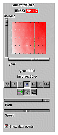
To the right of the main window are the summary window and slider controls. The summary window has a horizontal slider below it for selecting data points of the first independent dimension, and a vertical slider to the left for selecting data points of the second independent dimension. The horizontal slider's dimension is identified by a label below it. The vertical slider's dimension is identified by a label above it.
For datasets with one independent dimension (such as store-type.scatterviz), only the slider below the summary window appears, and the summary window is compressed (see Figure 7-8). This slider's dimension is identified by a label below it.

For datasets with no independent dimensions (such as brand.scatterviz), no slider control appears (see Figure 7-9).

The summary window provides a 2D representation of the aggregation of values that the main window displays in 3D. The whiter the areas of the summary window, the lower the total values represented by the entities in the main window. The greater the color density in areas of the summary window, the higher the total of those values. The density of these colors in the summary window provides a summary of the data across the one or two independent dimensions in the dataset.
By default, the summary window also contains a set of black dots, evenly spaced across the one or two dimensions of data. These dots indicate the precise positions of the discrete datapoints. You can turn off these black dots using the View|Show Data Points menu option.
After opening the company.scatterviz file, for example, the 2D summary window shows a color range from white (on the left) to red (on the right). White corresponds to a low sales volume; red represents a higher aggregate sales volume. In this example, the greater the density of red, the higher the total sales of life, auto, and home insurance.
If the dataset loaded into the Scatter Visualizer has at least one independent dimension, it is possible to view all or any part of that dataset via animation. This is done by first creating a path in the summary window (this path connects a sequence of data points), then activating the animation controls described in the next section.
The three ways to draw a path in the summary window are as follows:
Define a starting point by clicking and holding down the left mouse button, then draw a path by dragging the cursor over the window. End the path by releasing the left mouse button.
Define a starting point by clicking the left mouse button, then define an endpoint by moving the cursor to another part of the window and clicking the middle mouse button. A line appears between those two points. To add more line segments, continue with repeated middle mouse clicks.
Define a starting point by clicking the left mouse button, then drag one of the independent dimension sliders, thus drawing a straight line along this dimension. If there are two sliders, use of the second slider causes a straight line to be drawn along the axis controlled by this second slider.
The seven VCR-like buttons and two sliders (Path and Speed) below the 2D summary window let you control the animation.
Once a path is drawn in the summary window (see “Creating a Path in the Summary Window,” above), you can use the VCR-like buttons to control animation along this path. The middle Stop button is highlighted in blue, indicating an initial state. Use the adjacent Play Forward button (to the right of Stop) or Play Reverse (to the left) to begin simple movement along the drawn path in a forward or reverse direction. (Forward and Reverse are defined by the sequence in which the path was drawn, not by the left-to-right or right-to-left movement.)
To stop and restart the animation, click the Stop button, then use the Play Forward or Reverse button again. Note that when you stop, the animation continues in the current direction until the position falls upon a discrete data point.
Adjacent to the Play buttons are the Single-Step buttons, as well as Forward and Reverse. Clicking on one of these buttons changes the current path position to the next discrete data point.
On the outside are the Fast Forward and Fast Reverse buttons. Clicking one of these buttons while in Stop state changes the path position to the end (for Forward) or to the beginning (for Reverse) of the path. Clicking a Fast button when in Play state increases the animation speed.
Below the Animation Buttons are the three Animation Flow buttons.
Play-once (default)—the animation moves either forward or in reverse until it reaches the end of the path, then stops.
Loop—when the animation reaches the end of the path, it automatically resets to the beginning and starts over again.
Swing—when the animation reaches the end of the path, it reverses direction and retraces its path to the other end; upon reaching that end, the animation reverses direction again, beginning the cycle again.
While animation is stopped, you can move the Path slider to reset the position along the path. Note that when you use the Path slider, the cursor in the summary window moves across the drawn path, and the 1D sliders (below and to the left of the drawing area) move consistently with the cursor position. Then use the Play or Reverse button to restart the animation from the newly specified point. You can drag the Path slider to an arbitrary position between discrete data points; however, when you release the slider, the path position changes to the nearest discrete data point.
Use the Speed slider to adjust the speed of the animation along the path.
As animation proceeds, the variables mapped to size, color, and axes (positions) in the Scatter Visualizer change smoothly. However, the information displayed in the “Selection:” message box and the Pointer is over: field show only the data values of the nearest discrete data position; they do not show interpolated data values.
The animation is produced in the following manner: Assume you have data for 10 years, on a per-year basis (that is, 10 data values) and that these correspond to the size of one entity in the Scatter Visualizer. Assume further that the years are 1991 to 2000, the size for 1991 is 20, and the size for 1992 is 40. As you move the year slider from 1991 to 1992, the size changes by being uniformly interpolated between 20 and 40. For example, midway between 1991 and 1992, the size is 30. As you approach 1992, the size approaches 40. However, you cannot stop an animation between discrete data points, and you cannot drag the Path slider to a stationary position between discrete data points.
The data points in the summary window represent the slider positions corresponding to the actual data from the data file. For example, sizes 20 and 40 are representations of actual data, but size 30 is not. In this example, there would be data points in the summary window at the slider positions corresponding to each year.
Note that not all variables are required to vary with a slider. If there are two sliders, some variables can vary with only one of the sliders, while other variables vary with both.
Four pulldown menus let you access additional Scatter Visualizer functions. These are labeled File, View, Selections, and Help. If you start the Scatter Visualizer without specifying a configuration file, only the File and the Help menus are available.
The File menu is the substantially the same for all visualization tools see “The File Menu” in Chapter 5.
The View menu lets you control certain aspects of what is shown in the Scatter Visualizer window (Figure 7-10).
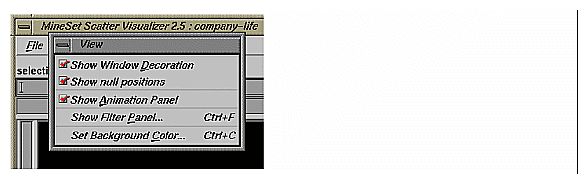
Show Window Decoration lets you hide or show the external controls around the main window.
Show null Positions lets you hide or show entities that have null or unknown position values along one or more axes.
Show Animation Panel lets you show or hide the animation control panel. This menu item is disabled for datasets with no independent dimension.
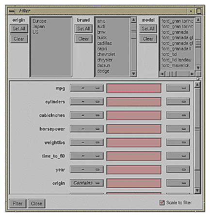
Show Filter Panel lets brings up the Filter Panel. This panel (Figure 7-11) lets you reduce the number of entities displayed in the main viewing area, based on one or more criteria. You can use the filter panel to fine-tune the display, emphasize specific information, or simply shrink the amount of information displayed. The Set Landscape to Filter checkbox, which appears in the lower right of the filter panel, lets you specify whether the landscape in the main window covers the entire dataset or just the filtered data.
Set Background Color brings up a color chooser to let you specify a new background color.
The Filter panel has two panes. The top pane lets you filter based on string columns. To select all values of a column, click Set All. To clear the current selections, click Clear. To select a value, click it. To deselect a value, simply click it again.
The bottom pane lets you filter based on the values of both string and numeric columns.
To filter numeric values, enter the value, and select a relational operation (=, !=, >, <, >=, <=). To filter alphanumeric values, enter the string. You can use any of three types of string comparisons:
For example, California matches Cal*, Cal?fornia, and Cal[a-z]fornia.
For columns which were binned, an option menu of values appears, instead of a text field. To ignore that column, select Ignored in the Option menu. You can use relational operators, such as >=, with these options. This means that the specified value as well as subsequent ones are selected.
In addition to numeric and string comparison operations, you can specify Is Null, which is true if the value is null.
To the right of each field is an additional option menu that lets you specify “And” or “Or” options. For example, you could specify “sales > 20 And < 40.” You can have any number of And or Or clauses for a given column, but cannot mix And and Or in a single column.
Scale to Filter lets you specify whether the filtered landscape is rescaled to the size of the filtered data or remains the size of the entire data set.
Click the Filter button to start filtering. If you press Enter while the panel is active, filtering starts automatically.
Click the Close button to close the panel.
The Selections menu lets you drill through to the underlying data.
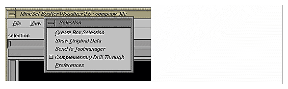
Create Box Selection creates a 3-D box selector that can be stretched and translated to select regions of the volume. While active, a table in Record Viewer format is opened showing information about all of the aggregated data that is represented by the entities within it. Closing this window clears all current selections. Any entities within the selection box or selected using Shift-click are shown in the table window. To translate the selection box, click on one of the faces with the left mouse button, and drag it in the desired direction. Holding the Shift key while dragging constrains the motion to the axis to which the drag motion is closest. To change the extent of the selection box, drag one of the gray scale tabs in the desired direction. Trying to resize or translate beyond the bounds of the volume is not permitted. The gray scale tabs constantly resize to maintain constant screen size. If at any time they appear too big, you can zoom in closer, and they reduce their size relative to the box.
Show Original Data retrieves and displays the records corresponding to what has been selected. The resulting records are shown in a table viewer.
Send To Tool Manager inserts a filter operation, based on the current box selection(s), at the beginning of the Tool Manager history. The actual expression used to do the drill through is determined by the extent of the current box selection. If nothing is selected, a warning message appears.
Complementary Drill Through causes the Show Original Data and Send To Tool Manager selections, when used, to fetch all the data that are not selected.
Preferences brings up a panel that lets you select which columns are used in drill-through. Unlike other visual tools, there are no specific columns in the data that are designated as the key to the data. It is impossible for the Scatter Visualizer to determine which columns the user desires in the drill-through expression. For example, you might have cars data with brand, model, and weight. Perhaps you want to drill through to the original data, and specify that brand and model should be considered, but weight should not. By default, all columns that have been mapped to graphical requirements are considered significant on drill-through. The others are not, but may be made so by highlighting them in the Preferences dialog box.
For further details on drill-through, see Chapter 18, “Selection and Drill-Through.”
The Help menu is substantially the same for all visualization tools; see “The Help Menu” in Chapter 6
The provided sample data and configuration files demonstrate the Scatter Visualizer's features and capabilities. The following files are in the /usr/lib/MineSet/scatterviz/examples directory:
company.data
This file contains fictitious sales data of several insurance companies in three product categories: life insurance, auto insurance, and home insurance. The data span ten years (in increments of one year) and includes five income brackets (the customer's annual income).company.scatterviz
This file specifies that the years form one slider dimension and the income brackets form the other slider. Sales of life insurance, auto insurance, and home insurance become the three dimensions in the Scatter Visualizer landscape. The color density in the slider summary window represents the total sales of all companies across all categories of insurance.company-total.scatterviz
This file contains the same specifications as company.scatterviz, except that the size of each company is determined by the total sales of that company across all the categories of insurance.company-life.scatterviz
This file contains the same specifications as company.scatterviz, except that the color of each object indicates the life insurance sales as a fraction of total sales.store-type.data and store-type.scatterviz
These files show sales of various product groups by store type during a three-year period. The single independent variable for which a slider appears is time. Each entity represents a store type (such as Food Store, Drug Store, Service Station, and so forth). For each store type, the data file contains the total sales of several product groups, such as alcoholic beverages, cereal, and so forth. The data spans 36 months, in increments of one month.The configuration file uses the month as the single slider dimension. One axis is sales of alcoholic beverages, the other is sales of tobacco products. A third axis is not used.
Note: The data file includes other categories. You can edit the configuration file to use other product categories for the axes (see Appendix D, “Creating Data and Configuration Files for the Scatter Visualizer”). brand.data and brand.scatterviz
These files show sales of several soft-drink brands in a variety of store types. In this dataset the brands form the entities, and the store types are associated with the axes. The total sales are mapped to the size of each brand. The color mapping is random. Since there are no independent variables, no slider is present.cars.data and cars.scatterviz
These files show the weight, horsepower, model year, and acceleration of several car models.people.data and people.scatterviz
These files show the height, weight, density, and cholesterol level for a population sample.nl.births.data and nl.births.scatterviz
These files show birth patterns in the Netherlands. For each region, the population density, birth rate, and population are shown. The animation sliders are mapped to the age of the mother and the year.adult94.data and adult94.scatterviz
These files show a complex example with scatterviz applied to /usr/lib/MineSet/data/adult.data. The three axes in the visualization are avg_hrswk (that is, average hours worked per week), avg_gross_income, and avg_education_num. Unfortunately “education num” does not correspond exactly to number of years of education, but it is close. The slider on the right side animates across different age ranges. Each aggregate was created by grouping by occupation, race and sex. This means that there is an entity for every combination of values for these three attributes. The color shows different occupations, as shown in the legend. The size of each entity corresponds to record counts. The summary slider is also colored by data density. To find out how this visualization was created, you may select Start Tool Manager from the File menu. This will bring up the Tool Manager with the session used to create this example.Initially the scene shows information for people under 20 years of age. Note that the average hours worked (about 14) and the average income (about $4000) are low. If you animate over age using the slider, and examine the scene from the three orthogonal viewer (try using the lower 3 buttons to the right of the main window), you will notice various trends emerge. For example, if you orient the scene so you see only income by hours per week, you can see that people start to work longer hours as they age, until about age 25, then they seldom work more that 49 hours per week until they retire. Income, however, grows until people age 50, then plateaus, then goes lower again. The actual trend depends somewhat on the career choice and other factors.
Suppose you were interested in comparing trends between the occupations craft-repair and prof-specialty. Open the Filter panel (View > Show Filter Panel) and select just “craft-repair” and “prof-specialty” from the list of occupations. Now when you animate, you can see that “prof-specialty” actually starts with lower incomes, but quickly outpaces “craft-repair” as people age. “Prof-specialty” is much higher on the education axis than “craft-repair”. You may wish to limit your filter further by showing just females, or those of a certain race.