This chapter discusses the features and capabilities of the Decision Table Visualizer, provides an overview of this tool, and discusses the methods of inducing Decision Tables. It then explains the Decision Table Visualizer's functionality when working with the
Label Probability Pane
Main Window
Finally, it lists and describes the sample files provided for this tool.
 | Note: It is assumed that you have read Chapter 10, “MineSet Inducers and Classifiers,” before proceeding with this chapter. |
The Decision Table presents correlations between pairs of attributes, and can be used as a visualizer alone, or as a classifier and visualizer, in the same manner as MineSet's other inducers and visualizers. The underlying structure used for classification is a Decision Tree which splits on a single attribute at each level of the tree hierarchy. Such a structure is called an Oblivious Decision Tree. That attribute is rendered discrete in an identical manner across the whole level. Accuracy is inhibited to a small degree by representing the Decision Tree in this way, but the advantage is a uniform structure in a compact tabular form, which can easily show correlations between pairs of attributes at adjacent levels in the tree.
The method of classification used by Decision Tables is similar to that of a Decision Tree. Classification is done by picking the majority class of the region in which the example is found. If a record to be classified falls in a region where no training data occurred, classification is done by picking the predominant class one level up in the table hierarchy.
An example Decision Table is shown in Figure 14-1 for the mushroom dataset. It is hierarchical in structure like a Decision Tree, but breaks the data down by two attributes at each level instead of one. Decision Tables do not assume that the attributes are independent.
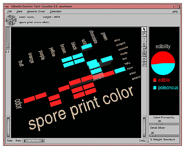
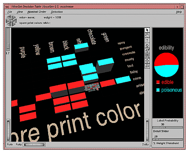
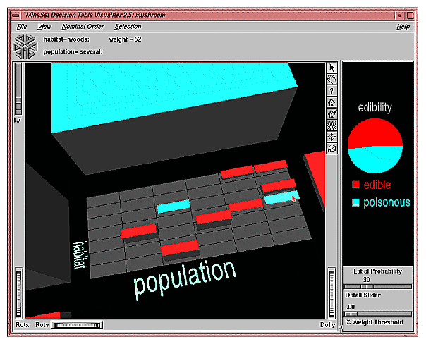
You might, for example create a Decision Table from the mushroom dataset to determine mushroom edibility (see Figure 14-1). The Main Window (on left) shows the top level of detail for a Decision Table induced from the mushroom dataset. Odor and spore-print-color were chosen to be at the top level because doing so improves the accuracy of the underlying classifier. In this dataset a dependence is shown between odor and spore-print-color at the top level. There is only one top level block with any ambiguity, meaning more than one class is present. It is the block with odor=none and spore-print-color=white. When you drill down to the next level (by clicking the right mouse button over the chart) the attributes habitat and population are shown at the next lower level (see Figure 14-2). The result of zooming in close to this drilled-down region is shown in Figure 14-3.
The Decision Table Visualizer may be used to answer questions such as:
When you know the values for only a few attributes, what can you predict for a new record? If the attributes for which you know the values appear in the top levels of the hierarchy, then this question is answered precisely, instead of approximately, as with the Evidence Visualizer.
How are the records distributed with respect to the label for the combination of attribute values that you are interested in?
The prior probability for each class label is depicted in the pie chart in the Label Probability Pane, on the right of the screen. The prior probability for a class label is the probability of seeing this label in the data for a randomly chosen record, ignoring all attribute values. Mathematically, this is the number of records with the class label divided by the total number of records.
The probability distribution for each rectangular block or cake in the Main Window on the left, shows the proportion of records in each class considering only records having that particular combination of values. These probabilities are precise for the data given.
By default, values of nominal attributes are sorted by how well they predict one of the classes. This helps identify important values. If the label is a binned attribute, the class that is the highest bin is used. If the label is nominal, then the class with the largest slice in the prior probability pie is used. When you select a particular class, and request a sort by label probability (nominal ordering > sort by label probability), that class determines the order of the result. Alternatively, the values of the nominal attributes can be sorted alphabetically or by weight. Values of binned attributes are always shown in their natural order.
When you drill down into a rectangular cake (using the right mouse button) the data represented by that cake is redisplayed in a new matrix of cakes where the attributes assigned to that level of detail are used as the axes. The cake charts sit on top of a gray base. If the base is completely covered with cakes, then every combination of values at this level is represented by the data. Often much of the base is uncovered. This shows regions where no data exists. In a very sparse dataset there are large regions that are empty. Picking or selecting a gray base has the same effect as selecting the cake that was one level up in level of detail. Drilling down on a base causes every cake sitting on top of it to expand to the next level of detail.
If an attribute has unknown (NULL) values, then the unknown values are denoted by a question mark (?). The NULL always appears as the first value if present and does not get sorted with the rest. It is possible to toggle the display of NULL values using View > Show Null Values.
If a cake is selected (left mouse click) on the left, then the probability pie on the right will show a posterior probability distribution which exactly matches that shown by the cake. When more than one cake chart on the left is selected (Shift-left mouse click), then the pie on the right will show the probability distribution (with respect to the label) for the set of records defined by the selected cakes. It is also possible to select a whole group of cakes by selecting the gray base below them. This has the same effect as selecting the cake one level up in the hierarchy.
Classes are listed under the pie chart on the right, and are in order of slice size. The class with the largest probability is at the top. As values on the left are selected, this order changes to reflect the changing probability pie. The class that would be predicted given current selections is shown at the top. If the label is a binned attribute the order of the classes is not changed on slice size. In addition, if the label is a binned attribute, colors are assigned according to a continuous spectrum: the highest bin is red; otherwise, random colors are used.
A Decision Table classifier can be induced, or generated automatically, from data. The data is made up of records, and a label associated with each record. (See Chapter 10, “MineSet Inducers and Classifiers”)
The automatic induction of Decision Table classifiers is a process in which record counts (or more generally record weights) are used to calculate the probabilities using the following method:
All continuous attributes are separated into discrete bins, so that class distributions in these ranges are as different as possible. The number of ranges is determined automatically. You can override automatic binning for any attribute by explicitly binning using Tool Manager.
The prior probabilities are the proportions of each class in the training set.
The number of cakes in any row along one of the axes (attribute) pairs shows the number of discrete ranges produced by the inducer. If there is just one range, it means that this attribute by itself was not useful in predicting the label. Initially, the prior probabilities of the labels are displayed in the Label Probability Pane.
There are three ways to assign attributes to X and Y axes at every level in the Decision Table hierarchy: manually, automatically, and automatically with feature search.
The classifier can have a loss matrix. When the classifier is applied, the loss matrix skews the predictions. In the visualization, the loss matrix can be used to adjust the posterior probability distribution.
The Decision Table Inducer requires the following files:
A data file (.data) consisting of rows of tab-separated fields.
A .dtableviz file containing the schema.The format of this schema is the same as described in “The .schema File” in Appendix A.
A training set, as described in “Training Set” in Chapter 10. Files are generated by extracting data from a source (such as a MineSet ASCII or binary file, or a table in an Oracle, INFORMIX, or Sybase database).
To apply the generated classifier, you should have a dataset of records with the attributes used by the classifier, except that the label need not be present.
There are two ways to run the Decision Table inducer:
From the Tool Manager
Connect to the server and select a data source (see “Choosing a Data Source” in Chapter 3).
From the File menu, choose Open New Data File. Log in to a server, and enter the filename. For the example shown here, the filename entered is /usr/lib/MineSet/data/mushroom.schema. In the Data Transformation panel you see 23 discrete attributes. Select the Mining Tools tab in the Data Destination panel and click the Classify tab. Select edibility as the discrete label. Select the Decision Table inducer, and ensure you have selected the Classifier & Error mode. To run the Inducer, click Suggest then click Go!.
The status window shows the progress and statistics, and the Decision Table Visualizer is launched automatically. You can also interrupt the automatic attribute suggestion process by selecting Cancel or Show Viz Now in the progress dialog. Selecting Show Viz Now stops the current server computation and uses the intermediate result to construct the Decision Table for the columns mapped so far. Alternatively you may manually map columns to the X and Y requirements as described in the next section.
From the command line
To induce a Decision Table classifier from the command line, refer to step 6 in “Starting the Decision Table Visualizer”.
As with the other visualization tools, there are six ways to start the Decision Table Visualizer:
Run the Decision Table Inducer from the Tool Manager under the Classify tab. After the inducer builds the classifier, it automatically invokes the Decision Table Visualizer. See below for details about using the Tool Manager in conjunction with the Decision Table Visualizer.
Use the Tool Manager to start the Decision Table Visualizer from the Visual Tools menu. (See Chapter 3 for details of the Tool Manager's functions, which are common to all MineSet tools.)
Double-click the Decision Table Visualizer icon on your Silicon Graphics desktop. The startup screen requires you to select a data file by choosing File > Open.
If you know what configuration file you want to use, double-click the icon for that configuration file. This starts the Decision Table Visualizer and automatically loads the configuration file you specified. This works only if the configuration filename ends in .dtableviz. (Configuration files created for the Decision Table Visualizer with Tool Manager all carry the .dtableviz suffix.)
If you know what configuration file you want to use, drag its icon onto the Decision Table Visualizer icon. This starts the Decision Table Visualizer and automatically loads the configuration file you specified.
Start the Decision Table Visualizer from the UNIX shell command line by entering this command at the prompt:
dtableviz [dataFile]
Here, dataFile is optional and specifies the name of the configuration file to use. If you don't specify a configuration file, you then must use File> Open to specify one.
To access the options for configuring the Decision Table inducer, select the Mining Tools tab on the Data Destination panel, shown in Figure 14-4.
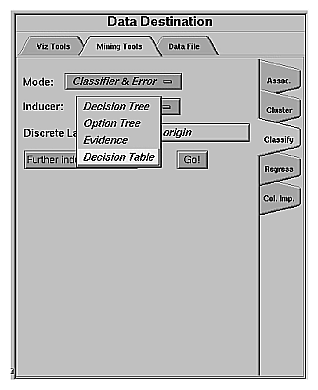
From the tabs at the right, select Classify. Ensure that the inducer you select is Decision Table. Your selections in the Mode and Inducer menus determine the options available in the Further Inducer Options menu. After you have made your selections in these menus, click Go! to run the inducer, which, in turn, creates the classifier. Or you can simply click Suggest and then Go!
The Discrete Labels menu provides a list of available discrete labels selected from the dataset you chose. Discrete attributes (binned values, character string values, or a few integers) have a limited number of values. You should select a label attribute with few values—two or three (see “Training Set” in Chapter 10). If there are no discrete attributes, the menu shows No Discrete Label, and the Go! button is disabled. You then must create a discrete attribute by binning or adding a new column, using the Tool Manager's Data Transformations panel.
The generated classifier is named with the prefix of the session filename (as determined in Tool Manager) and the suffix -dtable.class. By default, all classifiers are stored on the server in the file_cache directory, which defaults to mineset_files. These classifiers can be used for future classification of unlabeled records; that is, they can be used to predict the labels for unlabeled datasets (see “Applying a Model” and “Backfitting in Error Estimation” in Chapter 10).
You can explore the relationships between attributes in data by mapping columns to X and Y axes. Select a column name in the Current Columns panel of the Data Transformations pane of Tool Manager window, then select an item in the X-axis or Y-axis windows. The first two columns mapped are shown at the top level, and subsequent mappings descend through the levels. If you map an odd number of attributes, the last level of detail shows a single column of cakes corresponding to the values of that odd attribute. If an interaction between two attributes is suspected, map one attribute to the X axis and the other to the Y axis. If you have no idea which attribute to map to which axis, simply click the Suggest and Go button.
There are two different ways to Suggest: with or without feature subset search in the further inducer options turned on:
Checkbox Off runs Column Importance to find the features. Column Importance is described further in Chapter 17, “Column Importance.”
Checkbox On begins with Column Importance, then runs through all possible orders, beginning with the order recommended by Column Importance. An error estimate is run at every stage, and each option is explored. Predictably, this can be a tedious process, and if you become impatient you can click Stop at any time. The longer the feature search continues, the more accurate the resulting classifier.
Selecting Further Inducer Options causes the Inducer Options dialog box (Figure 14-5) to appear. This dialog box consists of four panels:
The top panel indicates the choices you made in the Tool Manager's Data Destination panel.
The second pane from the top lets you set the loss matrix and the weight attribute. See “Loss Matrices” and “Weight Setting” in Chapter 10.
The bottom-left panel lets you specify further Inducer Options.
The bottom-right panel lets you specify the Error Estimation Options (unless the mode you chose in the Data Destination panel was Classifier Only, in which case this area is empty). The options shown in this panel depend on the type of Error Estimation you chose (see “Applying Models, Testing Models, and Fitting New Data” in Chapter 10).
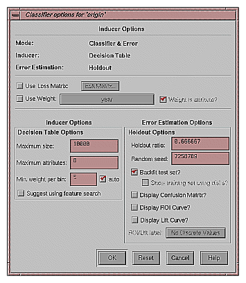
To fine-tune the Decision Table induction algorithm, you can change the following Decision Table inducer options (see Figure 14-5).
Maximum size
This is particularly useful when you have a large dataset. By default, there is a limit of 10000 nodes (these nodes correspond exactly to the cakes in the visualization). Limit the size by clicking the checkbox and typing a number for the limit. Limiting the number speeds up induction and limits the storage required. Although restricting the size decreases the run time, it might increase the error rate.
Maximum Attributes
This option determines how many different columns you allow to participate in the Decision Table when searching. Limiting the attributes simplifies the result and speeds its arrival. This limit affects only columns added by the Suggest mode. Columns added manually are not subject to the limit.
Minimum Weight per Bin
The Decision Table inducer discretizes all continuous attributes. This option lets you define the minimum number of instances per bin. The automatic setting calculates this number based on the dataset size: the larger the dataset, the larger the bin size. If your dataset is very large, you might obtain more discrete ranges than you want. To reduce the number of bins, raise this value.
If you started the Decision Table Visualizer without specifying a configuration file, the main screen shows the copyright notice for the Decision Table Visualizer. Only the File and Help pulldown menus are available. To view all menus and controls in the main window, open a configuration file. Use File > Open to see a list of configuration files.
When a valid configuration file is specified, the two panes in the main screen display graphics. For example, specifying /usr/lib/mineset/dtableviz/examples/adult.dtableviz results in the output displayed in Figure 14-6.
In the Main Window pane on the left is shown the Decision Table. The elements in this Decision Table may be further subdivided into smaller and smaller cake charts (see Figure 14-6). Each chart shows the same information as a pie chart, but with rectangular slices, rather than wedges.
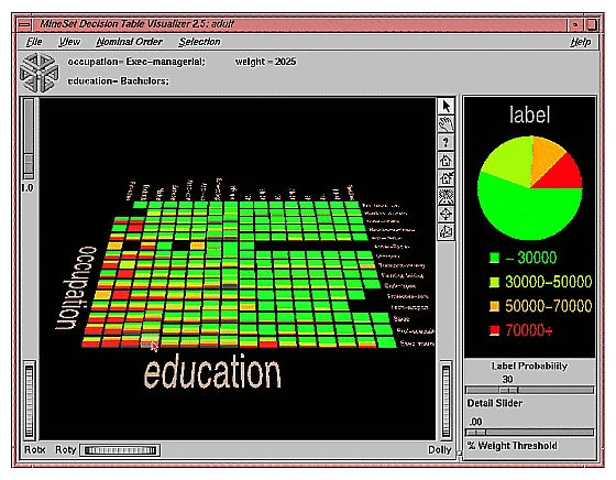
In the Label Probability Pane on the right, a list of all class labels appears under a large pie chart of the prior probability distribution. The color of the slices corresponds to the color associated with each class label; the size of the slices shows the proportion of data with each class label.
If you pick an object (place the cursor over it without clicking), you can see the values of the two attributes at that level of detail. The weight of records represented is proportional to the height of the cake. Picking a base (the gray block under the cake) shows the values for the two attributes for the cake one level higher in the hierarchy, together with the weight of records.
To see the values that define a particular chart, start by picking the base at the coarsest level of detail, and continue through the next most detailed base until you reach the base immediately below the chart of interest. The relevant value pair is then displayed at the top for each level of detail.
At each level of detail the attribute names are shown to the left and bottom of the array of charts; their values are shown to the right and top, respectively. If there is an odd total number of attributes, the lowest level shows only one attribute.
Both of the Decision Table Visualizer's window panes have two modes of viewing: grasp and select. Methods of viewing are the same as those for the Evidence Visualizer, see “Viewing Modes” in Chapter 13, and “Viewing Modes in the Main Window” in Chapter 13.
In select mode, the cursor appears as an arrow. You can then select one of the class labels by clicking the button to the left of it. Once a class label is selected, a white box appears around the button next to the label (see Figure 14-6). The size of that slice (the probability of predicting that label value) appears as text at the top of the display. To deselect a class label, click on it again. When you move the mouse over the button next to a class label in pick mode, the size of that slice (in percentage terms) appears in the top display.
If you select one of the classes in the Label Probability pane (on the right), and then select a cake chart on the left, you see probabilities and confidence intervals for that class shown in the top display, together with attribute values and weight. To select multiple charts on the left, hold down the Shift key while clicking the left mouse button.
For example, choose the /usr/lib/MineSet/dtableviz/examples/adult.dtableviz dataset. Select “class 70,000+” on right, then select a cake chart. The display at the top shows something like:
marital-status= Husband; weight = 484 occupation= Exec-Manag; Prob(70000+) = 15%[12%, 18%] |
The numbers in brackets, [12%, 18%], indicate a 95% confidence interval. That is, we are 95% confident that the actual percentage of likelihood that a husband executive manager earns over 70,000 is between 12% and 18%, assuming our dataset is a true random sample of the desired population.
Select an object using the left mouse button. Select multiple objects using Shift-select, in the same way you do for other tools. For example, you can select a number of cakes at different levels of detail in the scene as shown in Figure 14-7. On the right the distribution for the classes shows just the records described by the multiple selections.
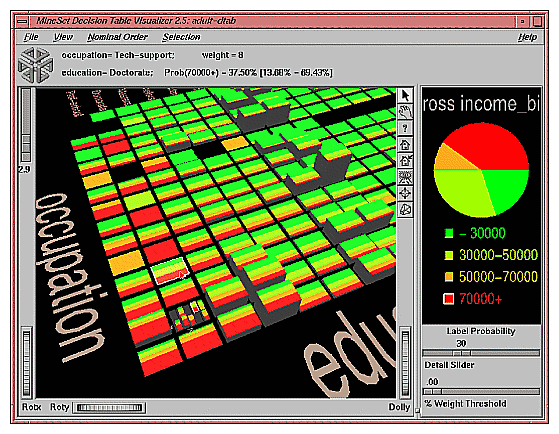
Drill down and drill up operate the same as in mapviz. (See“Drilling Down and Drilling up” in Chapter 6.) Drill down by clicking the right mouse button on one of the cakes. This replaces the one cake with smaller cakes which show the data broken down by the pair of attributes for the next level down. If the cursor is positioned on the background, clicking the right mouse drills down or up globally on all cakes. If the cursor is positioned on a gray base, clicking the right mouse button drills down on all cakes on that base. To drill up, click the middle mouse button when over a cake, a gray base, or the background.
The external controls for the visualizer associated with the Decision Table classifier are the same as those for the Map Visualizer. For a description of these controls, see “External Controls” in Chapter 5.
The Decision Table Visualizer contains three sliders: Height Scale, Detail Slider, and Percent Weight Threshold. The function of these sliders is the same as for the Evidence Visualizer. See “Sliders” in Chapter 13 for an explanation.
In using the Percent Weight Threshold Slider, the rectangular slices atop each cake show the distribution of the classes for the records represented by that cake. The height corresponds to the weight of the training set records that have reached this node (this is the number of records if weight was not set). In general, the higher the weight, the more reliable the class distribution the cake.
Four pulldown menus let you access additional Decision Table Visualizer functions: File, View, Selection, and Help. If you start the Decision Table Visualizer without specifying a configuration file, only the File and the Help menus are available.
The File menu lets you open a new configuration file, save under a new name, print an image of the current display, start the Tool Manager, reopen the current configuration file, or exit the Decision Table Visualizer.
The View menu lets you control certain aspects of what is shown in the Main Window (Figure 14-8).
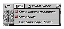
This menu contains three options:
Show Window Decoration lets you hide or show the external controls around the main window.
Show Nulls toggles the display of null values. Null values, if present, are shown as the first value, offset slightly from other non-Null values.
Use Landscape Viewer (or Use Examiner Viewer) switches to an alternative mode of 3D navigation. To understand navigation using the Landscape viewer see “Navigating With the Middle Mouse Button” in Chapter 5. Note that since the middle mouse button is used for navigation in the Landscape viewer, to drill-up you must click the middle mouse button while holding down the Ctrl key.
The Nominal Order menu lets you control how values for nominal attributes are ordered (Figure 14-9).
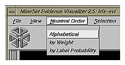
The three choices are:
Alphabetical implies attributes with nominal values are sorted from left to right (or bottom to top) alphabetically.
Weight sorts values from left to right, with those having the largest weight of records appearing toward the left.
Label Probability (the default) sorts the values of nominal attributes by the size of the slices corresponding to one of the classes. If the label is a binned attribute, the highest bin is used by default. If the label is nominal, then whatever class has the largest slice in the prior probability pie is used by default. If a particular class is selected, and then sort by label probability is requested, the selected class is used for determining the ordering. In all cases, if there is a NULL value, it remains the first value.
The Selection menu allows drill-through to the underlying data (Figure 14-10). To do a drill-through first select some combination of values and/or a class, then chose one of the two methods of drilling-through to the underlying records.
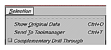
There are three menu items:
Show Original Data causes the records corresponding to the selected item to be displayed in a record viewer.
Send to Tool Manager causes a filter operation to be inserted at the beginning of the Tool Manager history. The actual expression used to do the drill-through is determined by
the cakes selected in the Main Window, and
the class (optionally) selected on the right.
Selected cakes are ORed together and then ANDed with the selected class, if present, to form a drill-through expression to do the filtering in Tool Manager. If nothing is selected, a warning message appears.
For example, for figure 14-10, the filter expression corresponding to the selections is:
(`gross income`>70000.0) &&
   ((`occupation`==”Tech-support”)&&(`education`==”Doctorate”)) ||
   (
     (`occupation`==”Prof-specialty”)&&(`education`==”Doctorate”)&&
     (`sex`==”Female”)&&(`race`==”Amer-Indian-Eskimo”)
   )
The three major terms in this expression correspond to the selected class on the right, the selected cake at the top level, and the selected cake at the second level, respectively.
Complementary Drill Through uses the complement of the expression defined by the selected objects for drill-through.
The Help menu provides access to six help functions. These are the same for all MineSet tools (see“The Help Menu” in Chapter 6.)
The following examples show cases in which the Decision Table can be useful. Each of these examples is associated with a sample data file provided with MineSet. By running the Decision Table inducer (with suggest using feature search turned on in the further inducer options), you can generate the -dtab.dtableviz and -dtab.dtableviz.data files described below.
| Note: The data (.data) and accompanying schema (.schema) files are located in /usr/lib/MineSet/data on the client workstation. The classifier visualization files, which have a -dtab.dtableviz extension, reside on the client workstation in /usr/lib/MineSet/dtableviz/examples. |
Churn is when a customer leaves one company for another. This example shows what causes customer churn for a telephone company. The data used to generate this example is in /usr/lib/MineSet/data/churn.schema.
The file /usr/lib/MineSet/dtableviz/examples/churn-dtab.dtableviz shows the structure of the classifier induced using the attribute churned as the label. The error rate for this classifier is 5.5%. Of the records, 14.3% represent customers who churned. The two attributes selected for the first level of detail were number_of_customer_service_calls and total_day_charge. By looking at the distribution over these two attributes, you can see that churn increases as total day charge increases, except when the total day charge is < 29.75, then the churn is high if the number of service calls is > 3. About 3/4 of the records have total day charge less than 38 and 3 or fewer customer service calls.
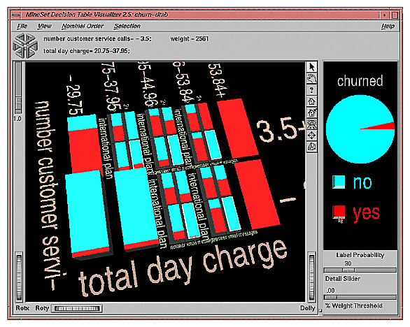
Begin to drill down on regions where its not clear when a customer churns. Figure 14-11 shows drilling down on all cakes in which there was not a clear majority class. The next attributes considered are international_plan and number_of_vmail_messages. Among those with heavy day charge, it appears clear that having the international plan and having few vmail messages correlates well with customer churn. Selecting the lower right cake in each of the drill-down regions, and then brushing with the mouse across the box next to “churned=yes” in the probability pane on the right, shows that only 3.4 percent of the customers in the selected regions churned.
Now drill down further on the cake in the upper left of each previous drill-down region. Doing so shows a very similar distribution for each. The consistent pattern shows: high total_evening_charge and high total_international_charge correlate well with churn. You can even drill-down another level to see the effect of total_international_calls, but doing so leaves so few records from which to draw conclusions, you could not be confident of the distributions seen. If you are interested in how total_international_calls affects churn and how it correlates with other variables, return to the Tool Manager and explicitly map total_international_calls to a higher level in the hierarchy, and rerun the decision table.
Although “state” is fairly well correlated with churn, it was not selected because the algorithm has a built-in preference for variables with few values. This prevents the algorithm from selecting attributes like social security number which uniquely identify each record, thus yielding high training set accuracy, but are not useful for classifying future unlabeled data.
The cars dataset contains information about different models of cars from the 1970s and early 1980s. Attributes include weight, acceleration, and miles per gallon (mpg). The file /usr/lib/MineSet/dtableviz/examples/cars-dtab.dtableviz shows the structure of the Decision Table Classifier induced for this dataset. This file was generated by running the inducer on /usr/lib/MineSet/data/cars.schema with the label set to “origin” (Japan, U.S., Europe).
Since the brand attribute uniquely determines the origin, the structure of the classifier is extremely simple. The only two attributes shown are brand and cylinders. It is interesting to see which brands tend toward high or low cylinder types. For example, there are 21 different models of Mazda, and 18 models of Honda, but they all have 5 or fewer cylinders. Conversely, Cadillac only makes cars with six or more cylinders.
This example could probably be made more interesting by first removing the brand attribute. Another useful transformation might be to convert cylinders to string so each unique cylinder value is shown, rather than a bin. Alternatively, one can create additional levels of detail beyond brand and cylinder, by mapping them explicitly.
The adult dataset contains information about working adults. This dataset was extracted from the U.S. Census Bureau. It contains data about people older than 16, with a gross income of more than $100 per year who work at least one hour a week. You might want to know how to characterize males and females.
The file /usr/lib/MineSet/dtableviz/examples/adult-sex-dtab.dtableviz shows the structure of the Decision Table Classifier induced for this problem. This file was generated by running the inducer on /usr/lib/MineSet/data/adult.schema, with the label set to sex, after removing the relationship column (which would have made the classifier trivial). To make it easier to see the distribution of records for each combination of values, you can scale the cake heights using the scale slider on the left.
In the Decision Table Visualizer, the Label Probability Pane shows that the prior probability of working males is higher than that of females. The Evidence Visualizer showed us that marital_status and occupation are very important attributes for determining gender, however, it did not show us the dependencies between these two attributes. The top level shows several interactions. For example, most people with occupation craft repair are married civilian spouses (more specifically 98.6 of them are husbands), while most people with occupation “Other-service” have “Never-married” (48% male).
At first it may seem odd that most of the people with “marital_status = Married-civilian-spouse” are male, but once you consider that this data was probably gathered from tax returns, it seems reasonable that the wives of these males are not working but filing jointly with their husbands.
The divorce rate seems highest among those with ”occupation = Admin-clerical”. Those in “Other-service” also have high divorce rates, but they seem to prefer separation, as the number who are separated is even greater than that of “Admin-clerical”.
Suppose you wanted to find out the probability of being female given that a person is “widowed” and has “occupation=Adm-clerical”. In the evidence visualizer one can get an approximate answer (94.7% female) for this by clicking on these two attribute values. Here we can get the exact answer by clicking the left mouse on the cake at the intersection of these two values (95.2% female).
Drill down to the lowest level on the cake for “Married-civilian-spouse” and “Occupation= Unknown.” There is a pattern evident here more than any of the other combinations of occupation and marital status. For this cake, the younger members tend to be women, and the older members tend to be men.
For a dataset of working adults, you might want to find out what factors affect salary. First bin gross_income into two bins, those that earn less that 50,000, and those earning over 50,000. You can run a MineSet classifier to help determine what factors influence salary. The file /usr/lib/MineSet/dtableviz/examples/adult-salary-dtab.dtableviz shows the Decision Table classifier induced for this problem. This file was generated by running the inducer on /usr/lib/MineSet/data/adult.schema with gross_income divided into five bins using user-specified thresholds.
Since the label is numeric, a continuous spectrum is used to assign colors to each class. Also the classes in the probability pane on the right are not sorted by slice size because they have a numeric order. Red is assigned to the highest bin (50,000+).
The two attributes chosen at the top of the hierarchy are relationship and education_num. The attribute education_num is not particularly useful because it is simply an enumeration of the different educations possible, not years of education, as you might think. However there is an approximate correlation. Replace this column with education if you prefer to see the actual string values. If you simply remove the column, education_num, and rerun using feature search, the algorithm may not pick education at the top of the hierarchy because it has so many values.
The order of the attributes in this model were selected automatically to increase accuracy. Often a model in which domain knowledge is used to perform the mappings can give a more useful visualization. Such a model is provided in /usr/lib/MineSet/dtableviz/examples/adult-salary3-dtab.dtableviz, and shown in Figure 14-12. Here the salary has first been binned into 3 ranges (20000, and 60000 are the thresholds). The attributes mapped at level one are: relationship and sex; level two has education and occupation; and level 3 has hrswk (hours worked per week) and age.
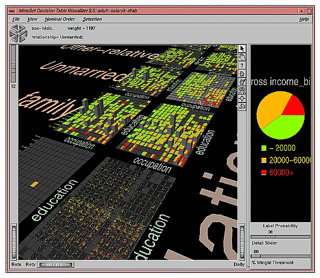
At the top level we know “relationship” and “sex” have a strong correlation. Of course we expect all husbands to be male, and wives to be female, but we can see right away this is not the case. By brushing on the cake for male wives we see that there are 3 of them and all their salaries fall in the 20,000-60,000 range. Drilling down on these cakes reveals more information about these anomalous records. You may wish to select these cakes (using the left mouse button) and drill through to the underlying data so you can find the values of all the other fields.
Click the right mouse on the background; this will drill down globally to the next level. Every cake is now replaced with a matrix for every combination of education and occupation. The ordering is the same for every matrix, and overall the ordering is by correlation with income. If you choose Nominal Order > by Weight from the pulldown menu the overall ordering will be by record weights. The most popular occupations and education levels will appear in the lower left corner of each matrix. High school grads is the most prevalent education level, and Professional-specialty is the most common occupation, but there are not many high school graduates whose occupation is professional specialty.
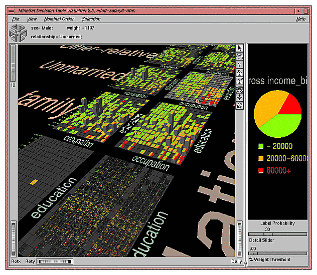
Returning to ordering of nominals by income, you can see distinct distributions for each combination of sex and relationship. There is not much difference between males and females whose relationship is not-in-family. The difference between unmarried males and females, however, is very pronounced. (See Figure 14-13). There is a very distinctive cluster of red cakes in the lower left of male matrix that does not exist in the female matrix. By scaling up the heights somewhat, you will notice that the female matrix has obvious spikes at occupation = “admin clerical” and “other service”. No such spikes are visible in the corresponding male matrix.
Click with the right mouse button on the most populous cake (male husbands). This operation may take a minute to perform because the visualizer needs to construct all the geometry for the next level for this cake. The geometry is constructed on demand because the time needed to create it all at the beginning would be excessive, and wasteful since the user rarely explorers most of the high detail regions. If you click on the background by mistake you may be forced to wait a very long time if the amount of detail at the next level is very long - as it is in this case. Figure 14-12 shows the result of drilling down on the male husband base.
Consider the many age by hrswk distributions that are displayed for every combination of occupation and education. The first surprising fact is that, in spite of the many hundreds of cakes shown, there is a single spike at that accounts for 2.5% of all husbands! (SeeFigure 14-13) If you had to pick characteristics for a typical husband, it would be reasonable to say he is a HS-grad doing craft-repair, aged between 41 and 59 and working between 38 and 41 hours a week.
Compare the salary distributions for husbands who are HS-grads in sales with those who are HS-grads and executive managers. Although the distribution of age and hours worked is similar, the probability of being in the income greater than 60,000 class is 34% for this group of managers, compared with 27% for the salesmen. To see these probabilities shown at the top, first click the button next to the 60000+ income class in the label probability pane on the right, then brush over cakes on the left.
In this dataset, each record describes four characteristics of iris flowers: petal width, petal length, sepal width, and sepal length. Each iris was further classified into the types iris-setosa, iris-versicolor, or iris-virginica. The goal is to understand what characterizes each iris type.
Before running a classifier, click the Column Importance tab in the Tool Manager's Classifiers tab; then click Suggest then Go!. You obtain a ranking of the importance of the features: petal_width, petal_length, and sepal_length. You can map these to the axes in the Scatter Visualizer, with the iris_type mapped to the color and see the clusters.
The file /usr/lib/MineSet/dtableviz/examples/iris-dtab.dtablerviz shows the structure of the Decision Table Classifier induced for this problem. This file was generated by running the inducer on /usr/lib/MineSet/data/iris.schema.
In the Decision Table Visualizer, we can see that petal_width is an excellent discriminatory attribute. When you add sepal_width you see that all instances of “iris_versicolor” appear in the sepal width<3.05 bin for those records which have petal width= 0.75-1.65.
Drill down on the three cakes which are not 100% pure. The top two cakes each contain a single instance of iris-versicolor which prevent them from being pure. For the sepal_width<3.05 cake it is very difficult to isolate the anomalous “iris-versicolor”. For the sepal_width>3.05 cake, however, the iris_versicolor is isolated by using petal_length.
The file /usr/lib/MineSet/dtableviz/examples/mushroom-dtab.dtableviz shows the structure of the Decision Table Classifier induced for this problem. This file was generated by running the inducer on /usr/lib/MineSet/data/mushroom.schema.
The goal is to understand which mushrooms are edible and which ones are poisonous, given this dataset. There are over 8000 records in this set; thus, running this inducer might take several minutes. Note that under the default mode of the one-third holdout for accuracy estimation, a third of the records are kept for testing.
Each mushroom has many characteristics, including cap-color, bruises, and odor. In the Decision Table Visualizer odor and stalk-shape appear at the top level. Note that odor alone does an excellent job of discriminating edibility. Only when the “odor=none” and the stalk-shape is “enlarging” is there any ambiguity. So naturally we drill down on this lone cake. Now we see just the records with these 2 values broken down by their values for bruises and gill-size. Notice the interaction between gill-size and bruises. This interaction is nearly impossible to discern using any other classifier.
Since all the attributes in this dataset are nominal, all the values are sorted from by how well they predict edibility. You might want to order the values alphabetically or by weight (prevalence). To do this, select the appropriate method from the nominal order menu. If you considered either bruises or gill_size alone you would not be able to predict large classes of completely edible or poisonous mushrooms, but by considering them together, we see that if there are no bruises and the gill-size is broad, then all 814 mushrooms of this type are edible. Conversely, if there are bruises and the gill-size is narrow, then all 11 mushrooms of this type are poisonous. To disambiguate the other two cases we would have to drill down further.
There is actually a mapping which can completely discriminate among all the examples in our training set using only 2 levels. The attributes for these to levels are: odor, spore_print_color and habitat, population. The reason the automatic suggestion did not use this mapping was because of the preference for attributes with fewer numbers of values.
In the Decision Table Visualizer, move the % Weight Threshold slider to the right. Eventually the “odor=musty” will be deleted from the scene. The reason for this is that there are fewer than 1% of the records with odor=musty.
This dataset consists of voting records. The goal is to identify the party a congressperson belongs to given data about key votes. The dataset includes votes for each member of the U.S. House of Representatives on the 16 key votes identified by the Congressional Quarterly Almanac (CQA). The CQA lists nine types of votes: voted for, paired for, and announced for (these three are simplified to yes), voted against, paired against, and announced against (these three are simplified to no), voted present, voted present to avoid conflict of interest, and did not vote or otherwise make a position known (these three are simplified to an unknown disposition).
Before running a classifier, look at the 16 votes to see if you can perceive which features are important. Then run the Decision Table Visualizer. For this dataset, you may wish to order the values alphabetically, so that all “yes” votes appear in the upper right and “no” votes appear in the lower left.
A the top level we see synfuels_corporation_cutback and physician_fee_freeze. There is a fascinating relationship between these variable that would be next to impossible point out with any other model. Everyone (but 3) who voted against physicians was a democrat. Nearly every democrat that voted against physicians also voted against the synfuels cutback (only 3 of 206 did not fit this pattern). Surprisingly, nearly every (all but 5) republican that voted for the physicians, voted against the synfuels cutback.This odd relationship between these very different issues hints that these bills may have been connected in ways that would require further investigation.
Most of the cakes at the top level are nearly pure except for the middle one (which contains only 6 records) and the one where the representatives voted yes on both issues. Here we can drill-down another level to discriminate the political affiliation of the representatives in this group. Doing so uses “anti-satellite test ban” and “adoption of the budget resolution” to further discriminate among the 55 representatives in this group.
The file /usr/lib/MineSet/dtableviz/examples/vote-dtab.dtableviz shows the structure of the Decision Table Classifier induced for this problem. This file was generated by running the inducer on /usr/lib/MineSet/data/vote.schema.
The breast cancer dataset contains information about females undergoing breast cancer diagnosis. Each record represents a patient with attributes such as cell size, clump thickness, and marginal adhesion. The final attribute is whether the diagnosis is malignant or benign. The file /usr/lib/MineSet/dtableviz/examples/breast-dtab.dtableviz shows the structure of the Decision Table Classifier induced for this problem. This file was generated by running the inducer on /usr/lib/MineSet/data/breast.schema.
In the Decision Table Visualizer, mitosis and uniformity of cell shape are shown at the top of the hierarchy. If both attributes have low values at the same time the given sample is 99.2% likely to be benign. On the other hand, 100% of the training records that had high values for both, were malignant.
Drill-down on the four cakes that are not so pure. Now marginal adhesion and bare-nuclei are used to discriminate. There are far fewer records in each cake at this level; as a result there is more noise, and trends are more difficult to detect. High values for both marginal-adhesion and bare-nuclei seem to contribute to malignancy, but its uncertain. Note that the first value of bare-nuclei is null. The distributions for these null cakes are more suspect than others so you may wish to hide them by unchecking View > Show Nulls.
If you drill down globally two more levels, you can note a few interesting features. The cakes get very small, and there are large regions of the multi-dimensional space which are empty. There are a few tiny regions where many records are clustered. There is one huge spike (100% benign) where all the values are low This spike alone accounts for about 20% of the data.
The hypothyroidism dataset is similar to the one for breast cancer. The file /usr/lib/MineSet/dtableviz/examples/hypothyroid-dtab.dtableviz shows the structure of the Decision Table Classifier induced for this problem. This file was generated by running the inducer on /usr/lib/MineSet/data/hypothyroid.schema.
There are 3,163 records in this dataset and most of them do not have hypothyroidism (95.45%). While this means that one can predict “negative” and be correct with high probability, it's those people that have hypothyroidism that we are most worried about. In technical terms, the false negatives are very important.
This is a case where you might want to adjust the loss matrix to skew the posterior probability toward predicting hypothyroidism in order to avoid false negatives. There might be a high cost associated with predicting that someone is healthy when they actually have the disease; predicting them sick when they are actually healthy means they take a more accurate test or a treatment they do not need.
Using the Decision Table Visualizer on this dataset, we note:
This dataset is a diagnosis problem for diabetes using statistics gathered from an Indian tribe in Phoenix Arizona. The task is to determine whether a patient has diabetes, given some medical attributes, such as blood pressure, body mass, glucose level, and age.
The file /usr/lib/MineSet/dtableviz/examples/pima-dtab.dtableviz shows the structure of the Decision Table Classifier induced for this problem. This file was generated by running the inducer on /usr/lib/MineSet/data/pima.schema.
Using the Decision Table Visualizer we note:
The file /usr/lib/MineSet/dtableviz/examples/dna-dtab.dtableviz shows the structure of the Decision Table Classifier induced for this problem. This file was generated by running the inducer on /usr/lib/MineSet/data/dna.schema.
There are 3,186 records in this DNA dataset. The domain is drawn from the field of molecular biology. Splice junctions are points on a DNA sequence at which “superfluous” DNA is removed during protein creation. The task is to recognize exon/intron boundaries, referred to as EI sites; intron/exon boundaries, referred to as IE sites; or neither. The IE borders are referred to as “acceptors” and the EI borders are “donors.” The records were originally taken from GenBank 64.1 (genbank.bio.net). The attributes provide a window of 60 nucleotides. The classification is the middle point of the window, thus providing 30 nucleotides at each side of the junction.
From the Decision Table Visualizer, you can see a surprising pattern not nearly as evident in any other classifier model. At the top level there is a pronounced interaction between left_01 and right_02. Exon/intron is only present if right_02 = T. Intron/extron is only present if left_01=G. For other values of left_01 and right_01 there are very few splice junctions.
Drill down globally to the next level (left_02 and right_01). Among the records where right_02 = T and left_01 = G we see a pattern which is consistent with the patterns along each edge.