The Scatter and Splat Visualizers look and feel similar, with the distinction that the Scatter Visualizer shows data as a series of individual entities, while the Splat Visualizer shows aggregates of data points appearing as clouds of varying opacity and color in a three-dimensional landscape. To learn more about the finer points of each, see the MineSet Enterprise Edition Reference Guide . This chapter covers the following topics:
Sample configuration and data files are provided to demonstrate the Scatter and Splat Visualizer's features and capabilities. These files are in the \examples directory under MineSet, in the location where MineSet was initially installed.
This section explains the use of the Scatter and Splat Visualizers and some of the reasons for choosing one over the other.
The Scatter Visualizer's individual datapoints correspond to rows in the data file. This visualization works well when the number of datapoints is less than 50,000, or when some processing has been performed so that the data is reduced to a small set of aggregates. The Scatter Visualizer produces scatterplots that can be animated to show relationships more clearly (Figure 4-1).

The Scatter Visualizer displays a three-dimensional landscape with columns of data mapped to entities, and to elements such as the axes, size and color. If you map one or two numeric variables to the sliders, you can animate the size, color, or position of the entities. In the example in Figure 4-1, the data represents the sales of several companies over time. If the time variable is mapped to a slider and the sales variable is mapped to size, then the entities grow or shrink as the time slider is animated. This example is MineSet\examples\company.scatterviz.
As you play back the animation path, you can watch the changing size, color, and motion of the datapoints for trends or anomalies. You can travel through the three-dimensional landscape to find an interesting point of view, or scale the values of variables for greater emphasis. To clarify the scene, you can filter the display to show only those entities meeting certain criteria.
With the Splat Visualizer you can visually analyze relationships among several variables, with some relationships seen even more clearly when you use the animation feature. The Splat Visualizer uses graphical objects, called splats, which represent aggregates of data points. The color and opacity, but not the position, of the splats can change during animation.

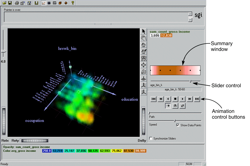
Figure 4-2 shows a Splat Visualizer view of a three-dimensional landscape with columns from the adult94 sample dataset mapped to axes, sliders, color, and opacity. It is similar to a scatterplot, except a scatterplot draws every datapoint separately, and the Splat Visualizer aggregates data points that are close together (fall in the same bin) and draws them as a single splat. The result approximates the image obtained if you rendered each individual point in a scatterplot. The resulting image can be thought of as a 3D color histogram.
From the Splat Visualizer results you can:
See global shifts and trends in the data, using the animation panel. Changing color and opacity give the illusion of actual movement (see the online version of this book for the color version of the figure).
Emphasize particular dimensions or a point of view, by flying over the three-dimensional landscape.
Enhance visibility using the scale slider (top left of the Main Window) to lower or increase splat opacity. The regions with dense data are likely to show less color variation, because the color is based on the average of many values.
Filter the display to show only those splats meeting certain criteria. You can filter on the columns corresponding to axes, sliders, weight, and color.
Pick out textual information about individual splats in the volume.
Define a selected region with a box selector for drilling through to the original data or for sending to the Tool Manager.
For example, the left axis in Figure 4-2 shows each occupation sorted by average income along an axis. The occupation executive-managerial, listed at the end of the axis, has the highest average income, and provides a natural progression for the values. On the other hand, the ordering for the values of education (the right axis in Figure 4-2) is generally from low to high; but in a few cases, there are anomalies in the order. This unexpected ordering might be interesting because it points out places where the data does not agree with expectations.
Considerable planning and knowledge of your data go into data transformation decisions. The columns that make up the dataset often require manipulation or transforming in some way before they can be mapped to an axis, color, or slider. You may often need to go back and transform the data differently after viewing a result.
In MineSet most of these transformations take place using the Data Transformations pane in the Tool Manager, (see “Transforming Data with the Tool Manager”). Some transformations you might want to consider are:
Adding columns, usually applying a mathematical formula to existing data.
Removing columns that are not pertinent, are redundant, or contain obvious, uninteresting predictors. This is useful to reduce the size of the dataset and speed processing.
Filtering the data. For example, you may want to use only records containing a certain range of values for a particular attribute.
Changing a column's name or type.
Binning data—breaking up a continuous range of data into discrete segments.
For the Splat Visualizer only, aggregating data—if you do not aggregate data manually with the Tool Manager, it will be done automatically in the tool. However, it is much better to do it in the Tool Manager so that the processing is done on the server, and the aggregated dataset is not brought to the client system (see “Techniques of Processing for the Splat Visualizer”).
For the Scatter Visualizer only, aggregating data—aggregation can be used to reduce a large dataset to a small set of aggregates. Each row in the table after aggregation will correspond to an entity in the scatterplot. Array columns for animation may be created during the aggregation step.
The interactivity of the visualization in the Splat Visualizer is independent of the number of data points represented; it depends only on the number of bins in the axis dimensions. If your dataset is very large, aggregate explicitly in the Tool Manager. This lets the server perform the processing using a streaming operation, rather than having the entire dataset sent to the client and aggregating there (see “Techniques of Processing for the Splat Visualizer”).
Table 4-1 lists the column types that you can map to visual entities in the Splat Visualizer.
Table 4-1. Allowable Column Types for Mappings in the Splat Visualizer
Entity | Column Type | Requirements |
|---|---|---|
Axis | Numeric | Will be binned, either manually or automatically by Tool Manager. |
| Binned | Can be mapped directly. |
| String | Can be mapped directly. |
Color | Numeric | Can be mapped directly. |
Opacity | Numeric | Defaults to record counts if nothing is mapped. |
Slider | Numeric | Must be binned, either manually or automatically by Tool Manager. |
Summary | Numeric | Can be mapped directly. |
Table 4-2 lists the column types that you can map to visual entities in the Scatter Visualizer.
Table 4-2. Allowable Column Types for Mappings in the Scatter Visualizer
Entity | Column Type | Requirements |
|---|---|---|
Axis | Any, including array | Can be mapped directly. |
Entity - size | Numeric or array | Can be mapped directly. |
Entity - color | Any, including array | Can be mapped directly. |
Entity - label | Any, including array | Can be mapped directly. |
Sliders | Binned | Can be mapped implicitly during aggregation. |
Summary | Numeric | Can be mapped implicitly during aggregation. |
If a string column is mapped to an axis, binning is defined to be the distinct values of that column. Those values are ordered so they correlate with the attribute mapped to color (if nothing is mapped to color, then they correlate to opacity). Looking at the color changes along a string-valued axis lets you see how well that column correlates with the column mapped to color.
You can avoid processing on the client by aggregating in the Tool Manager. This means most of the work is done on the server. The server is typically a more powerful machine than the client, and performs a streaming operation so that the full dataset does not need to be loaded into memory. Furthermore, aggregating in the Tool Manager avoids having to transfer a large dataset to the client. This can be done by:
Use Tool Manager to bin the numeric columns to be used for axes and sliders.
Aggregating the column to be mapped to color by count and average, while grouping by the axis and slider columns.
Mapping the resulting count aggregation to opacity.
Mapping the resulting average aggregation to color.
Using the adult94 dataset (provided with the distribution) as an example, the steps of the process shown above are listed below.
Bin age and hours_per_week. You will be using the former on a slider, which needs binned values, and the latter as an example of binned numerical values on an axis.
Aggregate gross_income using Count and Average. Keep education, occupation, age_bin and hours_per_week_bin in the Group-by Columns pane while removing all the other columns. This gives a visualization showing how gross_income varies according to the three other criteria.
Map education, occupation, and hours_per_week_bin to the axes.
Map avg_gross_income to color, count_gross_income to opacity, and age_bin to a slider. This mapping allows color and opacity to show variations in income (average and count) according to age, depending on the criteria mapped to the axes.
When you invoke the tool, note that all the processing is done on the server, and that the datafile, adult94.splatviz.data, contains rows that are aggregates of rows in the original data. This produces the same visualization as seen in Figure 4-2.
The simplest way to start the Scatter or Splat Visualizer is from the Tool Manager:
Bring up Tool Manager, and choose a server and data source. This is explained in “Starting MineSet”. In the first example, the churn dataset is used.
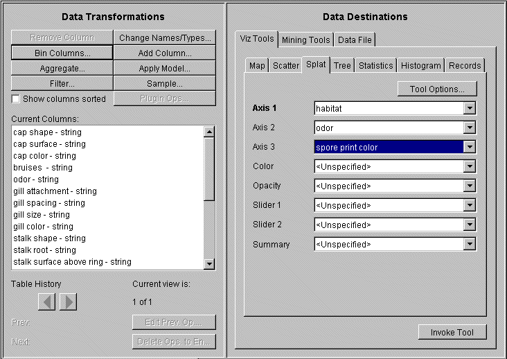
In the Data Destinations pane of Tool Manager, choose the Viz Tools tab; from the lower row of tabs, choose Scatter Visualizer or Splat Visualizer, (Figure 4-3).

If you have the Viz Tool icon on your desktop, you can drag an existing MineSet visualization file icon and drop it on the Viz Tool icon. The visualization will then display in the Viz window.
You can also drag a visualization file into an open Viz Tool window. If you have your preferences set to Single Document mode, you must drop the file icon onto the title bar of the Viz window. If you have your preferences set to Multiple Document mode, you can drop the file icon anywhere within the window, and it will display.
In the Data Transformations pane of Tool Manager, map Current Columns to Visual Elements by selecting from the scrolling menus. For example, for the Scatter Visualizer, if you are using the churn dataset, for Axis 1 choose number of vmail message, Axis 2 choose total day charge, and Axis 3 total eve charge
Table 4-3. Mapping Visual Elements in the Scatter Visualizer
To undo a mapping, select the element, then select <unspecified> from the list of available columns. If you are using your own dataset, consider running the Column Importance tool to help determine possible mappings (see “Finding Important Columns.”)
Click Invoke Tool in the lower right of the Data Destination pane.
Like the Scatter Visualizer, the Splat Visualizer requires that columns be linked to visual elements before being launched. Some columns may require manipulation before they fit the visual elements criteria. This example uses the mushroom dataset from the provided examples to show how to deal with manipulating columns to fulfill mapping requirements. Begin from the Tool Manager as described in “Starting the Scatter and Splat Visualizers”, choosing the mushroom dataset and selecting the Splat Visualizer.
In the Data Transformations pane of Tool Manager, map items in Current Columns to items in Visual Elements by choosing from the scrolling menus.
For this example, for Axis 1 choose habitat, for Axis 2 odor, for Axis 3 spore print color.
Table 4-4 identifies the mapping effects of the Splat Visualizer Visual Elements.
Table 4-4. Mapping Visual Elements in the Splat Visualizer
In mapping columns, if you need a numeric column, you can turn a two-valued string column into a newly created numeric column using an expression such as: ('stringCol'==”value1”)? 1:0. See “Removing and Adding Columns” in Chapter 3 for more details.
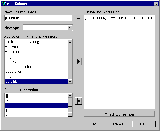
The current example adds an integer column to represent the probability of edibility. This step is included in order to demonstrate how to add a new column, but it is actually not necessary. Color can be mapped to a string value directly.
In the Tool Manager Data Transformations pane, click the Add Column button. In the resulting dialog box, create p_edible as a new column name of type int. The expression is (`edibility' == “edible”)?100:0. Notice the disposition of the quotes.
Map p_edible to color to define whether a mushroom is edible or not according to the color displayed.
To undo a mapping, choose <Unspecified> from the pulldown menu.
Click Invoke Tool in the lower right of Tool Manager's Data Destination pane. The resulting visualization provides interesting insights into mushrooms.
The Splat Visualizer also allows you to map a categorical column to the entity color. For example, in the cars sample database, the origin column contains a string type with the possible values “Japan,” “USA,” and “Europe.” The Splat Visualizer displays this information using categorical splats. If you map the column origin to color, each possible value of origin is assigned a unique color. The Splat Visualizer then breaks down each individual splat to show the different origins contained in that splat.
Figure 4-6 shows categorical splats for the cars database. This visualization was generated by mapping mpg to Axis 1, weightlbs to Axis 2, time-to-60 to Axis 3, and origin to Color.
When a categorical column is mapped to Color in the Splat Visualizer, the menu and toolbar are slightly different. The normal options under the shape menu are replaced with five different settings for categorical splats. Also, toolbar buttons are provided for the different modes of categorical splats.
The five shape options are as follows:
nominal Hex96 | Renders categorical splats using 96 transparent triangles in a hexagonal layout. |
nominal Hex384 | Renders categorical splats using 384 transparent triangles in a hexagonal layout. |
nominal Tri96 | Renders categorical splats using 96 opaque triangles in a hexagonal layout. |
nominal Tri384 | Renders categorical splats using 384 opaque triangles in a hexagonal layout. |
nominal pointcloud | Renders categorical splats using a cloud of colored points. |

As with any of the visualizers, if you start either the Scatter or Splat Visualizer without specifying a configuration file, (that is, a file with a name ending in .scatterviz or .splatviz) only the File and Help pulldown menus can be used. For the Visualizer main window to show all menus and controls, open a configuration file. Use File > Open to see a list of configuration files. These files are in the MineSet\examples directory, in the location where MineSet was initially installed.
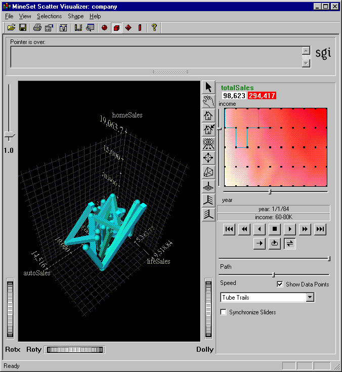
When you open a valid configuration file, the three-dimensional landscape is visible. The company-total.scatterviz is shown in Figure 4-1, showing the sales of life insurance, auto insurance, and home insurance with respect to income brackets over time.
The two modes of viewing in the Scatter and Splat Visualizers are grasp and select. To toggle between these modes, move the cursor into the main window, and press the Esc key. You can also change from one mode to the other by clicking on either the arrow or the hand on the border of the main pane of the visualizer window.
When in select mode in the Scatter Visualizer:
To show information about an entity in the Scatter Visualizer upper text field, move the mouse cursor over an object.
To select an entity, press the left mouse button over an object. To select multiple entities, hold down the Ctrl key while left-clicking the mouse button.
To clear the selection, click the black background. For full details of navigation see “Navigating in the MineSet 3D Visualizers”.

For information on specifying the Scatter and Splat Visualizers from the command line, refer to their respective entries in the MineSet Enterprise Edition Reference Guide .
In select mode in the Splat Visualizer, you can move a 3-D pick dragger through the dense cloud of points to find information about regions in the scene. This pick dragger is composed of a cylinder and a square.
To move parallel to the cylinder's axis, click the cylinder and drag the mouse cursor in the desired direction.
For movement constrained by a selected plane of the square, click the square and drag. Use the Shift key to constrain the motion along one of the two axes within the plane.
To change between parallel and constrained modes, press the Control key with the cursor over the dragger. (You need not press the mouse button.)
Alternatively, each axis has a disk that aligns with the pick dragger position. Moving the disk on an axis moves the dragger, and vice versa.
When the pick dragger is over data, the cylinder changes color to that of the splat under it, and information about that region shows at the top of the view area (Figure 4-8). If there is no data, the cylinder remains light gray, and information about its position is displayed at the top of the area to help in navigation.
When you are finished dragging and have released the mouse button, the message for the splat you are currently over is shown in the selection window at the top. This pick information is updated if the animation slider is moved. Using the mouse, you can cut and paste this selection information into other applications, such as reports or databases.
The pick dragger may be removed from the scene by unchecking Selection > Show Pick Dragger.

An explanation of the window icons can be found in “Navigating in the MineSet 3D Visualizers”. See the “Scatter Visualizer” and “Splat Visualizer” entries in MineSet Enterprise Edition Reference Guide for expanded descriptions of visualizer options, and the “Color Browser” entry for details of the changing colors.
When you suspect that a value changes according to the value of another column, you can map a column to a slider. A column can be mapped to a slider if that column is numeric (of the type int, float, double) or binned. If the column is already binned, it has _bin after the name. The column type is noted after the name of the column in the Current Columns list, for example total day calls - double. In most cases, simply mapping a column to a slider in the Tool Manager automatically creates the slider.
If the sliders are not specified implicitly during the aggregation step, the Tool Manager creates them for you through automatic binning and aggregation. These automatic operations occur after clicking Invoke Tool. Every column that is not deleted or mapped to a visual entity is used to determine the number of unique entities (in other words these will be the Group-by columns in the automatic aggregation). The current slider indices are listed in the Tool Options dialog box when you click Tool Options in the Tool Manager.
Every numeric column that is mapped to a visual element will be aggregated. You can choose the type of aggregation in the Tool Options panel. If you want to aggregate differently for different entities, you must use manual slider creation.
To guarantee the results you expect, it is preferable to explicitly bin and aggregate with Tool Manager yourself. Do this by performing an aggregation in which you aggregate columns (using average, count, or sum) which you plan to map to visual entities, group by other string or binned columns, and finally “array index” by those binned columns which you wish to become animation sliders. The result will have array columns for all the aggregated columns that are indexed by the slider variables. When the sliders are specified this way, they cannot be mapped directly to the slider elements. Refer to the “Aggregate” entry in the MineSet Enterprise Edition Reference Guide for details about aggregation.
If there is an array column in the current data table, the Scatter Visualizer will have a slider corresponding to the indices of that column. For one index, there will be a one-dimensional X slider; for two indices, both an X and Y slider are created. All array columns in the current table must have the same indices; otherwise, no slider is created. See “Creating New Columns by Aggregation” in Chapter 3, and the MineSet Enterprise Edition Reference Guide for more information on creating arrayed columns.
Animations are created using the animation control panel to the right of the main visualizer window. The animation window appears only if the sliders have been mapped. For example, company.scatterviz offers such a dataset. See the “Animation” entry in the MineSet Enterprise Edition Reference Guide . When you suspect a value changes according to a specific criterion, for instance population density changing over the years, you can map that column to a slider. A Splat Visualizer example that uses an animation slider is adultJobs.splatviz.
It is most useful to choose attributes which you feel are independent attributes for sliders or axes, and dependent attributes for axes, size and color. If there is only one slider mapped (such as adultJobs.splatviz or adult94.scatterviz), the summary window is compressed. This slider's dimension is identified by a label below it. If the dataset has no columns mapped to sliders (such as brand.scatterviz), no slider control appears.
You create an animation in the summary window portion of the animation control panel of either the Scatter or Splat Visualizer. The summary window shows in one or two dimensions an array of summary values based on an aggregation of the data appearing in the main window. There is a summary value for each black dot in the summary slider window. The summary color is assigned to high values, and white is assigned to low values (interpolating between these two colors for intermediate values). If there is no data, or only null values, for the summary variable at a particular position, then it is colored gray to indicate an unknown. The summary value is computed using the specified aggregation of all the data shown in the plot on the left of that slider position. You can turn off these black dots using the “Show data points” check box on the animation panel.
This example shows you how to create an animation, using the prepared company.scatterviz file.
From the Tool Manager menu bar choose Visual Tools and select 3D Visualizer.
From the menu, select File > Open menu.
Open the company.scatterviz file. This file is under the MineSet\examples directory, in the location where MineSet was initially installed.
In the summary window, select a black dot to be the animation path starting point. Click and hold the left mouse button on the dot and drag the cursor over the window. End the path by releasing the left mouse button.
You can also define a starting point by left-clicking on a dot with the mouse. Then drag one of the independent dimension sliders, drawing a straight line along this dimension. If there are two sliders, you can then use the second slider to draw a straight line along the second axis.
Another way is to define a path by left-clicking on a dot, then middle-clicking on another dot to make successive path segments. This option is available only if you have a three-button mouse and your preferences are set to three-button mouse.
Use the VCR-like buttons below the summary window to control the animation. Click the play button in the top row before clicking the path button in the second row. For details on the controls, see the “Animation” entry in the MineSet Enterprise Edition Reference Guide .
With the Scatter Visualizer you can show motion trails to demonstrate the changing animation path of an entity. When you create an animation, the trail shows behind each selected entity in the form you have selected. The motion option menu, located at the bottom right of the Scatter Visualizer animation control panel (Figure 4-9), allows you to select from:
No trails—the default
Line trails—a thin colored line
Fade-out trails—a transparent colored line similar to the line trail, most opaque at its most recent position
Tube trails—trails in three-dimensional tubular form, the thickness of which varies with the entity's changing size as it moves through the animation path. Too many tube trails may slow animation noticeably.
All trails are color-coded according to the originating entity. When an entity changes color, say from red to blue, as the slider beneath the summary window moves, the corresponding trail changes color gradually between the two positions. Trails are made between points whose unmapped attributes stay the same over the course of the path. As an example, you can show how income changes over the years, and leave behind a visual trail to show the rate of change between one point and another.
Aggregated data grouped by a small number of columns tends to be an excellent candidate for displaying motion trails. Initially, motion trails are displayed for all points in the scatterplot affected by the path. Selecting any entity by clicking it causes only the selected point to display a trail. This can be used to reduce visual clutter. Entities with null positions appear as breaks in the trails.
Figure 4-9 shows an example of the Scatter Visualizer with tube motion trails.
Animating in the Splat Visualizer is substantially the same as in the Scatter Visualizer, except that the Splat Visualizer does not have the trails options. An example for adultJobs.splatviz is shown in Figure 4-10.
If the configuration file specifies no slider mappings, then no slider control appears.
The summary window (see Figure 4-10) shows the aggregation of the summary attributes in the slider dimension. Color density indicates high summary values represented by the splats in the main window. If no column is explicitly mapped to summary, count is used to show which positions on the slider represent the most data.
In the example shown in Figure 4-10, the black dot in the pure white region of the summary slider indicates that the splat plot on the left is composed of 3,606 records when the slider is at that position. The plot has 12,838 records for the reddest point on the slider.
The evenly spaced black dots indicate the precise positions of the discrete data points. You can turn off these black dots by unchecking the “Show data points” box at the bottom of the animation panel. Slider positions between these positions use interpolation of the underlying data to produce an image.
You can interpret how color density reflects values by using the adultJobs.splatviz file. The summary window shows a color range from white (on the left) to red (in the middle) to white (on the right). Red represents more records, while white represents fewer records. In this example, the greater density of red in the middle of the slider means the highest concentration of people are in the 20-50 age range.
You create a path in exactly the same manner as you do in the Scatter Visualizer, and the controls are the same. It is worth noting, however, that as animation proceeds, the size and color of the splats change smoothly. The information displayed in the status field shows the interpolated data values. When the slider motion stops, the slider position continues to the nearest discrete data position where interpolated data values are not used.
There is a table for each binned position on the summary slider. Each row in one of these tables (which is an aggregate of original data) defines a splat in the scene. Tables corresponding to adjacent bins on the summary need not have the same number of rows because of the differences in data distribution from one position to the next. For example, if the visualization in Figure 4-2 changes from showing 40-50 year-olds to one showing 50-60 year-olds by moving the slider one notch to the right (see Figure 4-11), some positions might show splats where there were none before, and vice versa.
Figure 4-11. Changed Visualization as a Result of Moving the Slider (Compare to Figure 4-2)
For interpolation on a one-dimensional slider, two adjacent tables are merged, then aggregated using the spatial columns as unique keys. The weight is simply interpolated (0 weight is assumed if one of the tables lacks a particular row). The average value used for color is also interpolated, but weighted by the weight.
For an example of the technical details of interpolation, see the “Splat Visualizer” entry in the MineSet Enterprise Edition Reference Guide .
Five pulldown menus let you access additional Scatter and Splat Visualizer functions. These are labeled File, View, Selections, Shape, and Help. If you start the visualizers without specifying a configuration file, only the File and the Help menus are available. Once you have opened a file, other menus become available. The File and Help menus are standard and are detailed in the .
The View menu lets you control certain aspects of what is shown in the visualizer window. Figure 4-12 shows the Scatter and Splat Visualizer View menu.
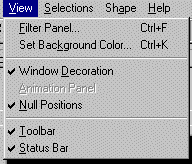
The following table explains the choices:
Table 4-5. View Menu Choices for Scatter and Splat Visualizers
Option | Description |
|---|---|
Filter Panel | Brings up Filter Panel (Figure 4-13) to manipulate the content of the display. |
Set Background Color | Brings up a color chooser to specify new display background color. |
Window Decoration | Shows or hides external controls around the main window. |
Animation Panel | Shows or hides any animation control panel. |
Null positions | Shows or hides entities with null or unknown positions along the axes. |
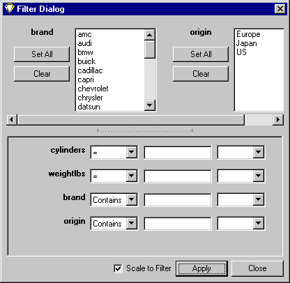
If you want to filter the amount of data shown, based on certain criteria, use the Filter Dialog shown in Figure 4-13. From the View menu select Filter Panel. The upper pane lets you filter based on string columns. To select a value, click it. To deselect a value, simply click it again. To select all values of a column, click the Set All button. To clear all the current selections, click the Clear button.
The bottom pane lets you filter based on the values of both string and numeric columns. See the “Filter Panel” entry in MineSet Enterprise Edition Reference Guide for detailed information.
With the “Scale to Filter” check box in the lower right, you can specify whether the landscape in the main window covers the domain of the entire dataset or just the filtered data.
Click the Apply button to start filtering. If you press the Enter key while the panel is active, filtering starts automatically.
The Scatter Visualizer Selections menu lets you drill through to the underlying data.
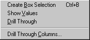
Create Box Selection creates a three-dimensional box selector that can be stretched and moved to select regions of the volume. While this is active, a Record Viewer table opens showing information on the aggregated data about the entities within it. Make sure the cursor is in Select mode. To move the selection box, click on one of the faces with the left mouse button, and drag it in the desired direction. Holding the Shift key while dragging constrains the motion to the axis to which the drag motion is closest. To change the extent of the selection box, drag one of the gray scale tabs in the desired direction. You cannot resize or move beyond the bounds of the volume. The gray scale tabs constantly resize to maintain constant screen size. If at any time they appear too big, you can zoom in closer, and they reduce their size relative to the box.
Show Values displays the values of selected entities in a table.
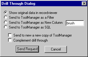
Drill Through opens the Drill Through Dialog box (Figure 4-15). This dialog box gives you the following choices for viewing the selected records:
Show original data in recordviewer.
Send to ToolManager as Filter.
Send to ToolManager as new column.
Send to ToolManager as SQL.
You can also choose one of the following:
Drill Through Columns brings up a panel that lets you select which columns are used in drill through. Unlike other visual tools, there are no specific columns in the data that are designated as the key to the data. It is impossible for the Scatter Visualizer to determine which columns the user desires in the drill-through expression. For example, you might have cars data with brand, model, and weight. Perhaps you want to drill through to the original data, and specify that brand and model should be considered, but weight should not. By default, all columns that have been mapped to graphical requirements are considered significant on drill-through. The others are not, but may be made so by highlighting them in the Preferences dialog box.
For further details see the “Drill Through” entry MineSet Enterprise Edition Reference Guide .
Selecting and Drilling Through in the Splat Visualizer
The Splat Visualizer Selections menu differs slightly from the Scatter Visualizer in the options available to drill through to the underlying data.
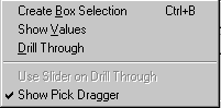
Create Box Selection creates a 3-D box selector that can be stretched and moved to select regions of the volume. While the box selector is active, a table is open and showing information about all of the aggregated data that is represented by the entities within it (Figure 4-17). Closing this window clears all current selections. Any entities within the selection box or selected using shift-click are shown in the table window.
To move the selection box, click on one of the faces with the left mouse button, and drag it in the desired direction. Holding the Shift key while dragging constrains the motion to the axis to which the drag motion is closest. To change the extent of the selection box, drag one of the gray scale tabs in the desired direction. Trying to resize or translate beyond the bounds of the volume is not permitted. The gray scale tabs constantly resize to maintain constant screen size. If at any time they appear too big, you can zoom in closer, and they reduce their size relative to the box.
Within the box selection, you will also see a 3D rectangle or rectangles resembling wire-frame boxes (Figure 4-17). These boxes show where the actual data points are.
Show Values retrieves and displays the records corresponding to the data points which you have selected in the Splat visualization. The resulting records are shown in a table.
Drill Through opens the Drill Through Dialog box (Figure 4-18). This dialog box gives you the following choices for viewing the selected records:
Show original data in recordviewer.
Send to ToolManager as Filter.
Send to ToolManager as new column.
Send to ToolManager as SQL.
You can also choose one of the following:
Use Slider on Drill Through uses the slider position when drilling through.
Show Pick Dragger toggles the visibility of the pick dragger (on by default). The pick dragger is removed when a box selection is started, but it can be made active at the same time that a box selection is active.

For further details see the “Drill Through” entry in the MineSet Enterprise Edition Reference Guide .
The Shape menu lets you change the method for drawing the scatter points in the Scatter Visualizer. The following opaque primitives can be used to represent scatter points.
Cube draws an opaque cube, whose volume is proportional to the attribute mapped to the size visual element.
Diamond draws a wire frame triangle. Its orientation varies with its color, and its size is proportionate to the value of the attribute mapped to the size visual element.
Sphere draws an opaque sphere, whose volume is proportional to the value of the attribute mapped to the size visual element.
Bar draws elongated rods, the height of which is determined by the value of the attribute mapped to the size visual element.
The Splat Visualizer Shape menu lets you change the method for drawing the splats. You can choose to exchange accuracy for interactivity. Texture splats are the most accurate representation of ideal Gaussian density distribution that is approximated in every approach. Because most computers support hardware-assisted texturing well, the texture splat is usually the best choice. The three splat types are:
Linear draws a small set of triangles to give a linear approximation to a Gaussian splat.
Gaussian draws a large set of triangles to approximate a Gaussian splat.
Texture uses a texture-mapped rectangle to give the most accurate representation. This can be very slow on systems that do not support hardware-assisted texture mapping.
Alternatively, you can choose one of the following opaque primitives to represent the splats:
Cube draws an opaque cube whose volume is proportional to the attribute mapped to the opacity visual element, if any, or to count.
Diamond draws a wire frame triangle. Its orientation varies with its color, and its size is proportional to the attribute mapped to the opacity visual element, if any, or to count.
Sphere draws an opaque sphere whose volume is proportional to the attribute mapped to the opacity visual element, if any, or to count.