This chapter provides the basic steps to designing an interface with RapidApp and techniques for working with interface elements. It contains the following sections:
Also, the Calculator tutorial in Chapter 1 steps you through the basic use of RapidApp as does the “Getting Started” tutorial available through the Help menu in RapidApp's main window.
One of RapidApp's features is to automatically provide the Indigo Magic style when you create interface elements using RapidApp. To learn more about this style, see Chapter 3, “Windows in the Indigo Magic Environment,” in the Indigo Magic User Interface Guidelines and Chapter 2, “Getting the Indigo Magic Look,” in the Indigo Magic Desktop Integration Guide.
Before you begin building the interface to your application, you should understand the basic steps for constructing an interface using RapidApp. If you are using RapidApp to construct a component library, see Chapter 8.
From the Windows palette, create a top-level window.
Top-level window's can contain exactly one interface element.
From the Containers palette, choose and add a container to the window.
Containers can contain one or more interface elements (including other containers).
From any palette (except the Windows palette), choose and add one or more interface elements to the container.
This section describes the following:
When an interface element is added to another interface element, it becomes a child of that element. A container is a child of a window (or another container), and any element added to a container is a child of that container. Figure 3-1 diagrams the parent/child relationship.
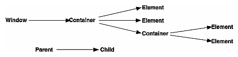
To select an element's parent, you click on the parent. When you can't determine the parent, or can't click on the parent (e.g., you can't click on a shell widget or a window that has a child), do the following:
Select the child element.
Choose “Select Parent” from the Edit menu in RapidApp's main window.
RapidApp selects the element's parent.
By default, when you create an element by dropping it onto a valid parent, the new element becomes a child of that parent even if you have another parent selected. This behavior is a result of pointer focus mode.
If you want to ensure that elements are added to the selected parent only, change to explicit focus mode by choosing “Keep Parent” from the View menu. In this mode, any element you create is added to the currently selected container, no matter where you drop the child in the application you're creating or in the RapidApp interface.
As a further convenience, when “Keep Parent” is set, RapidApp grays out icons that you can't add to the currently selected container. For example, if you select a menu bar when “Keep Parent” is set, RapidApp grays out all menu palette icons except those you can add to the menu bar.
The section describes the following:
“See Also”—a reference to additional information
This section steps you through the process of creating an interface element. To create an interface element:
Decide what you are creating.
You need a window to which you add a container to which you add your remaining interface elements.
Or, you need a window to which you add a complex component. Complex components are described in section “Work With User-Defined Components”.
If you are creating a menu or dialog, see sections “Work With Menus” and “Work With Dialogs”.
Go to the appropriate palette by clicking on its tab.
Click the desired icon.
An outline appears, representing the default size of the element.
If the element is a window, move the outline over the desktop; otherwise, move the outline over your top-level window.
Press the left mouse button to position the upper left corner of the element.
Release the mouse button to accept the element's default size.
–or–
Drag out a new size before releasing the button.
Unless added to another container, container elements automatically fill a window's entire work area.
To create an interface element, other than a window, using the drag and drop method:
With the cursor over an icon, press the middle mouse button.
Drag the cursor over a window or container and release the mouse button.
The element displays in its default size.
Figure 3-2 demonstrates how to create a Simple Window.

When your interface requires several instantiations of the same interface element—same size, same label, same border thickness, etc.—you can simplify creation by designing one element and then copying it. A copied element retains the settings of the original except for the instance name which must be unique. RapidApp uniquely names each copied element by appending a number to the original name (e.g. copied versions of “myButton” are named “myButton1,” “myButton2,” etc.).
To copy an interface element:
Select the element.
From the Edit menu, choose “Copy.”
From the Edit menu, choose “Paste.”
An outline of the element appears
Place the new element by clicking in the target container.
The “Getting Started” tutorial accessed by choosing “Tutorial>Getting Started” from the Help menu in RapidApp's main window.
This section describes the following:
How you move or resize an element in RapidApp depends on the type of element you're working with and the type of its parent element. The following sections are included:
A container with a window as its parent, maintains the same size and position as the window's work area.
A container with another container as it parent, depends on its parent when being resized or moved. To understand how parent containers control their child elements, see “Moving and Resizing Elements within Containers” below.
 | Tip: If your interface requires containers within containers, consider constructing the inner container in its own window. Resize and move its child elements as necessary. When complete, move the container and its children into the other container, or create a user-defined component comprised of the elements and instantiate this component into the other container. For more information on user-defined components, see “Work With User-Defined Components”. |
A container controls the position and size of its child elements. To help you understand how to work with elements in their containers, the following sections are included:
“Directly Moving Child Elements” of flexible containers
“Directly Resizing Child Elements” of flexible containers
“Indirectly Moving Child Elements” of controlling containers
RapidApp uses IRIS IM container widgets, a collection of containers that provide a variety of ways to organize interface elements. To maintain their organizational features, many containers keep a tight control over their child elements, often determining their size and position by the order in which the elements were created.
For example, the Row Column container supports menu bars and menu panes. For this reason, it forces all of its children to have the same height and limits their ability to be resized. The Bulletin Board container is a simple more flexible container. As such, it allows its children to be resized and moved without limitation (except to remain within the container's boundary).
 | Note: How these containers behave is a function of Xt and IRIS IM, and not of RapidApp. |
To understand how to manipulate child elements, you must understand and choose the appropriate container in which to place them. For information on the containers used by RapidApp, see “Work With Containers”.
RapidApp provides a grid to help you control the placement and size of interface elements. As you move or resize an element, it snaps to the grid. To control the grid:
From the View menu, choose “Snap to Grid.”
Set the resolution to 2, 5, 10, or 20 pixels
–or–
Turn the grid off.
Directly Moving Child Elements
You can easily move child elements in the following containers:
Bulletin Board
Rubber Board
Form (elements attached to other elements influence each others size and position)
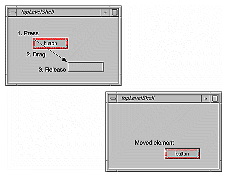
To move a child element using the cursor:
With the cursor over the element, press the left mouse button.
Drag the element to its new position.
Release the mouse button.
Figure 3-3 illustrates this process.
To move a child element using the arrow keys:
Select the element.
Press the appropriate arrow key.
The element moves one pixel ignoring the grid setting.
Some containers have more complex behaviors. In a simple Bulletin Board widget, moving a child is equivalent to changing its x,y position, as determined by its XmNx and XmNy resources. However, in a Form widget, moving a component is equivalent to changing its XmNleftOffset, XmNrightOffset, XmNbottomOffset, and/or XmNtopOffset resources.
Directly Resizing Child Elements
You can easily resize child elements in the following containers:
Bulletin Board
Rubber Board
Form (elements attached to other elements influence each others size and position)
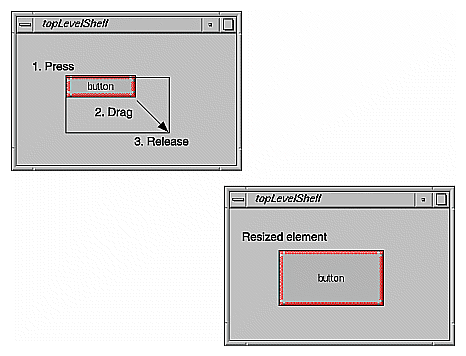
To resize a child element
Select the element.
With the cursor over one of the handles surrounding the element, press the left mouse button.
Drag the handle until the element is the desired size.
Release the mouse button.
Figure 3-4 illustrates this process.
| Tip: Some elements have a recomputeSize resource. When set to true, the element resizes to accommodate its label string when the label string is changed. If you set the size of such an element and then change its label string, the element will resize. To prohibit this behavior, set the recomputeSize resource to false. For more information on resources, see “Modifying an Interface Element's Appearance or Behavior”. |
If the element is too small to resize:
Select the element.
From the Edit menu, choose “Grow Widget.”
The width and height of the selected element increases by 20 pixels.
To return an element to its default size:
Select the element.
From the Edit menu, choose “Natural Size.”
| Note: The “Natural Size” option has no effect if the element is a child of a container that controls its size (for example, a Row Column). |
Indirectly Moving Child Elements
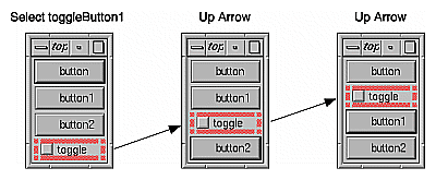
For containers in which a child's position depends on the order in which it was created, changing the child's x,y position is ignored. In many cases, though not all, resizing a child of such a container is also ignored. Though RapidApp cannot control this behavior, it can create the allusion of movement through the use of “Up/Left” and “Down/Right” on the Edit menu or through the use of arrow keys. When you use one of these commands or one of the arrow keys, the selected element appears to move in the appropriate direction. RapidApp is actually altering the element's creation order. Figure 3-5 shows an example of repositioning a toggle button in a row column container.
In addition to moving an element within a container, you can move an element to another container.
To move a child element via the Edit menu:
Select the element.
From the Edit menu, choose “Cut” or “Copy.”
From the Edit menu, choose “Paste.”
An outline of the element appears.
Place the element by clicking in the target container.
When you copy an interface element, all of its settings are copied with it, except for the instance name which must be unique. RapidApp creates a unique name by appending a number to the name (e.g. a copy of “myButton” is named “myButton1”).
To move a child element using the middle mouse button:
With the cursor over the element, press the middle mouse button.
Drag the element to the target container.
If you hold down the <Ctrl> key while dragging, RapidApp copies the selected element instead of moving it.
Select the element.
From the Edit menu, choose “Cut.” This option saves the element to the clipboard.
–or–
From the Edit menu, choose “Delete.” (or press <Backspace> or <Delete>). This option doesn't save the element to the clipboard.
There is no undo feature.
All interface element names must be unique. When you create an interface element, RapidApp assigns it a unique name automatically. For example, RapidApp gives the name “button” to the first push button you create, “button1” to the next button you create, and so on. The name determines both the string given to the element (its resource name) when it is created, and the variable that represents the element in the program.
To change an element's name:
Select the element.
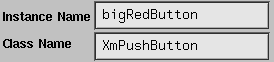
Edit the Instance Name field in the header area of RapidApp's main window.
Figure 3-6 shows the header area with a user-specified name displayed in the Instance Name field.
You control an interface element's appearance and behavior by setting the element's resources. For example, to change the string of a push button, you change its labelString resource. The following sections are included:
To modify an element's resources:
Select the element.
The resource editor displays the element's resources.
Change the desired resource as follows:
For string values – edit the text field. The value is accepted when you press <Return> or click outside of the field.
For Boolean values – click the desired toggle.
For enumerated values – choose a value from the option menu, by pressing on the option button to the right of the resource.
Figure 3-7 shows the resources for a push button.
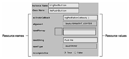
IRIS IM widgets are highly configurable and often include a large number of resources. Typically, when writing an application, you need to access only a few, so RapidApp displays the most commonly used resources. You can access all resources programmatically by editing the source code generated by RapidApp or by editing the application's resource file. Colors and fonts are controlled by schemes in the Silicon Graphics environment. Colors can be changed using the Color Scheme editor available as part of the Indigo Magic desktop.
Callbacks are functions that associate program behavior with user input. For example, a push button interface element has an callback function that is activated when the user clicks the button. To specify this function, you enter the function's name in the push button's activateCallback resource, as shown in Figure 3-8. (You don't have to enter the parentheses; RapidApp automatically provides them when you finish editing the resource.) When RapidApp generates code, it creates these callback functions as empty virtual member functions in a C++ class. The implementation of the function body is left up to you. (See “Code Management” in Chapter 5 for more information on editing generated code to implement functionality.)

IRIS IM (and, therefore, RapidApp) supports the concept of constraints—resources added to an element when it is a child of a particular type of container. Constraint resources assist the container in controlling the appearance and behavior of its child elements.
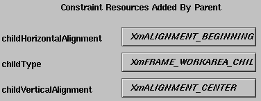
For example, a label element always has the following resources: alignment, labelPixmap, labelString, labelType, recomputeSize, and schemeFont. When added to a frame container, a container that typically has a work area with a title, the container adds the following constraint resources to the label: childHorizontalAlignment, childType, and childVerticalAlignment. This allows the container to control the position of the label after you indicate that the label is a title. This is the reason you may see elements of the same type with different resources.
The resource editor lists constraint resources separately from other resources, below a label identifying them as constraint resources. You modify constraint resources just as you do other resources. Figure 3-9 shows the constraint resources added to a label element when it is a child of a frame container.
RapidApp supports several dynamic resources that act much like constraints but are not supported by IRIS IM. These correspond to extensions and features provided by IRIS ViewKit classes. For example, when you place a push button in a menu pane, RapidApp adds an undoCallback resource to the push button. This callback isn't a resource supported by IRIS IM, but it provides support for the IRIS ViewKit undo mechanism.
Also, RapidApp displays some resources only when appropriate. For example, the push button supports an accelerator resource that describes a key combination used to activate the button when it is in a menu. RapidApp displays this resource only when the button is in a menu; it is meaningless otherwise.
Extended resources provide interface elements with additional behavior; behavior that isn't in Motif. For example, The Indigo Magic environment uses co-primary windows—auxiliary windows that aren't displayed on startup. The term “co-primary” is unknown to Motif. To enable you to create a co-primary window, RapidApp includes a coprimaryWindow extended resource for both the simple window and VkWindow.
This section describes some additional techniques for working with interface elements, and includes the following sections:
Sometimes it's hard to manipulate elements because they're too close to or covered by other elements. For example, some containers wrap “tightly” around their child elements. In these cases, it can be difficult to move or resize the container without accidentally selecting another element.
To “lock on” to an element and prevent RapidApp from selecting another element, hold down <Ctrl> while manipulating the selected interface element.
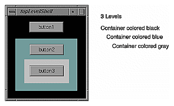
To help you see the structure of the interface element hierarchy, You can have RapidApp color code the nested containers within the hierarchy.
To view an interface element hierarchy by color coding:
Choose “Color by Depth” from the View menu.
RapidApp colors the containers differently within the same hierarchy.
This is a toggle command and choosing it again turns off the color coding.
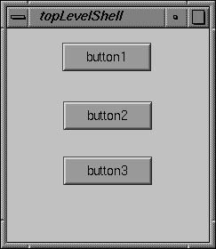
Figure 3-10 shows a window containing three buttons. Figure 3-11 shows the same window with “Color by Depth” turned on. You can see the depth of this hierarchy by the fact that the nested containers are colored differently.
For a more detailed description of the hierarchy, use the editres program. For more information, see the editres(1) reference page.
In RapidApp, you save a description of your application's interface using the “Save As” File menu option. You have RapidApp create and save all your application files using the “Generate C++” Project menu option. In both cases, you should first specify the project directory in which to save these files.
To specify the project directory:
From the File menu, choose “Preferences.”
In the Preferences dialog, go to the Project card.
In the Project Directory filed, enter the directory path for the project directory.
Fill in the other options as necessary.
To save a description of the interface:
From the File menu, choose “Save As.”
In the Save As dialog, provide the project directory and the name of the file. The file name must end with a .uil suffix.
The .uil suffix is a file format used by IRIS IM, as well as by many user interface tools. If this suffix is missing, RapidApp adds it automatically.
Note: The “Window Template” option on the Save As option menu is discussed in “Adding New Top-Level Window Layouts to RapidApp”.
To have RapidApp create and save all application files:
After you've built your interface, choose “Generate C++” from the Project menu.
For a list of generated files, see “Code Generation”.