This chapter discusses the features and capabilities of the Evidence Classifier and Visualizer. It provides an overview of this classification tool as well as the inducer that generates it. It describes the ways of invoking this tool. It then explains the Evidence Visualizer's functionality when working with the
Label Probability Pane
Evidence Pane
Finally, it lists and describes the sample files provided for this tool.
 | Note: It is assumed that you have read Chapter 8, “MineSet Inducers and Classifiers,” before proceeding with this chapter. |
The Evidence Classifier assigns each record in a dataset to a class. The Evidence Visualizer displays the structure of an evidence classifier (Figure 10-1). The visualizer can help you understand the importance of specific attribute values for classification. Also, it can be used to gain insight into how classification is done, as well as to answer “what if” questions.
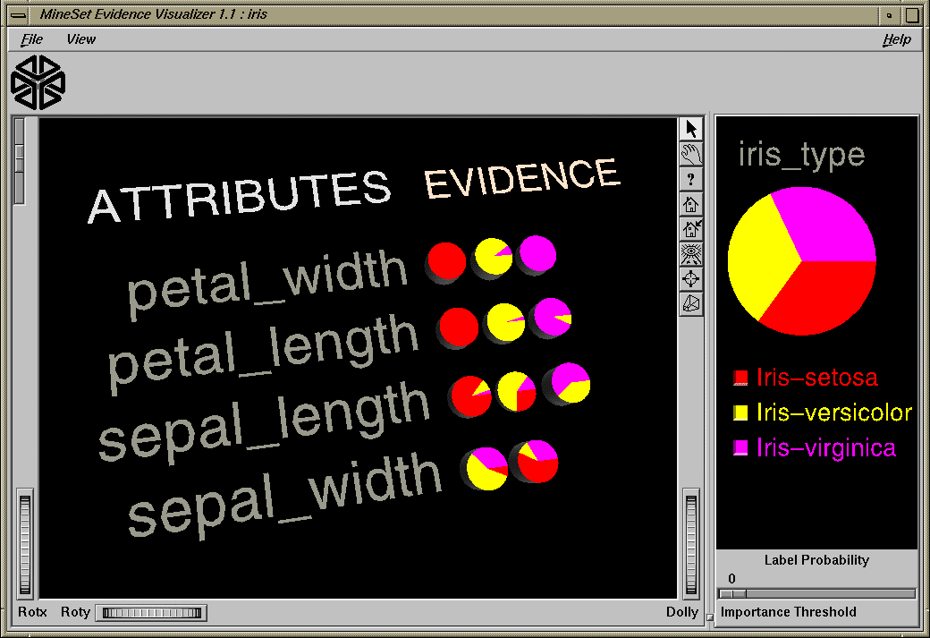
The Evidence pane (on the left) consists of rows of pie charts or bars for the attributes used by the classifier. Characterization of a particular class label can be achieved by selecting one of the values in the Label Probability Pane (on the right). There is one pie chart or bar for each discrete value of the attribute. In the case where the attributes are not discrete, the continuous range has been discretized (binned) in a way that maximizes the differences between adjacent pie charts. Pie height is proportional to the number of records having that attribute value. The sum of the pie heights for every row is the same. The height of the graphical objects can be scaled to exaggerate the differences between the pie charts. By adjusting an importance threshold slider, attributes that are less useful for classification can be filtered out.
The kinds of questions you might answer by using the Evidence Visualizer are as follows:
What is the likelihood that a new record, for which you know only the values for a few attributes, has a certain label?
Which values of which attributes are the most useful for classifying the label?
What is the distribution of records by attribute values?
What are the characteristics of records that have a certain label?
What is the probability that an attribute takes on a certain value given that it has a specific class label?
The prior probability for each class label is depicted in the pie chart in the Label Probability Pane, on the right of the screen. The prior probability for a class label is the probability of seeing this label in the data for a randomly chosen record, ignoring all attribute values. Mathematically, this is the number of records with the class label divided by the total number of records.
The conditional probabilities, depicted by pie charts in the visualization in the Evidence Pane on the left of the screen, show the relative probability of each attribute value given (conditioned on) each class label. The size of a pie slice indicates the amount of evidence the classifier adds to the prior probability after taking into account a given attribute value in a record. If the size of the slices are equal, the value is irrelevant, and the classifier adds the same amount of evidence to all classes.
Technically, the slice of the pie represents the normalized conditional probability of an attribute value A, given the class label L. The conditional probability, P(A|L), is the probability that a random record chosen only from records with label L takes the value A. Under the default settings, the probability is computed based on record counts. For example, P(0.75 < petal width ≤ 1.65 | iris-versicolor) is 91.6, because there are 36 records with label iris-versicolor, and 33 of them have a petal width in this range.
The Evidence Inducer, sometimes called Naive-Bayes (or Simple Bayes), builds a model that assumes the probabilities of each attribute value are independent given the class label. For example, this assumes that the four attributes (sepal_length, sepal_width, petal_length, and petal_width) are independent for each class of iris (iris-setosa, iris-versicolor, and iris-virginica). While this simplistic model is rarely true, the model is excellent for initial explorations of data and its classification prediction performance is very good in practical applications.
Each attribute value, or range of values, defines exactly one pie chart, which, in turn, gives the conditional probabilities for each class label. To classify a given record, one computes the probability of each class by multiplying its prior probability by the appropriate conditional probability from each row in the matrix. The final product gives the relative probability for each class and the highest value is the predicted class. If an attribute has an unknown value, it is ignored. (The unknown value does not add evidence to any of the classes.) The unknown values are denoted by a question mark (?).
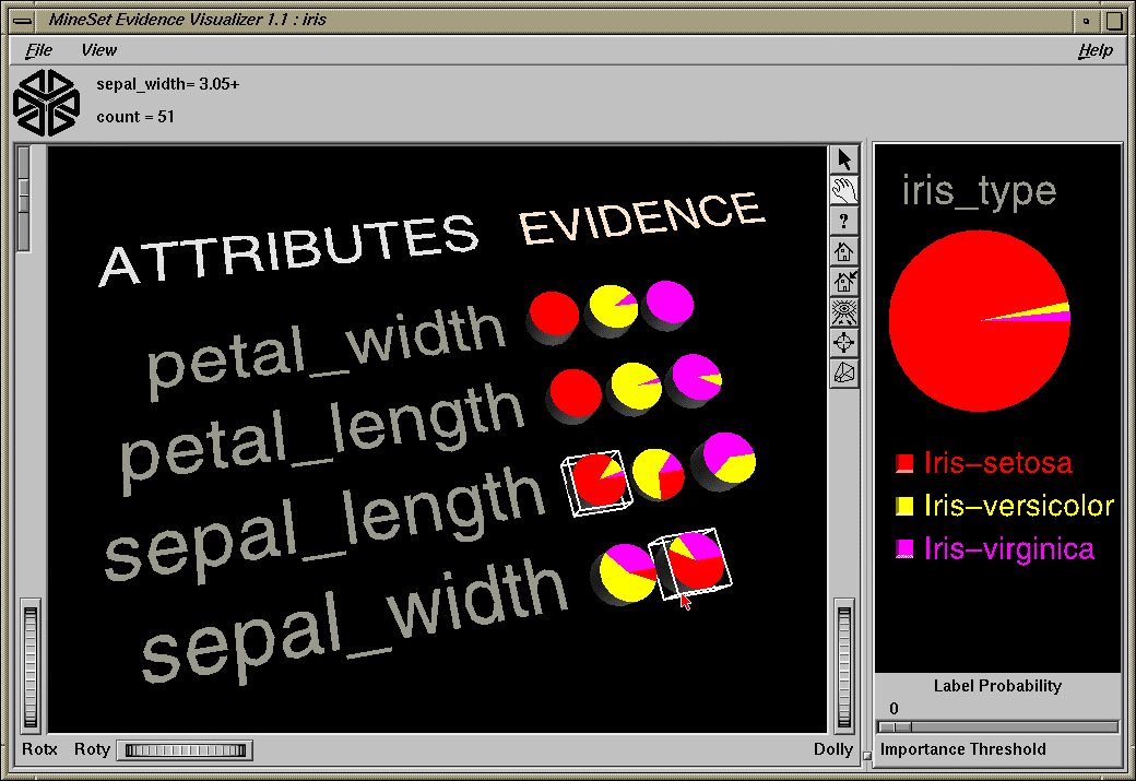
This process of classification can be done interactively using the Evidence Visualizer. Simply select all the values for the attributes that you know. The probability pie on the right changes to show the distribution you would expect, given what you selected. For example, selecting the pie for sepal length < 5.45 inches and the pie for sepal_width > 3.05 inches shows that an iris with these characteristics belongs almost certainly to the class iris-setosa (see Figure 10-2).
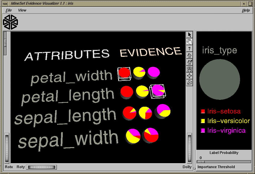
For some combinations of selected values, the probability pie on the right turns completely gray. This occurs when the values selected are contradictory according to the model. For example, in iris.eviviz there are no irises flowers that have petal_width < .75 inches and petal_length > 4.85 inches. Thus, selecting the two pies on the left representing these two values results in a gray pie on the right (see Figure 10-3).
Importance is a measure of predictive power with respect to a label. The Evidence Pane provides valuable insight not only into the importance of each attribute value affecting the class value, but also into the importance of specific attribute values. For example, in the mushroom dataset (described on page 301), the veil-color attribute is not very important because most of the time its attribute value is white (see Figure 10-4), which does not add much evidence to either class.
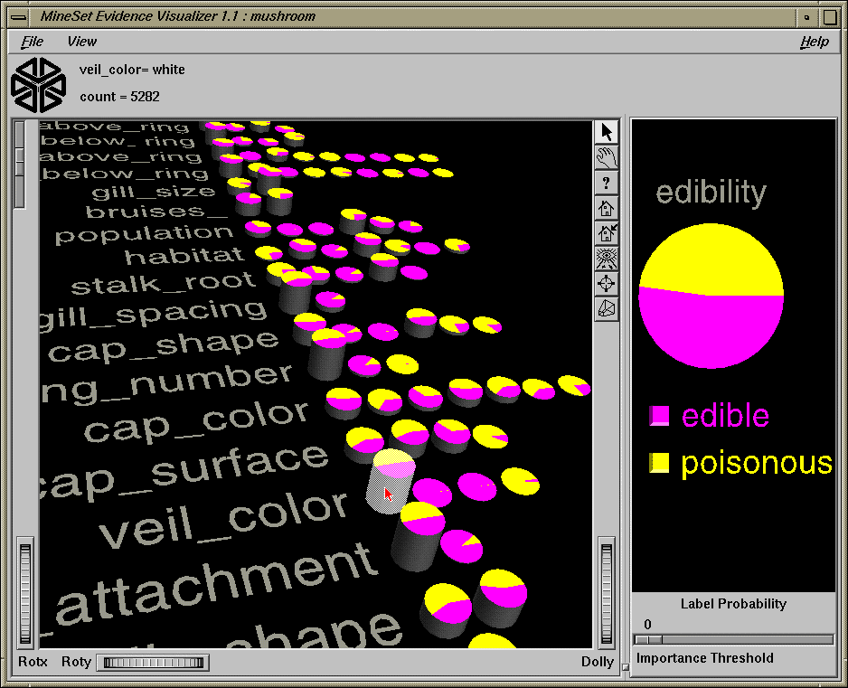
However, if the veil color is brown or orange, the mushroom is likely to be edible, while if it is yellow, it is likely to be poisonous. Similarly, a “test for AIDS” might not be an important attribute for determining whether a patient has a deadly disease because most people would not test positive. However, the value POSITIVE for this test is highly informative because most patients that test positive do have a deadly disease (there might be test errors so this is not 100%).
The automatic induction of evidence classifiers is a process whereby counts are used to calculate the probabilities. Evidence classifiers are automatically induced (generated) from data. The data, which is made up of records and a label associated with each record, is called the training set (see Chapter 8).
The probabilities are generated using the following method:
All continuous attributes are discretized (binned), such that class distributions in these ranges are as different as possible. The number of ranges is determined automatically. To override the automatic binning, bin the given column with respect to the label using the Automatic Thresholds option under the Data Transformations' Bin Column button.
The prior probabilities are the probabilities of each class in the training set.
The conditional probabilities are the probabilities of each attribute value conditioned on each class label in the training set.
The number of pies in a row is the number of discrete ranges produced by the inducer. If there is just one range, it means that this attribute by itself was not useful in predicting the label. The prior probabilities are what is initially displayed in the Label Probability Pane.
An optional Laplace correction can be applied to the probabilities, which avoids extreme probabilities (for example, probabilities of zeros and ones). We may prefer not to assign a probability of 1 to the event “a patient tested positive for AIDS has a deadly disease.” We may want to assign a probability close to 1 (but not 1), in order to allow for errors or unrepresentative samples. This is especially important if the number of records is small.
The Evidence Visualizer requires a training set, as described on page 229 of Chapter 8, “MineSet Inducers and Classifiers.” Files are generated by extracting data from a source (such as an ASCII file or a table in an Oracle, INFORMIX, or Sybase database). The Evidence Visualizer data file is output as a result of running the Evidence Inducer. The format of this file, which has a .eviviz extension, is described in Appendix F. When starting the Evidence Visualizer or when opening a file, you must specify the data filename. To apply the generated classifier, you should have a dataset of records with the same attributes as the training set, except that the label need not be present.
There are two ways to run the evidence inducer:
From the Tool Manager
To see the induction process, choose Client File from Tool Manager and type /usr/lib/MineSet/data/iris.schema. You'll see four continuous attributes and one discrete attribute in the Data Transformation panel. Since there is only one discrete attribute, the label option automatically shows it. Select the Evidence Inducer, and ensure you have selected the Classifier & Accuracy mode. To run the Inducer, click Go!.
You'll see a small popup window with information and statistics, followed by another window showing the classifier structure in the Evidence Visualizer.
From the command line
To induce an evidence classifier from the command line, refer to Appendix E, “Command-Line Interface to MIndUtil: Classifiers, Discretization, Column Importance, and File Conversions.”
There are six ways to start the Evidence Visualizer:
Run the Evidence Inducer from the Tool Manager under the Classifiers tab. After the inducer builds the classifier, it automatically invokes the Evidence Visualizer. See below for details about using the Tool Manager in conjunction with the Evidence Visualizer.
Use the Tool Manager to start the Evidence Visualizer from the Visual Tools menu. (See Chapter 3 first for details on the Tool Manager's functionality, which is common to all MineSet tools.)
Double-click the Evidence Visualizer icon on your Indigo Magic desktop. The startup screen requires you to select a data file by choosing File > Open.
If you know what configuration file you want to use, double-click the icon for that configuration file. This starts the Evidence Visualizer and automatically loads the configuration file you specified. This works only if the configuration filename ends in .eviviz (which is always the case for configuration files created for the Evidence Visualizer via the Tool Manager).
If you know what configuration file you want to use, drag its icon onto the Evidence Visualizer icon. This starts the Evidence Visualizer and automatically loads the configuration file you specified.
Start the Evidence Visualizer from the UNIX shell command line by entering this command at the prompt:
eviviz [ dataFile ]
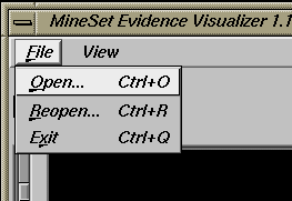
Here, dataFile is optional and specifies the name of the configuration file to use. If you don't specify a configuration file, you then must use File > Open to specify one (see Figure 10-5).
To access the options for configuring the Evidence Inducer, select the Mining Tools tab on the Data Destination panel (Figure 10-6). From the subsequent tabs, select Classifiers. Ensure that the inducer you select is Evidence (the default). Your selections in the Mode and Algorithm menus determine the options available in the Further Inducer Options menu. After you have made your selections in these menus, click Go! to run the inducer, which, in turn, creates the classifier.
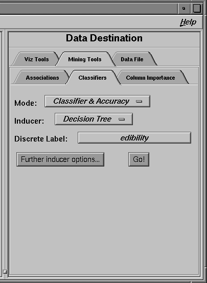
Figure 10-7 shows the two possible induction algorithms for creating the two MineSet classifiers.
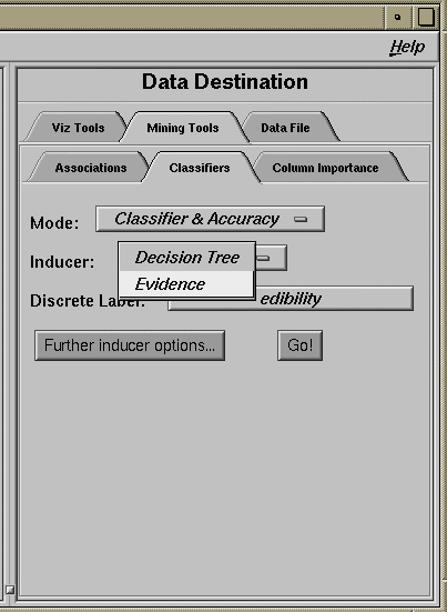
To build an Evidence classifier, select Evidence. The Decision Tree classifier is discussed in Chapter 9.
The Discrete Labels menu provides a list of possible discrete labels. Discrete attributes (binned values, character string values, or a few integers) have a limited number of values. You should select a label attribute with few values; for instance, two or three (see “Training Set” in Chapter 8). If there are no discrete attributes, the menu shows No Discrete Label, and the Go! button is disabled. You then must create a discrete attribute by binning or adding a new column using the Tool Manager's Data Transformations panel.
The generated classifier is named with the prefix of the session filename (as determined in Tool Manager) with the suffix -evi.class. By default, all classifiers are stored on the server. These classifiers can be used for future classification of unlabeled records; that is, they can be used to predict the labels for unlabeled datasets (see “The Apply Classifier Button” in Chapter 3).
Selecting Further Inducer Options causes the Inducer Options dialog box to appear (see Figure 10-8). This dialog box consists of three panels:
The top panel shows the choices you made in the Tool Manager's Data Destination panel. The type of Accuracy Estimation is determined by the model.
The bottom-left panel lets you specify further Algorithm Options.
The bottom-right panel lets you specify the Accuracy Options (unless the mode you chose in the Data Destination panel was Classifier Only, in which case this area is empty). The options shown in this panel depend on the type of Accuracy Estimation you chose (see “Accuracy Estimation” in Chapter 8).
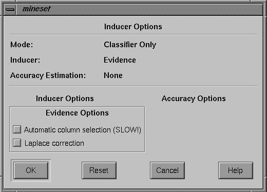
By choosing Further Inducer Options, you can fine-tune the Evidence inducer.
-
This applies a process that chooses only those columns that help prediction the most. Because extra columns can degrade the prediction accuracy of the evidence classifier, this process searches for a good subset of the columns automatically. Only those columns found to be useful are used. This process can take a long time, especially if there are many columns.
The selection of columns is done by estimating the accuracy of different attribute sets using the wrapper approach. See Appendix I, “Further Reading and Acknowledgments,” for details.
-
This biases the probabilities towards the average, thus avoiding extreme numbers (such as zero and one). The fewer the records in a bin, the more it will be changed towards the average.
If you started the Evidence Visualizer without specifying a configuration file, the main screen shows the copyright notice for the Evidence Visualizer. Only the File and Help pulldown menus are available. To view all menus and controls in the main window, open a configuration file. Use File > Open (see Figure 10-5) to see a list of configuration files.
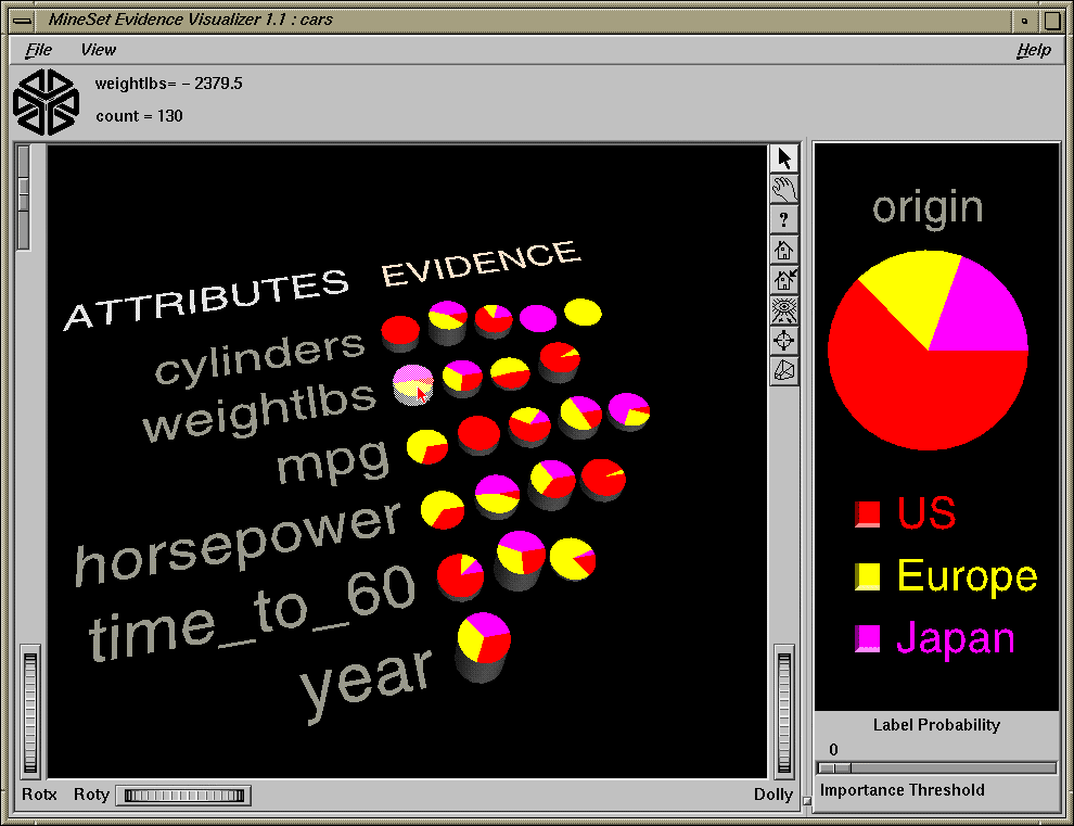
When a valid configuration file is specified, the two panes in the main screen display graphics. For example, specifying cars.eviviz results in the output displayed in Figure 10-9.
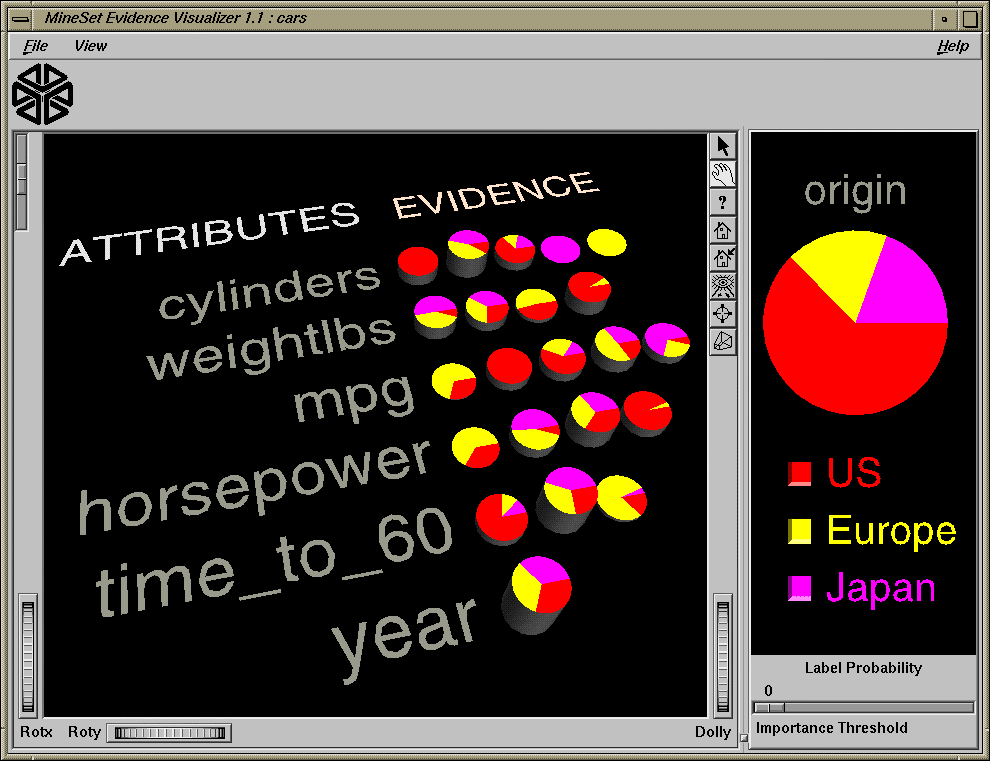
In the Evidence Pane on the left, one row of pie charts appears for each attribute in the dataset that the classifier is using. Each pie chart corresponds to a value for the attribute associated with the row. In the Label Probability Pane on the right, a list of all class labels appears under a large pie chart of the prior probability distribution. Note that the color of the slices correspond to the color associated with each class label. This prior probability represented by the pie shows the proportion of data with each class label.
Each of the Evidence Visualizer's main window panes has two modes of viewing: grasp and select.
The Label Probability Pane is located on the right of the Evidence Visualizer's main window. The top two buttons of those aligned vertically between the panes toggle between the grasp and select modes. Alternatively, the Esc key also toggles the viewing mode for both panes.
In grasp mode, the cursor appears as a hand that lets you pan and scale the scene's size.
To pan (translate) the display, press the middle mouse button and drag it in the direction you want the display panned.
To enlarge the scene, press the left mouse button, and drag the mouse downward.
To shrink the scene, press the left mouse button, and move the mouse upward. Moving the cursor over the buttons next to the label values causes the size of the slice to be shown at the top.
The Evidence Pane is located on the left of the Evidence Visualizer's main window. The top two buttons of those aligned vertically between the panes toggle between the grasp and select modes. Alternatively, the Esc key also toggles the viewing mode for both panes.
In grasp mode, the cursor appears as a hand, so you can pan, rotate, and scale the scene's size. The Label Probability pane contains only 2D geometry; thus, rotation is disabled.
To rotate the display, press the left mouse button and move the mouse in the direction you want. (Also see “Thumbwheels”.)
To pan (translate) the display, press the middle mouse button, and drag it in the direction you want the display panned.
To enlarge the viewpoint, simultaneously press the left and middle mouse buttons and move the mouse downward. To shrink the viewpoint, simultaneously press the left and middle mouse buttons, and move the mouse upward. This is equivalent to the functions provided by the Dolly thumbwheel.
In select mode, the cursor appears as an arrow. You can then select one of the class labels by clicking the button to the left of it. Once a value is selected, a white box appears around the button next to the label (see Figure 10-10). The size of that slice (the probability of predicting that label value) appears in the text output line at the top. To deselect a value, click it again.
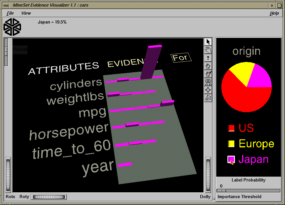
If no label is selected, the Evidence Pane on the left displays pie charts. The pie charts show the effect a certain attribute value has on the distribution in the Label Probability Pane.
If a label is selected, the representation on the left displays bar charts. The height of each bar shows the evidence in favor of the selected label value. Technically, evidence for is the negative log of the quantity one minus the size of the slice matching the selected label in the corresponding pie of the pie chart representation.
As the default, the amount of evidence common to all the labels is subtracted. This means that the height of a bar for each value is reduced by the height representing the label for which the evidence is smallest. If you select a different label, the bars and their colors change to represent the new class label. Selecting the same label again deselects it, and the Evidence Pane again displays the pie charts. Uncheck the View > Subtract minimum evidence option if you do not want to subtract the common evidence.
In select mode, the cursor appears as an arrow. You can highlight an object (either a pie chart or a bar) by moving the cursor over that object. Information about that object then appears above the Evidence Pane. The information is displayed as long as the cursor is over the object.
If the object is a pie chart, then the message takes this format:
<attribute name>: <value or range>
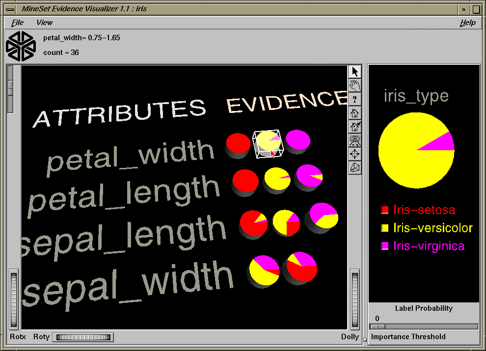
count = <count>Here, count is the number of data points that fall in that range or have that value for that attribute (see Figure 10-11). The pie height is proportional to this number.
If the object is a bar, then the message takes this format:
(<attribute> = <value>) ==> Prob(<selected label>) = x% [low%-high%] Evidence=z
<selected label> ==> Prob(<attribute> = <value>) = y% [low%-high%]Here, x is the probability that a record has the selected label given that it has the highlighted attribute value. The bracketed range, [low%-high%] gives the 95% confidence interval. Similarly, y% is the probability that a record has the highlighted attribute value given the selected label (see Figure 10-12). Note that the height of the bar shows evidence, not probability. The amount of evidence, z, is directly related to the bar heights. Evidence can be summed in order to determine which class is predicted (unlike probability, which must be multiplied).
Technically, evidence for is defined as
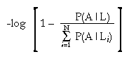
while evidence against is defined as
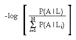
A is the attribute value, L is the selected label value, and N is the number of label values. When computing the bar heights, a very small number is added inside the brackets of the above expressions to prevent the bars from becoming infinitely tall. The word “for” or “against” in the Evidence Pane has a box around it to indicate that it may be clicked on. Do this to toggle the representation.
The height of the gray rectangular base (on which the bars stand) represents the amount of evidence contributed by the prior probability. For example, if the label is car cylinders, there are very few three cylinder cars, so the base is low when evidence for is showing, and high when evidence against is showing. You can add to this height the height of individual bars that are on top.
Evidence for can be useful in determining which values are the most helpful in predicting a particular label value.
The amount of evidence (bar height) is not derived directly from either probability shown while highlighting. Instead, the evidence depends on the conditional probability relative to the other probabilities for all the other label values according to the equation above.
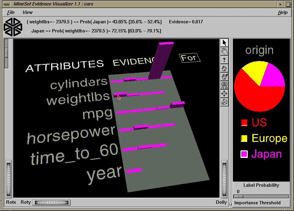
You can also select one pie chart or bar from an attribute row by clicking the left mouse button while the cursor is over one of the attribute values. This causes the object to be drawn with a white bounding box surrounding it (see Figure 10-13). Note that it is not possible to select a pie chart corresponding to an unknown value of an attribute (if one exists, it is in the first position of the row and denoted by a question mark). Trying to do so results in a beep. The large pie chart in the Label Probability Pane on the right changes to reflect the item you select; it now shows the posterior probability, given the attribute value that was just selected. The Evidence Visualizer arrives at this new probability distribution by multiplying the probabilities of all the selected objects together, then multiplying this result with the prior probability.
Note that this multiplication corresponds to a conditional independence assumption. When this assumption is not appropriate, and multiple values for attributes are chosen, the predicted class probabilities are likely to be too extreme, although the final classification might be correct. The estimated accuracy shown in the information and statistics window when you run the inducer can help you determine how reasonable this assumption is. If the accuracy is high, the assumption is reasonably robust in the domain.
Before clicking on a pie, the Evidence Visualizer appears as shown in Figure 10-1. This shows that given no additional information, there is an approximately equal likelihood that an iris will be designated type iris-setosa, iris-versicolor, or iris-virginica. If you click a pie for petal_width .75 - 1.65, the pie on the right changes to that shown in Figure 10-13. This indicates that if the petal width is between .75 and 1.65, the iris probably belongs to the class iris-versicolor. You then can select additional values to further change the distribution, but you can select at most one pie or bar from each row. The order in which you select pies or bars does not matter.
When a particular label has been selected in the Label Probability Pane, the Evidence Pane shows bars rather than pies for each value of an attribute. The title over the bars reads Evidence For. The box around the For indicates that it can be selected (Figure 10-14).
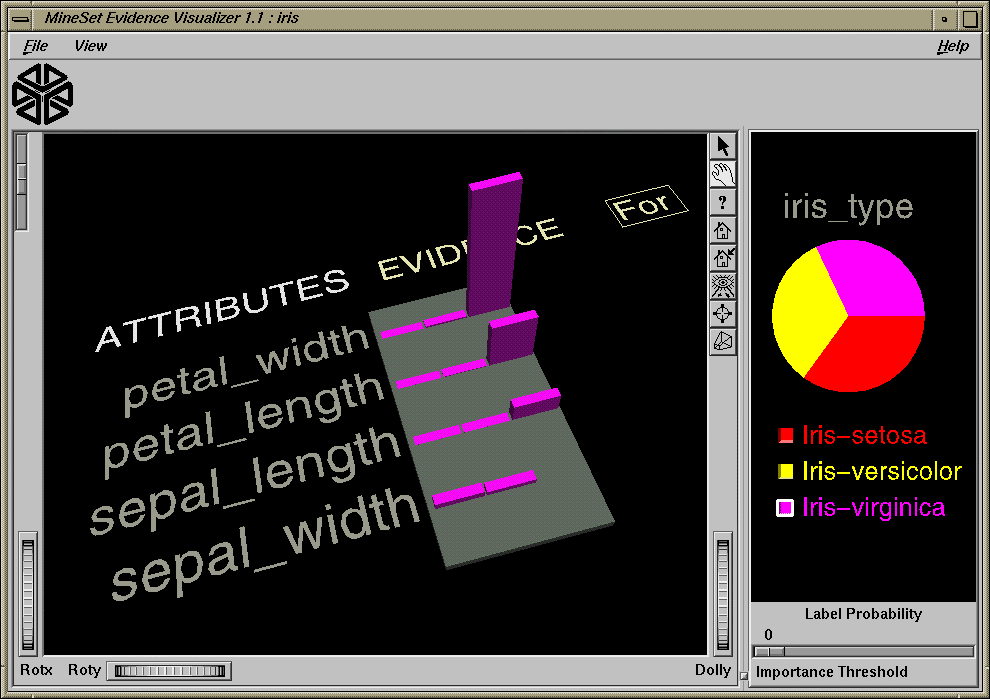
Clicking the For in the Evidence For title toggles it to display Against. As a result, the bar heights change to show evidence against the label (Figure 10-15).
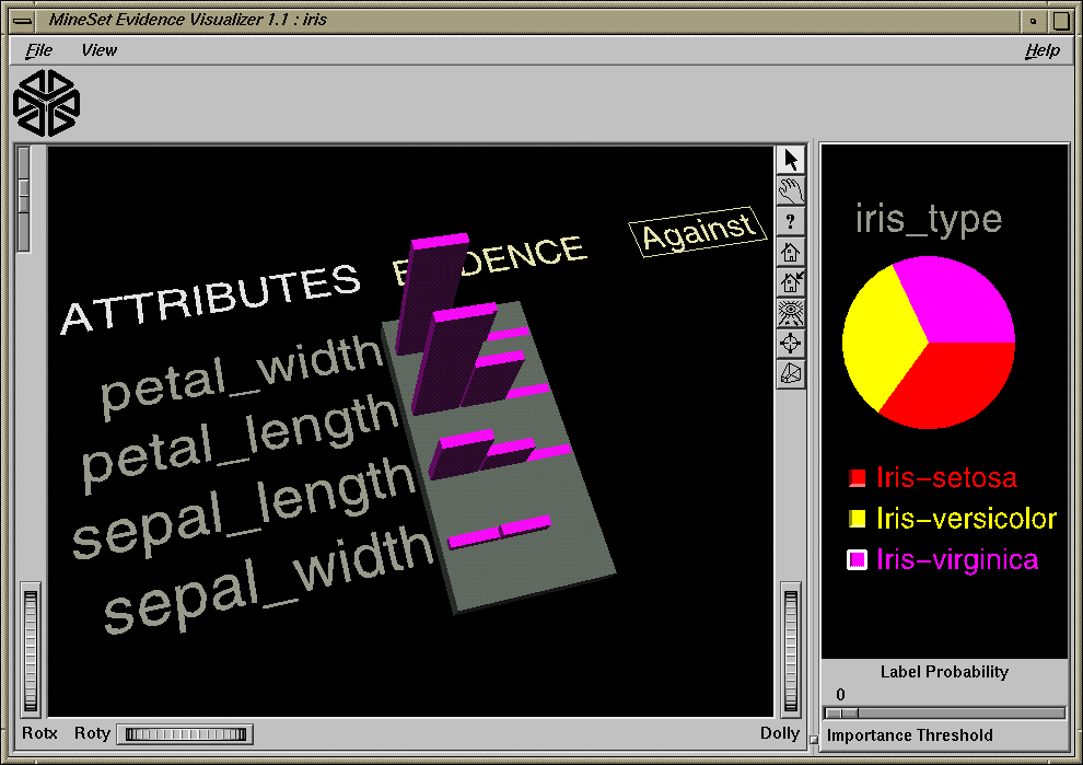
Selecting bars has the same effect on the large probability pie in the Label Probability Pane to the right as did selecting pies. The bar height indicates the amount of evidence for or against the selected label contributed by that selected value. Since log probabilities are used to represent evidence, the bar heights are added to accumulate evidence (whereas probabilities must be multiplied).
Several external controls surround the Evidence Pane: buttons, thumbwheels, and sliders. This section describes each type of control.
At the top right of the Evidence Pane area are eight buttons (Figure 10-16). These buttons are described below.
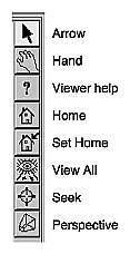
Arrow puts you in select mode for both panes. When in this mode, the cursor becomes an arrow. Select mode lets you highlight, or select, entities in the Evidence Pane or select labels in the Label Probability Pane.
Hand puts you in grasp mode for both panes. When in this mode, the cursor becomes a hand. Grasp mode lets you rotate, zoom, and pan the display in the Evidence Pane, or pan and zoom in the Label Probability Pane.
Viewer Help brings up a help window describing the viewer itself.
Home takes you to a designated location. Initially, this location is the first viewpoint shown after invoking the Evidence Visualizer and specifying a configuration file. If you have been working with the Evidence Visualizer and have clicked the Set Home button, then clicking Home returns you to the viewpoint that was current when you last clicked Set Home.
Set Home makes your current location the home location. Clicking the Home button returns you to the last location where you clicked Set Home.
View All lets you view the entire graphic display, keeping the angle of view you had before clicking this option. To get an overhead view of the scene, rotate the camera so that you are looking directly down on the entities, then click the View All button.
Seek takes you to the point or object you click after selecting this button.
Perspective is a button that lets you view the scene in 3D perspective (closer objects appear larger; farther objects appear smaller). Clicking this button again turns 3D perspective off.
If Perspective is off, the Dolly thumbwheel becomes the Zoom thumbwheel. (The Dolly thumbwheel is described in “Thumbwheels”.)
The Evidence Visualizer contains two sliders: Height Scale and Importance Threshold.
The Height Scale Slider (Figure 10-17), which is located in the upper left of the Evidence Visualizer, scales the height of the pies and bars. You can use this slider to magnify small differences.
The Importance Threshold Slider, located at the bottom right of the Evidence Visualizer window (Figure 10-18), filters out attributes that are not as useful for classifying the selected label. This quality, assigned a value between 0 and 100 by the inducer, is called importance. This measure is on an absolute scale. To understand how importance is calculated, see “Column Importance and Relation to Classifiers”. As the slider is moved to the right, attributes that fall below the requisite importance value are removed from the scene. If the attributes are sorted by importance (the default), then the ones at the bottom are the first to be removed.
Three thumbwheels appear around the lower part of the main window border (see Figure 14). They let you dynamically move the viewpoint. Rotx and Roty rotate the scene about the x or y axis, respectively. The dolly thumbwheel moves the virtual cameral forward or backward.
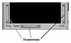
| Note: If Perspective is off, the Dolly thumbwheel becomes the Zoom thumbwheel. |
Three pulldown menus let you access additional Evidence Visualizer functions: File, View, and Help. If you start the Evidence Visualizer without specifying a configuration file, only the File and the Help menus are available.
The File menu (Figure 10-5) lets you open a new configuration file, reopen the current configuration file, or exit the Evidence Visualizer.
The View menu lets you control certain aspects of what is shown in the Evidence Visualizer pane (Figure 10-20).
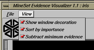
This menu contains three options:
Show Window Decoration lets you hide or show the external controls around the main window.
Sort By Importance lets you display the attributes sorted according to their usefulness in classifying with respect to the chosen label. If this option is turned off, then the attributes will appear in the same order they did under “Current Columns” in the Tool Manager.
Subtract Minimum Evidence applies only when a label has been selected and the bars are shown. With this option on (the default), the height that is the minimum over all the label values is subtracted. This amount may be different for each value of each attribute, but for a given attribute value, the amount subtracted is constant across label values. Activating this option magnifies small differences by subtracting the least common denominator among all the label values.
The Help menu provides access to five help functions (see Figure 10-21).
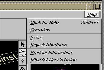
Click for Help turns the cursor into a question mark. Placing this cursor over an object in the Evidence Visualizer pane, and clicking the mouse, causes a help screen to appear; this screen contains information about that object. Closing the help window restores the cursor to its arrow form and deselects the help function. The keyboard shortcut for this function is Shift+F1. (Note that it also is possible to place the arrow cursor over an object and press the F1 function key to access a help screen about that object.)
Overview provides a brief summary of the major functions of this tool, including how to open a file and how to interact with the resulting view.
Index provides an index of the complete help system. This option is currently disabled.
Keys & Shortcuts provides the keyboard shortcuts for all of the Evidence Visualizer's functions that have accelerator keys.
Product Information brings up a screen with the version number and copyright notice for the Evidence Visualizer.
MineSet User's Guide invokes the IRIS Insight viewer with the online version of this manual.
The following examples show cases in which classifiers might be useful. Each of these examples is associated with a sample dataset provided with MineSet. By running the inducer, you can generate the .eviviz files described below.
| Note: The data files, which have a .schema extension, are located in /usr/lib/MineSet/data on the client workstation. The classifier visualization files, which have a .eviviz extension, reside on the client workstation in /usr/lib/MineSet/eviviz/examples. |
The cars dataset contains information about different models of cars from the 1970s and early 1980s. Attributes include weight, acceleration, and miles per gallon (mpg). The file /usr/lib/MineSet/eviviz/examples/cars.eviviz shows the structure of the Evidence Classifier induced for this problem. This file was generated by running the inducer on /usr/lib/MineSet/data/cars.schema with the label set to origin (Japan, U.S., Europe) and the cylinders column changed to type string. The cylinders were changed to type string in order to see all values and avoid the automatic discretization.
If you have a dataset of car attributes, you might want to know what characterizes cars of different origins.
From the distribution of label values in the pie on the right we can see that most cars in this dataset were made in the U.S. (62.1%) and a smaller number in Japan (19.5%) and Europe (18.4%). Clearly brand is the best predictor of origin, since each brand is associated with only one country. For this reason it has the highest importance, and is at the top of the list. By looking at the height of the pies it can be seen that many cars have four cylinders, most weigh less that 3000 lbs and most can reach 60 miles per hour in less than 20 seconds but more than 13.
Look at the distribution of slices for individual attribute values. If a car has engine size >169 cubic inches it is almost surely made in the U.S., and there is no chance it was made in Japan. Other pies show us that U.S. cars generally have six or eight cylinders, low miles per gallon, high horsepower (over 122), heavy weight (over 2981 pounds), and fast acceleration. Japanese cars have better gas milage, three or four cylinders (and a few six cylinders), and smaller engines. If you click “Europe” in the Label Probability Pane, you can see bars representing evidence for a car being European. For example, five cylinders strongly indicates that a car is European. The height of the corresponding pie, however, shows that there were only three cars with five cylinders in the data. If a car gets good mileage, there is a lot of evidence in favor of it being European. If a car's mileage is >41, then there is an 83% chance that it's European. If a car is European, there is only a 10.4% chance that its mileage is better than 41 mpg. But only 2% of Japanese cars—and no U.S. cars—have mpg in this range, so Europe gets the most evidence.
Suppose you wanted to predict where a car came from knowing only that its milage was 40 mpg and it could accelerate to 60 mph in 20 seconds. You can answer this by selecting the appropriate pies (or bars): mpg=30.95-41.15 and time_to_sixty=19.5+. The resulting probability distribution on the right shows a two thirds chance that the car is European and one third chance that it is from the U.S. Why is there no possibility it is Japanese? Because there were no Japanese cars in the training set with time_to_sixty>19.5. If you run the inducer again with the Laplace correction turned on, you get a different answer: 53% chance for European, 26% chance for U.S., and a 21% chance of being Japanese. The reason for this is that Laplace correction prevents any slice in the pies from going completely to zero. Certainly there is no fundamental reason why the Japanese could not make a car that accelerates to 60 mph in >19.5 seconds. Hence, when the probabilities (pies) are multiplied together, the possibility of predicting a Japanese car is not eliminated.
The adult dataset contains information about working adults. This dataset was extracted from the U.S. Census Bureau. It contains data about people older than 16, with a gross income of more than $100 per year who work at least one hour a week. You might want to know how to characterize males and females. The file /usr/lib/MineSet/eviviz/examples/adult-sex.eviviz shows the structure of the Evidence Classifier induced for this problem. This file was generated by running the inducer on /usr/lib/MineSet/data/adult.schema, with the label set to sex, after removing the relationship column (which would have made the classifier trivial).
In the Evidence Visualizer, the Label Probability Pane shows that the prior probability of working males is higher than that of females.
Marital status is the most important predictor of gender. If a worker is a married-civilian-spouse there is a greater probability of being male. A worker who is widowed and working, however, is much more likely to be female.
The second attribute listed shows occupation. Study this to learn which occupations are popular with a particular gender. Male oriented trades are Craft-repair, Transport-moving, Farming-fishing, and Armed-forces. Female trades are Private-house-service and Adm-clerical. By clicking on the button next to “Female” in the Label Probability Pane, and then moving the mouse over occupation=Adm-clerical, one can see that 23% of females choose Adm-clerical as their job. Conversely, given that one's job is Adm-clerical, there is a 67% chance that the gender is Female.
Suppose you wanted to find out the probability of being female given that a person is widowed and has occupation=Adm-clerical. This can be done by clicking on the pies or bars representing these values and reading 95% from the test at the top when you move the mouse over the box next to “Female” (in pick mode).
If the working class is either self-employed-inc or self-employed-not-inc, the probability that the person is a male is higher. Conversely, if the working class is state-gov, the conditional probability that the person is a female is higher, but the posterior probability (after taking into account the prior probability) is not higher (click it and look at the posterior probability on the right). The size of the female slice increased by selecting state-gov, but not so much that it would lead you to predict that a person was female, given only that they worked for the state.
By rotating the view, you can see that most people work in private industry by looking at the height of the pie.
By looking at the gross-income attribute, you can see that the higher the income range, the higher the probability of being male.
Education generally does not indicate much about gender, except for doctorate degrees, where you are more likely to find males.
Different occupations have different distributions for males and females.
The race attribute shows that African-Americans have a higher percentage of females working than the percentage of other races in the conditional probability. Click the value to see that the posterior is about equal between males and females.
Males in this dataset work more hours per week than do females.
If you have a dataset of working adults, you might want to find out what factors affect salary. You might then divide the records into two classes: those making ≤ $50,000 a year and those making more. Each record then has an attribute with two values: “- 50,000” and “50,000+”. You can run a MineSet classifier to help determine what factors influence salary. The file /usr/lib/MineSet/eviviz/examples/adult-salary.eviviz shows the Evidence classifier induced for this problem. This file was generated by running the inducer on /usr/lib/MineSet/data/adult.schema with gross_income binned at the user-specified threshold of 50000 and the label set to gross_income_bin.
The attributes in the Evidence Visualizer are ranked by importance; thus, relationship, marital status, age, occupation, education, hours per week, and sex are considered most important.
Relationship shows that husbands and wives are likely to make more money than unmarried workers or workers not in a family. Note also that even though the “Husband” pie shows approximately 3/4 yellow (over $50,000), this indicates only a larger amount of evidence for the class. Since the original population showed that most people are making less than $50,000 per year, clicking the button shows you through the pie on the right that the populations now are approximately equal.
Marital status shows that most people are married (the second pie chart from the left is tall). Married workers earn more money than unmarried people.
Age shows that age is a crucial factor. Until the age of 61, when many people retire, the probability of making over $50,000 increases as workers get older.
Different occupations yield different probabilities. Executive and professional jobs raise the evidence for making over $50,000 per year.
Education is an important factor. When considering just education, the highest evidence for earning over $50,000 is given to workers whose educational level includes a masters or doctoral degree, or matriculation from professional schools.
Hours per week show that the more hours worked, the higher the evidence for earning more money.
Sex shows that being a female gives evidence for making less than $50,000 per year.
In this dataset, each record describes four characteristics of iris flowers: petal width, petal length, sepal width, and sepal length. Each iris was further classified into the types iris-setosa, iris-versicolor, or iris-virginica. The goal is to understand what characterizes each iris type.
Before running a classifier, click the Column Importance tab in the Tool Manager's Classifiers tab; then click Go!. You obtain a ranking of the importance of the features: petal_width, petal_length, and sepal_length. You can map these to the axes in the Scatter Visualizer, with the iris_type mapped to the color and see the clusters.
The file /usr/lib/MineSet/eviviz/examples/iris.eviviz shows the structure of the Evidence Classifier induced for this problem. This file was generated by running the inducer on /usr/lib/MineSet/data/iris.schema.
In the Evidence Visualizer, we can see that petal_length and petal_width are excellent discriminatory attributes, while sepal_length and sepal_width are not as good. Move the importance threshold slider to the right to see that the sepal-based attributes disappear first.
The file /usr/lib/MineSet/eviviz/examples/mushroom.eviviz shows the structure of the Evidence Classifier induced for this problem. This file was generated by running the inducer on /usr/lib/MineSet/data/mushroom.schema.
The goal is to understand which mushrooms are edible and which ones are poisonous, given this dataset. There are over 8000 records in this set; thus, running this inducer might take several minutes. Note that under the default mode of the one-third holdout for accuracy estimation, a third of the records are kept for testing.
Each mushroom has many characteristics, including cap color, bruises, and odor. The Evidence Visualizer orders attributes by importance (that is, usefulness in predicting the label). Odor and color appear at the top of the list because the distributions in the pies is most different from value to value for these attributes. You can see a characterization of poisonous mushrooms by changing the pointer to an arrow (click the arrow icon at the top right of the main screen), then clicking the button by that class label in the right pane. High bars are associated with values that indicate the mushrooms are poisonous.
In the Evidence Visualizer, move the importance threshold slider to the right. The attributes with the lowest importance are removed from the scene. The most important attribute by far is odor, as its importance is 92; all other attributes have importance less than 48. Almost all values are good discriminators, but if there is no odor (none), then there is a mix of both classes. The Evidence Visualizer lets you see specific values that might be critical, even if the attribute itself is not always important. For example, stalk_color_below_ring is not a good discriminatory attribute because most of the time it takes on the value white. White offers no predictive power because there are equal amounts of edible and poisonous mushrooms with this value. When stalk_color_below_ring takes the value gray or buff, it provides excellent discrimination, but there are very few mushrooms with these values.
This dataset consists of voting records. The goal is to identify the party a congressperson belongs to given data about key votes. The dataset includes votes for each member of the U.S. House of Representatives on the 16 key votes identified by the Congressional Quarterly Almanac (CQA). The CQA lists nine types of votes: voted for, paired for, and announced for (these three are simplified to yes), voted against, paired against, and announced against (these three are simplified to no), voted present, voted present to avoid conflict of interest, and did not vote or otherwise make a position known (these three are simplified to an unknown disposition).
Before running a classifier, look at the 16 votes to see if you can perceive which features are important. Then run the Evidence Visualizer.
The file /usr/lib/MineSet/eviviz/examples/vote.eviviz shows the structure of the Evidence Classifier induced for this problem. This file was generated by running the inducer on /usr/lib/MineSet/data/vote.schema.
The breast cancer dataset contains information about females undergoing breast cancer diagnosis. Each record represents a patient with attributes such as cell size, clump thickness, and marginal adhesion. The final attribute is whether the diagnosis is malignant or benign. The file /usr/lib/MineSet/eviviz/examples/breast.eviviz shows the structure of the Evidence Classifier induced for this problem. This file was generated by running the inducer on /usr/lib/MineSet/data/breast.schema.
In the Evidence Visualizer, you can see that sample_code_number was discretized into one range that is equally split, meaning that it does not indicate whether the breast cancer is benign or malignant.
The hypothyroid diseases dataset is similar to the one for breast cancer. The file /usr/lib/MineSet/eviviz/examples/hypothyroid.eviviz shows the structure of the Evidence Classifier induced for this problem. This file was generated by running the inducer on /usr/lib/MineSet/data/hypothyroid.schema.
There are 3163 records in this dataset and most of them do not have hypothyroid (95.45%). While this means that one can predict “negative” and be correct with high probability, it's those people that have hypothyroid that we are most worried about. In technical terms, the false negatives are very important.
In the Evidence Visualizer, you can see that fti is very important. The first two ranges (besides the unknown) give a lot of evidence for hypothyroid.
This dataset is a diagnosis problem for diabetes using statistics gathered from an Indian tribe in Phoenix Arizona. The task is to determine whether a patient has diabetes, given some medical attributes, such as blood pressure, body mass, glucose level, and age.
The file /usr/lib/MineSet/eviviz/examples/pima.eviviz shows the structure of the Evidence Classifier induced for this problem. This file was generated by running the inducer on /usr/lib/MineSet/data/pima.schema.
In the Evidence Visualizer, you can see that many attributes are irrelevant by themselves. As plasma_glucose increases, the probability of having diabetes increases. The number of pregnancies is also a good indicator when it is high (above 6), as is age (above 27).
The file /usr/lib/MineSet/eviviz/examples/dna.eviviz shows the structure of the Evidence Classifier induced for this problem. This file was generated by running the inducer on /usr/lib/MineSet/data/dna.schema.
There are 3,186 records in this DNA dataset. The domain is drawn from the field of molecular biology. Splice junctions are points on a DNA sequence at which “superfluous” DNA is removed during protein creation. The task is to recognize exon/intron boundaries, referred to as EI sites; intron/exon boundaries, referred to as IE sites; or neither. The IE borders are referred to as “acceptors” and the EI borders are “donors.” The records were originally taken from GenBank 64.1 (genbank.bio.net). The attributes provide a window of 60 nucleotides. The classification is the middle point of the window, thus providing 30 nucleotides at each side of the junction.
From the Evidence Visualizer, you can see that attributes near the center are chosen as very important. Attributes further away from the splice junction are less important.
If you click and select the pie charts in the left pane corresponding to “left_01: G” and “left_02: A”, then the pie chart in the label probability pane on the right will change to show the probability distribution of each class as predicted by the evidence classifier. Given these two values, pie chart shows that the evidence model built assigns the highest probability to “intron/exon”, followed by “exon/intron” and “none”.
The accuracy improves slightly if you invoke automatic feature selection, although running time increases dramatically (sometimes hours). In such cases, run feature selection once, and continue mining only with the chosen features.