This chapter continues to explore the MineSet tools. It assumes that you have worked through Chapter 3, “Churn Tutorial,” and prepares you to use other aspects of MineSet:
When confronted with an unfamiliar dataset, you can discover interesting attributes or characteristics using the clustering algorithm. This non-predictive algorithm segments records into clusters that are similar in several ways. For this example, return to the Tool Manager window, and begin a new history by reopening the churn.schema file.
In the upper row of tabs in the Data Destinations pane, click the Mining Tools tab.
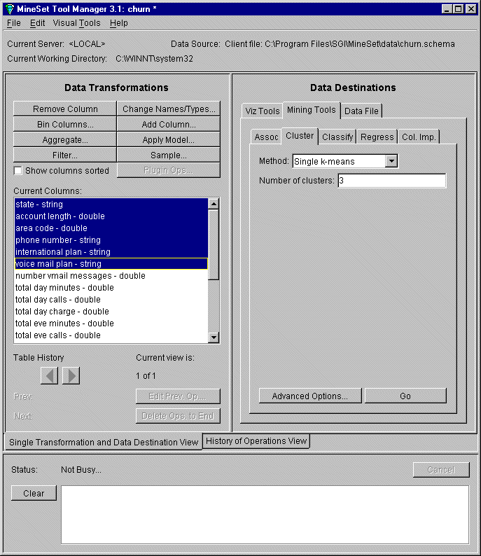
In the lower row of tabs, click the Cluster tab, and make the following selections:
Method: Single k-Means
Number of Clusters: 3
In the Data Transformations pane of Tool Manager, select and remove the following columns from the Current Columns pane by highlighting them and then clicking Remove Column (see Figure 4-1):
state
account length
area code
phone number
international plan (because it correlates to total intl charge)
voice mail plan (because it correlates to number vmail messages)
Multiple selections can be made using the Ctrl key.
The columns that are removed are those that are not likely to influence the clustering productively. The column “churned” is retained to help explain results. You can experiment with removing different columns as you explore the dataset further.
Click Advanced Options to set the weight of the attributes.
By default, the weight of each column is set to one (1), which means each column is given equal importance. Set the churned column to 0 for this example, to see if this attribute is generated spontaneously as the dataset is clustered. Click Set then OK.
Click Go on the right side of the Tool Manager window.
The Status window on the bottom of Tool Manager shows the progress of the clustering operation, as the algorithm selects significant characteristics by which to group the records. The model is saved as churn.cluster.
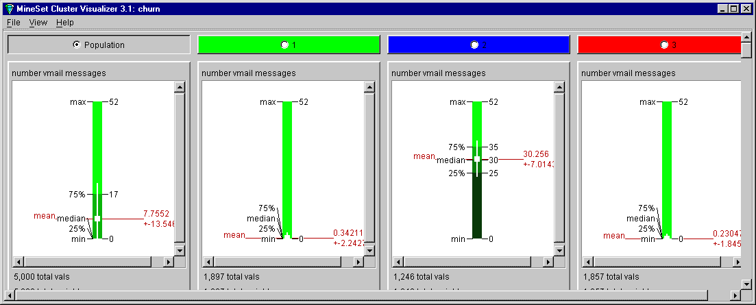
Figure 4-2 shows a partial view of the result of Cluster Visualizer. Adjust the window to see the full width of all the clusters.The columns are sorted by their power in discriminating how one cluster differs from another. Clearly the number of voice mail messages, total day minutes, and total day charge are the most important columns. Color and means are quite different between clusters at the top of columns, yet as you scroll down the display, the differences become minimal.
At the top of the display, click the circle next to the cluster number. This changes the attribute ordering, so that attributes important in discriminating this cluster from the others change order.
Choose File > Exit in the Cluster Visualizer window to close the window and return to the Tool Manager window.
With Cluster Visualizer you can look at independent attributes in a dataset, examine the most prominent, and see how each differs. However, to see how attributes relate to each other between clusters, Scatter Visualizer provides a clearer view. To apply the clustered model to Scatter Visualizer, you need to determine which columns should be mapped to the various axes.
In the Data Transformations pane of Tool Manager, click Apply Model and select churn.cluster from the list of available models. Click OK.
Although Cluster Visualizer indicated three columns as the most important, each cluster's order of importance was independent, with no indication of interactions between attributes. At this point, the Column Importance tool is useful.
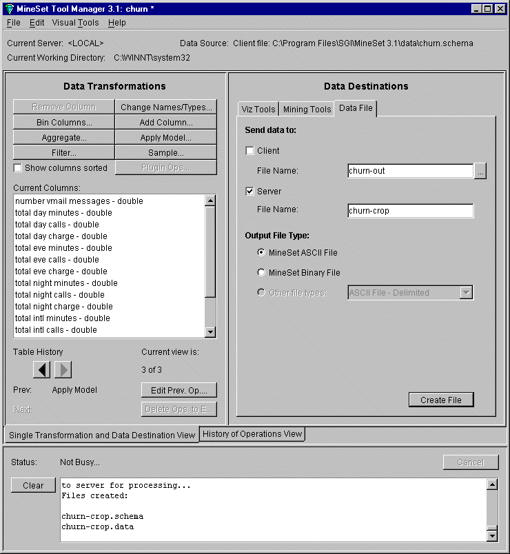
In the upper row of tabs in the Data Destinations pane, click the Data File tab, then click the Server checkbox. In the text field, type the filename churn-crop, and click Create File. This saves the abbreviated version of the churn dataset that is used later in this tutorial.
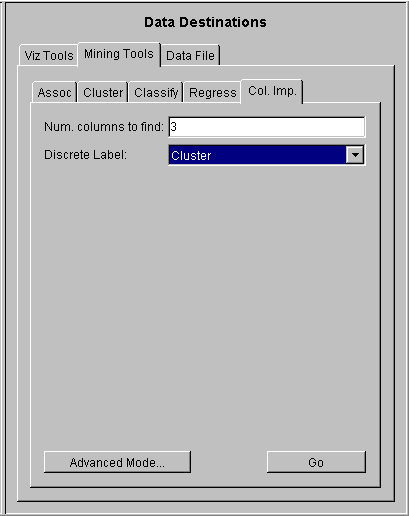
In the Data Destinations pane of Tool Manager, click the Mining Tools tab, then click the Col. Imp. tab (Column Importance). By default the tool selects the top three columns in terms of importance. The discrete label is Cluster.
Click Go.
The displayed panel that shows:
1. number vmail messages
2. total day minutes
3. total eve minutesThe status window shows that time spent on the phone during the day is a factor, with all other columns showing a correlation. The next step is to map these columns to axes in Scatter Visualizer.
In the upper row of tabs in the Data Destinations pane, click the Viz Tools tab; then from the lower row of tabs click the Scatter tab to access the Scatter Visualizer.
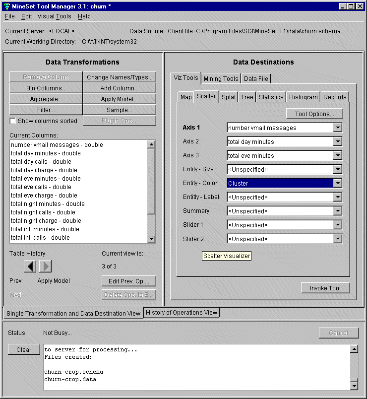
In the Data Destination pane, map these elements to the following columns using the pulldown menus (see Figure 4-5):
Axis 1 choose number vmail messages
Axis 2 choose total day minutes
Axis 3 choose total eve minutes
Entity-color choose Cluster (created when you applied the model)Click Invoke Tool.
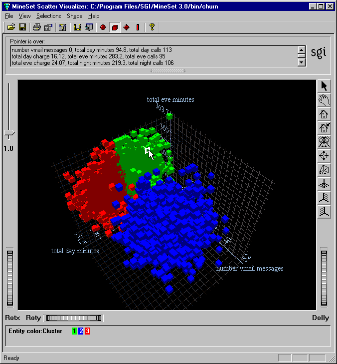
The Scatter Visualizer window in Figure 4-6 shows the clusters clearly differentiated in color. The blue scatter cubes represent cluster 2, and the flat pancake shape is split evenly between red and green—clusters 1 and 3. This pancake indicates very low numbers of voice mail messages. Clearly, total day minutes and total evening minutes are interdependent. If you click on an interesting visual point, the supporting data is displayed. Dismiss the Scatter Visualizer window and return to Tool Manager for the next step.
For this example, instead of using Scatter Visualizer to see your clustered data, you can visualize the same data as a Decision Table.
In the Tool Manager window, choose File > Open New Data File.
In the Open .schema file window, click the Server File button, and select churn-crop.schema. This is the file saved earlier. If you exited MineSet between sessions, you are automatically returned to where you left off. This can be set from the Tool Manager File > Preferences menu.
Click on the file and click Open.
In the upper row of tabs in the Data Destinations pane, click the Mining Tools tab.
In the lower row of tabs, click the Classify tab, and make the following selections from the pulldown menus:
Mode: Classifier & Error
Inducer: Decision Table
Discrete Label: churned
Make sure you have the correct discrete label. You are about to induce a decision table and allow the algorithm to suggest which columns are most important to map to the X and Y axes.
Verify the Suggest checkbox is checked, then click Go.
You can see columns being mapped to axes as the tool determines appropriate mappings. The Status window on the bottom of Tool Manager shows progress and summary information about the induction process, including the classification error rate. When the induction step is done, the Decision Table Visualizer is automatically invoked, showing the model visually. Manipulate the Dolly thumbwheel to enhance the display, or work with the mouse buttons for navigation— see Appendix A, “Navigating in the MineSet Visualizers.”
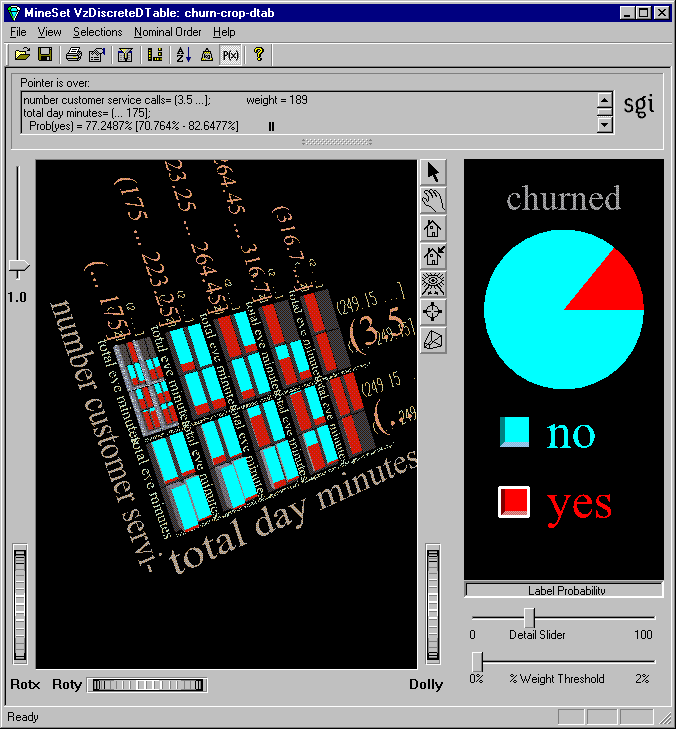
Figure 4-7 shows a round pie chart in the Label Probability pane, like Evidence Visualizer, indicating the overall percentage of churn. In the left pane, the data is shown as cake charts, that tell you, within this subset of the data, how much churn exists. Clearly, customers with high total day minutes always churn.
The Decision Table shows you data at different levels of detail, taking only a few columns into consideration at first, adding more detail as you examine further. Change the cursor mode from grasp to pick, and pass the cursor across the scene to display data above the window. Notice the bar that falls out of the expected pattern—total day minutes less than 175, and customer service calls over 3.5. Drill up and down using the mouse buttons, see Appendix A, “Navigating in the MineSet Visualizers.” Dismiss the display when you are finished examining the Decision Table, and return to Tool Manager.
Previously, you created models to predict which customers are likely to churn. Now that you have such a model, you may want to target customers who are likely to churn before they churn. The lift curve helps accomplish this goal.
A lift curve is a plot in which the X axis shows the number of records from 0 to 100% and the Y axis shows the number of records corresponding to customers who have a given label value (Churn=yes in this case). Two curves are shown on the graph in Figure 4-10. The lower curve or line (red) shows the number of customers expected to churn given a random ordering of the records. The upper curve (white) shows the percentage of customers who churn when placed in order according to the classifier's score (probability estimate) for each record. Records representing customers that the model identifies as most likely to churn appear first; those less likely to churn appear last. The advantage that the model ordering provides can be seen by the difference between the model's curve and the random curve.
In building this lift curve, a selected model is applied to the test set. In the example below, a specified segment of the dataset is used for training. Then the induced model is run on the remainder of the dataset. Although lift curves can be generated easily by selecting Lift Curve from the Advanced Options for classifiers, in this tutorial a more complex scenario is shown, one that involves sampling and application of a model to a dataset.
For this example, return to the Tool Manager base window, and begin a new history by using File > Open New Data File and returning to the local file churn.schema.
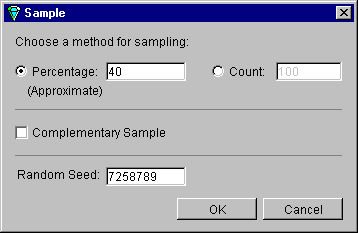
In the Data Transformations pane, click Sample. In the Sampling dialog box type 40 for the percentage of sampling, and click OK.
This choice simply samples a random 40% of the total dataset, from which the classifier is induced.
In the upper row of tabs in the Data Destinations pane, click the Mining Tools tab; then from the lower row of tabs click Classify and make the following selections from the pulldown menus:
Mode: Classifier only
Inducer: Decision Tree
Discrete Label: churned
You are inducing a decision tree classifier based on the random 40% sampling, and choosing “Classifier only” because this is the training set. The test set is the remainder of the dataset (excluding the 40% sampled records).
Click Go
The resulting decision tree demonstrates the model, which is required in the next stage. The root weight is substantially diminished, because the size of the sample is less than the complete dataset, and no color appears at the base of each node, indicating that no error estimation is available.
You can see in the status field that the classifier is automatically saved under the name churn-dt.class. The next step is to use this classifier on the remainder of the churn dataset.
Dismiss the Decision Tree window and return to the Tool Manager window. Because you have used the first 40% of the dataset to build the model, you have the remaining 60% to use as a test set.
In the Data Transformations pane click Edit Prev. Op. You are presented with the Sampling Dialog box again.
In the Sampling Dialog box, enter 40 in the Percentage text field again, but this time click the Complementary Sample box to indicate you want the other part of the sample.
Click OK.
Click the Apply Model button in the Data Transformations pane.
From the list of available models choose churn-dt.class. This is the Decision Tree model built on the churn dataset.
Click the Test Model tab in the lower part of the pane; turn on Show lift curve, and set the ROI/Lift label pulldown menu to yes.
Having built a classifier based on the random sample, you now apply it to the remainder of the churn dataset.
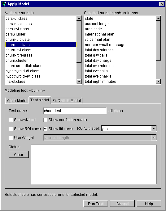
Click Run Test. The process takes some time. The resulting lift curve is shown in Figure 4-10, with the details of any selected point shown in the upper banner.
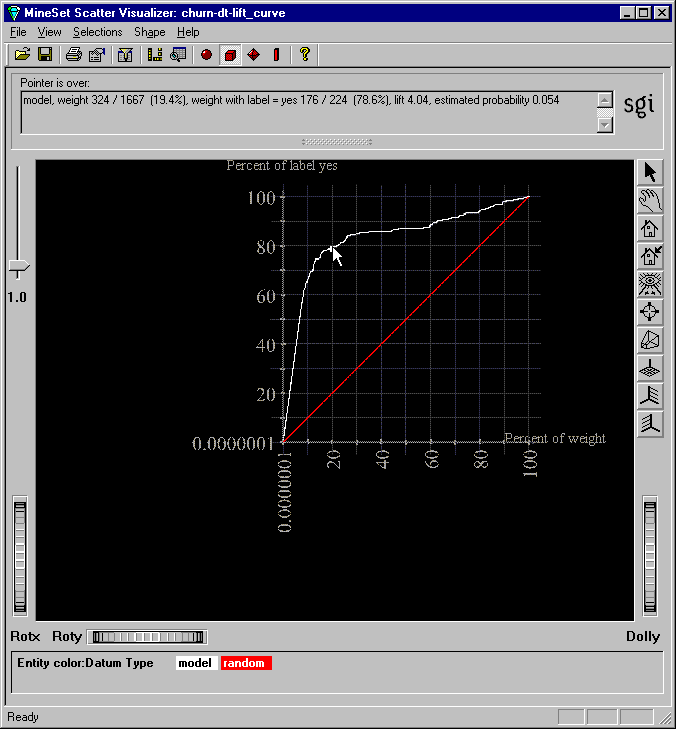
Move the pointer along the white (model) line, clicking at various points to see the lift and percentage of customers with churn=yes. Look for the knee of the curve, in this example where the estimated probability of the classifier is 0.054.
This is the point at which the return on investment of sending incentives to customers that may churn diminishes rapidly. The next step is to apply the classifier to the full dataset.
Return to the Apply Model dialog box; click the Apply Model tab, select churn-dt.class and make these selections:
Estimated probability values for label yes
New column name: p_churned (You must type this in.)
When you click Estimated probability values for label, yes is chosen to match the corresponding selection in the Test Model step. This process adds a new column representing the likelihood that certain people will churn (p_churned.) Click OK.
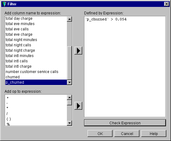
On the Data Transformations pane of Tool Manager click Filter; in the “Defined by Expression” text field create the expression p_churned > 0.054. Check expression before clicking OK.
This is the estimated probability figure retrieved from Step 7 shown in Figure 4-10. The intention is to select only those customers with the greatest likelihood of churning. In a real-life situation, this step would be executed against unlabeled data to predict which of the existing customers are likely to churn.
Finally, you can view the results in Record Viewer, eliminating unnecessary columns for easier reference, as detailed next.
In the Data Destinations pane of Tool Manager, click the Viz Tools tab, then click the Records tab. In the Data Transformations pane, select all columns except area code, phone number, and p_churned, then click the Remove Column button. Select multiple columns by pressing the Shift key for a range, or the Ctrl key for specific selections.
Click Invoke Tool.
The result is a useful phone list, shown in Figure 4-12, of those customers who have the greatest likelihood of churning based on the model.
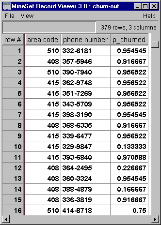
In Record Viewer, for every record there is a number estimating the probability that the customer will churn. Filtering has retained those customers with the highest numbers. That provides the list of only those potential churn customers to whom you should send incentives (for example, solicit by phone, send mail, and so forth). Dismiss the Record Viewer, and continue exploring the churn dataset.
You can reduce the cost of making mistakes in building the model using three important tools in MineSet: confusion matrix to give a detailed picture of errors and incorrect predictions, loss matrix to take into account that some mistakes are worse than others, and return-on-investment curve to show when investing more time or money is fruitless.
Return to the Tool Manager window, and reopen churn.schema.
In the Data Destinations pane, click the Mining Tools tab; then click the Classify tab and make the following selections from the pulldown menus:
Mode: Classifier & Error
Inducer: Decision Tree
Discrete Label: churned
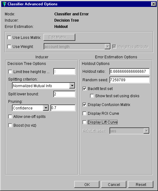
Click Advanced options and the Classifier options pane shown in Figure 4-13 appears.
In the process a message may appear that the attribute “phone_number” is being removed because it had more than 100 distinct values. Click OK and proceed.
Turn on Display Confusion Matrix and Backfit test set. Make sure Display Lift Curve and Display ROI Curve are turned off, then click OK.
In the Classify pane of the Tool Manager Data Destination pane click Go.
The Confusion Matrix displays where the classifier makes mistakes in classifying. Dismiss the Tree Visualizer and examine the Confusion Matrix. From this, you can construct a Loss Matrix based on what you now know about the data, to make some errors less tolerable than others.
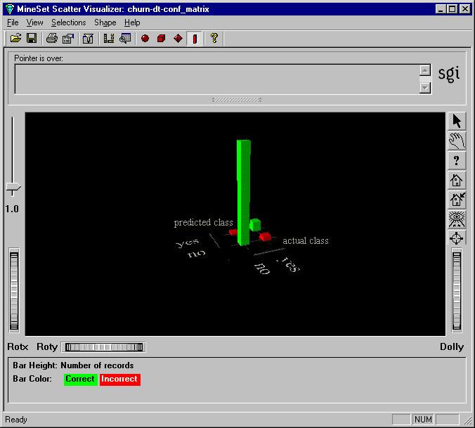
In the window shown in Figure 4-14, the two green bars (one tall and one short) represent correct classifications. The two red bars represent misclassifications. Substantial misclassification occurs in the category represented by the larger of the two red bars —”predicted class: no, actual class: yes.” These customers were predicted not to churn, but actually did so, a costly mistake even at 4.7% (to see the percentages, choose Selections > Show values). You can try to reduce that error by constructing a Loss Matrix based on what you now know about the data, and weight the errors represented by this particular red bar more heavily.
The purpose of constructing a Loss Matrix is to control which errors the classifier will favor and which it will avoid.
Dismiss the Confusion Matrix display with File > Exit and return to the Tool Manager window.
Click Advanced options to return to the Classifier options pane.
In the Classifier Advanced Options dialog box, turn on Use Loss Matrix.
Click Edit Matrix to weight the cost of making errors. A Loss Matrix pane similar to that shown in Figure 4-15 appears.
Set the following values across the rows of the Loss Matrix, reading from left to right:
Actual Values: no: 10—0—3
Actual Values: yes: 10—10—(-10)
The value in the column under the question mark should be somewhat high, to prevent the classifier from predicting “unknown.”

Using these values, if you predict a customer will not churn, and you are correct, you neither win nor lose (represented by zero). If you predict a customer will not churn (and therefore fail to send them any incentives), and they do churn, you incur a loss of 10 (represented by positive 10, since the numbers represent loss). If you incorrectly predict a customer will churn, and they do not, you lose three, representing the cost of sending a mailing unnecessarily. If your mailing program works, and you retain some of the customers who would have churned, you gain 10 (represented by minus 10). Your next step is to investigate the return on your investment.
The Return on Investment curve lets you see the cost of making certain kinds of errors, and indicates to you the point at which it is no longer fruitful to continue taking action
Make sure Backfit test set, Display Confusion Matrix, and Use Loss Matrix are turned on in the Classifier Advanced options pane.
Ensure Display ROI Curve also is checked on.
Ensure ROI/Lift label is set to yes and click OK.
Click Go in the Classify pane of the Tool Manager window.
Three display windows appear; the Decision Tree and Confusion Matrix, and the ROI Curve. The Confusion Matrix shows the classifier is more conservative in making churn=no predictions, thus reducing false negatives. The errors on one side have been increased, but those on the other have been decreased. Dismiss both the Confusion Matrix and the Decision Tree display, and examine the ROI curve window.
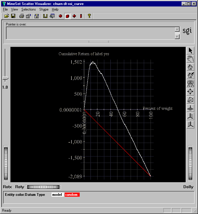
The ROI curve shown in Figure 4-16 bears a marked resemblance to a lift curve. The horizontal line across the middle represents zero profit and loss. The red line represents the expected performance if you were to take a random sample of the population and send them mail. You expect a loss if you mail to everyone, because of the cost of mailing. However, there is a point of optimum return on investment, represented by the knee of the curve, at 1488 or 12.6% of the population.
See the MineSet Enterprise Edition User's Guide , the MineSet Enterprise Edition Reference Guide, and the MineSet Enterprise Edition Interface Guide for descriptions of these tools and what the analytical data mining algorithms can show. The manual is online and can be launched by selecting Help > MineSet User's Guide.
This tutorial has only been a brief introduction to the MineSet tool suite. Other aspects covered in the MineSet User's Guide include:
Scatter Visualizer.
Tree Visualizer for visualizing hierarchies.
Option Tree Inducer and Classifier.
Association Rules Generator and Visualizer.
Regression, to allow you to predict a continuous value instead of discrete.
Transformations, including binning, distribution, and indexing of arrays.
Record weighting, which allows assigning different weights to different records, because some records are more important than others (for example, highly profitable customers).
Learning Curve, which can help you determine whether sampling can be done on your dataset to speed up the knowledge discovery process, without losing much of the accuracy of the induced classifiers.
Many tool options, including color manipulation, message boxes.
Animation sliders for visual tools.
Batch processing. The program mineset_batch can be used to execute operations non-interactively. This is useful if a job needs to run regularly (for example, once a night).
Error estimation using advanced techniques such as cross-validation.
Also described in the MineSet User's Guide are the technical details of file and data manipulation.
 | Note: Data mining algorithms find correlations that may not be causal. A well-known discovery is the strong correlation between shoe size and reading ability: the larger one's shoe size, the better the reading ability. This correlation, while true, is not causal; both shoe size and reading ability improve with age (as children get older, their shoe size and ability to read both increase.) You are cautioned against attributing causality to discovered correlations. Wearing larger shoes is unlikely to increase your reading ability. |