This chapter steps you through a possible knowledge discovery process using the churn dataset provided with MineSet. It is assumed that MineSet is installed on the system you use, together with all the sample files. Each step is explained in detail. Unless otherwise noted, each step builds on the step before. These steps are:
 | Note: In order for the examples in this book to display properly, the color palette on your display must be set to True Color. To set this, choose Start > Settings > Control Panel. When the Control Panel directory displays, double-click on the Display icon. In the resulting dialog box, choose True Color from the Color Palette drop down menu. |
The churn dataset deals with telecommunications customers—people who use the phone regularly. Customers have a choice of carriers, or companies providing them with telephone service. When these customers change carriers they are said to “churn,” which results in a loss of revenue for the previous carrier. A telecommunications company is likely to have a database of call records containing call information (source, destination, date, duration), a billing database, a customer database, and a customer service database. Relevant information about the customer appears in all these databases. This information, when combined, yields a set of customer signatures. The churn dataset provided with MineSet is such a set; the step of identifying the data and creating customer signatures into records has already been done. This dataset, which is used in the rest of the chapter, contains one record per customer.
Start MineSet by choosing Start > Programs > MineSet Enterprise Edition > MineSet, or double-click the MineSet icon on your desktop.
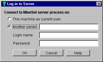
If the “Log in to Server” dialog box (Figure 3-1) does not come up by default, choose File >Connect to Server. In the resulting dialog box, click “This machine as current user,” if you wish to use your current system as both client and server. If you wish to use another system as a server, type in the server name, your login name, and your password (if any).
Click OK. If you have previously logged in to MineSet, you may be presented with a restored session. For the purposes of this tutorial, you must open a new file (step 4).
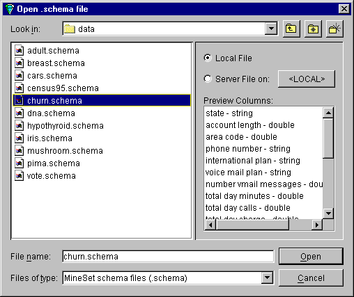
In the Tool Manager window, choose File > Open New Data File. If the resulting dialog box does not show the data directory, go to the directory where MineSet was installed, in which the default is MineSet > data.
Select churn.schema. A series of entries appears in the right-hand Preview Columns pane as shown in Figure 3-2.
Click Open.
This gives you access to a dataset of telecommunications customers. The next time you run MineSet, you will be automatically returned to this position (or wherever you were when you last exited MineSet), and any option selections you made will be saved.
You can see the records in spreadsheet form, after bringing up MineSet Tool Manager, by following these steps:
In the upper row of tabs in the Data Destinations pane of the Tool Manager, click the Viz Tools tab; then in the lower row of tabs, click Records to access the Record Viewer tab.
The churn dataset used in the rest of the chapter contains one record per customer. The Data Transformations pane on the left side of Tool Manager lists columns with their type: state (string), account length (double), and so forth. Columns are defined as double or float if they are numbers, or string if they are made up of characters.
Click Invoke Tool at the lower right.
The data appears as a spreadsheet. The columns and their meanings are shown in Table 3-1.
Table 3-1. Details of Columns Shown for churn Dataset by MineSet Record Viewer
Column name | Value |
|---|---|
state | Two-letter abbreviation for the customer's U.S. state of residence |
account length | Numerical value indicating the number of months the customer has been with the long-distance carrier |
area code | Three-digit telephone company designations |
phone number | Three+four-digit telephone company designations |
international plan | Special pricing package for international calls, expressed as a yes/no value |
voice mail plan | Special pricing package for customers with voice mail provided by the carrier, expressed as a yes/no value |
number of voice mail messages | Average number of voice mail messages per day |
total day minutes | Average number of minutes charged at the carrier's day, evening, night, or international rate |
total day calls | Average number of calls made during the carrier's day, evening, night, or international hours |
total day charge | Average amount charged at the carrier's day, evening, night, or international rate |
number customer service calls | Number of calls this customer made to carrier customer support in the last six months |
churned | Whether this customer changed long-distance carriers in the last six months, expressed as a yes/no value |
Close the Record Viewer window. You should see the Tool Manager window again, still using the churn data source.
In the Data Destination pane of the Tool Manager window, the Viz Tools tab should still be displayed; in the lower row of tabs, click the Statistics tab.
Click Invoke Tool.
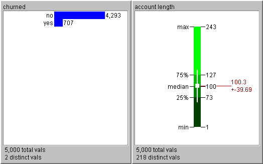
The Statistics Visualizer display appears consisting of a number of histograms and box plots. The histograms show the distribution of values for discrete variables, and the box plots show summary statistics for continuous variables.
Each box plot (on the right in Figure 3-3) shows statistics about data from a single column, including the minimum, maximum, mean (in red), median, and two out of four quartiles (25th and 75th percentiles). These values are marked as lines, and the standard deviation (in red) is shown after the +/- sign.
The mean is the number found by adding the data in a column, then dividing by the number of records. The median is the middle number when numbers in a given column are arranged in order of size. The standard deviation is a measure of the dispersion of the data in a column.
The histograms consist of specific discrete values: state names or yes/no values. Scroll down to find the churned histogram in the display (see Figure 3-3, left). It shows that 707 customers out of 5,000 have left the carrier. The churned column is important throughout this tutorial.
Close the Statistics Visualizer window and return to the Tool Manager window.
You are now ready to perform analytical data mining. Verify that MineSet is connected to the appropriate server, and that the data source is churn.schema. If you exited MineSet between sessions, the history file automatically returns to where you left off.
In the Data Transformations pane of the Tool Manager, delete the following columns. Click a column, then press and hold the Ctrl key to gather the rest. Then click the Remove Column button.
phone number
total day minutes
total day calls
total eve minutes
total eve calls
total night minutes
total night calls
total intl minutes
total intl callsThe phone number column has no predictive value. The total minutes and total calls columns correlate with the total charge columns and add little extra information. Removing these columns shortens processing time for inducing the model and produces a more succinct visualization.
In the upper row of tabs in the Data Destinations pane of the Tool Manager window, click the Mining Tools tab.
In the lower row of tabs click the Classify tab, and make selections from these pulldown menus:
Mode: Classifier & Error
Inducer: Evidence
Discrete Label: churned
You are about to induce an evidence classifier to help characterize the customers who are likely to churn. The default mode, Classifier & Error, uses a holdout method on the data, inducing the classifier from two-thirds of the data and leaving the remainder as a test set to estimate the error rate.
Click Go
As the inducer reads the data you may be warned that the column “state” will be removed because it has too many unique values. If this happens, go to the Tool Manager File > Preferences menu and change the default maximum attribute values to 100.
The Status window on the bottom of Tool Manager shows progress and summary information about the induction process, including the estimated error rate of 11.40% plus or minus .78%. When the induction step is done, the Evidence Visualizer is automatically invoked, showing the model visually (Figure 3-4).

The Evidence Visualizer sorts the columns by discriminating power for the label “churned,” starting from the top. To adjust the view quickly, use the Dolly thumbwheel. For this tutorial both the square cake charts in the left pane and the pie charts in the right pane are termed “charts.”
The Label Probability pane (on the right side in Figure 3-4) shows a pie chart representing prior probability. Prior probability means the probability of a random record having a churn value of “yes” (red wedge) or “no” (blue wedge), without taking into account any of the attribute values. Mathematically, this is the number of records with the class label, divided by the total number of records.
In the Evidence pane (on the left in Figure 3-4), the columns in the dataset are represented by charts, each one with a value or range of values for that attribute. Switch the cursor mode from grasp (hand) to pick (arrow), and click on the box titled Evidence. The cake charts show conditional probability, that is, the probability that a customer with the particular attribute value represented by the pie chart (for instance a “yes” value in the “voice mail plan” column) have a churn value “yes.”
Click on a chart to update the right pane to show the expected probability according to the model.
Navigate using the thumbwheels at the screen's border, or use the mouse buttons and Ctrl key in various combinations. See Appendix A, “Navigating in the MineSet Visualizers,” for more details about navigation controls.
You can see the factors that affect churning, because the slice representing churn increases from left to right on the first and second rows in Figure 3-4, so a serious problem is evident. Customers that use the company's service the most also churn at a higher rate. The company is losing its most valuable customers.
To find out about a class label (for example, a churn value of “yes”), select a value in the Label Probability pane on the right. Click on the button by the label “yes” in the right pane, and the evidence is shown as bars. Pointing to bars will show you the estimated probabilities.
The discriminating attributes shown here also can be used to choose axes for a scatterplot visualization. The state attribute, shown relatively high on the list of attributes, hints at a possible geographical relationship.
Evidence models use and show attributes independently; however in many datasets attributes are not independent, and a set of attributes, considered in combination, is better for determining the label. The error estimation in the Tool Manager status window shows that the classifier expects about an 12% error rate. Later we generate a decision tree that is more accurate. Close the Evidence Visualizer before moving on to work with the Splat Visualizer.
The Splat Visualizer requires that the column mapped to color must have a numerical value. The churned column is a string that must be converted to a number (p_churned, indicating the probability of churning), before mapping it in Splat Visualizer:
In the upper row of tabs in the Data Destinations pane, click the Viz Tools tab; then, in the lower row of tabs, click the Splat tab to access the Splat Visualizer.
In the Data Transformations pane, click Add Column.
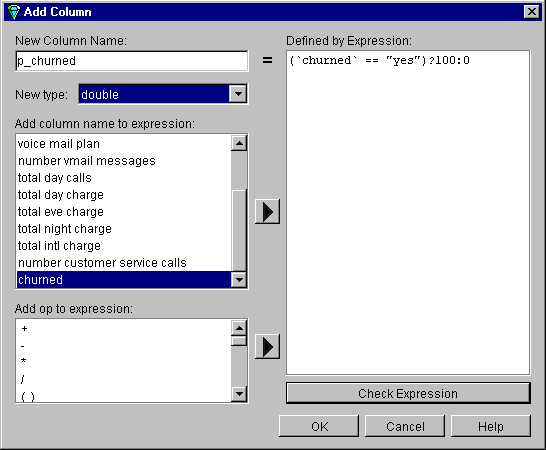
In the Add Column dialog box (Figure 3-5), in the New Column Name text field, enter the new name, p_churned. The intention is to make a column of numbers, based on the churned column.
In the Defined by Expression text field, create the expression (`churned` == ”yes”) ? 100 : 0. You can create this expression from the two scrolling lists on the left: “Add column name to expression” and “Add op to expression,” or you can type it in directly. This expression translates to “if the value in the churned column is “yes,” give p_churned a value of 100, otherwise give it a value of 0.” The purpose of this is to translate a string (yes or no) into a numerical value. Verify that the “New type” text field is set to double.
Click Check Expression to ensure there are no syntax errors. Click OK to dismiss the dialog box and OK to add the column.
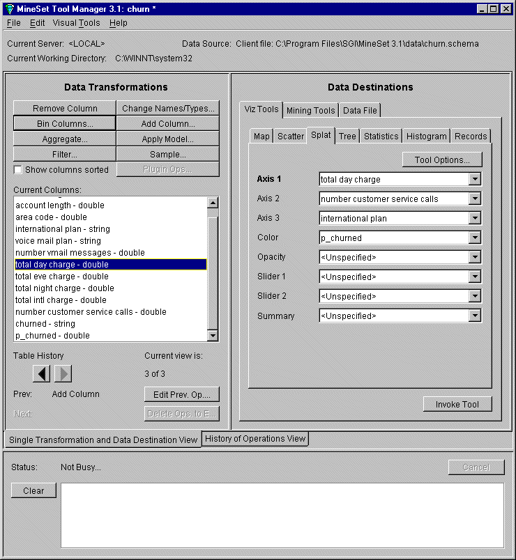
In the Data Transformations pane, under the Splat tab, map columns to the visual elements by selecting a column in the pulldown menu next to each element. For this tutorial, from the pulldown menu:
for Axis 1 choose “total day charge”
for Axis 2 choose “number customer service calls”
for Axis 3 choose “international plan”
for Color choose “p_churned,” so the result is similar to Figure 3-6.
Note: The Data Source listed in the Tool Manager window will reflect the directory in which you installed the data files.
Click Invoke Tool.
The data is plotted on the Splat Visualizer window, shown in Figure 3-7. The slider bar in the upper left varies the color density. See Appendix A, “Navigating in the MineSet Visualizers,” for help on window manipulation. To navigate in the scene and examine different areas, click and hold both left and right mouse buttons, and move the cursor across the scene. Splat Visualizer allows you to analyze complex data by viewing the varying behavior in several dimensions.
You can save the current state of the Tool Manager including special options by choosing File > Save Current Session As, and specifying churn1.mineset.
In the visualization shown
ability of churn occurs in two places: in the yellow to red areas when total day charge is high, shown in the bottom of this figure; and when the total day charge is low and customer service calls are high (near the upper left of this figure). Low-paying customers who make many customer service calls leave. These are customers you may not want to keep, because they cost you money and bring little reward. The high-paying customers at the bottom of the figure are a better target.
Close the Splat Visualizer and return to the Tool Manager Window.

As shown in Figure 3-4, the Evidence model indicated that state was a good discriminating attribute. If your model does not show this, you may have failed to change the maximum values as described in Step 4 of “Building an Evidence Classifier”. This section builds on previous computations to display data geographically to illustrate how churn varies by state.
You have already added the column (p_churned) from existing columns in the dataset. You can now transform the data into a smaller dataset that contains the average churn per state. Such a transformation is called aggregation.
In the Data Transformations pane of the Tool Manager window, click Aggregate.
In the Aggregate dialog box move p_churned into the left column (highlight it and click the left arrow). Highlight p_churned in the new window, check Average and Count on, and ensure Sum, Min, and Max are unchecked. Leave state in the central column and move all the rest to the right column. (Hold down the Ctrl key to gather multiple columns.) Make sure your screen looks like Figure 3-8. Click OK to apply your choices.
In the upper row of tabs in the Data Destinations pane, click the Viz Tools tab, then the Records tab. Click Invoke Tool to see a record for each state, with the average churning customers and the total number of customers who churned for that state.
Close the Record Viewer window and return to the Tool Manager window. You will now link this data to a map of the United States.
From the lower row of tabs in the Tool Manager Data Destination pane, click the Map Visualizer tab. Then click the Tool Options button. The Map Visualizer Options dialog box appears (Figure 3-9).
Click the button to the right of the Entities File text field. From there, navigate to the directory where MineSet was installed and choose config > mapviz > gfx_files>usa.state.hierarchy.
Click Open to retrieve that file, and OK to dismiss the Map Visualizer Options panel.
The next step is to link the visual elements to the columns.
Map the current columns in the Data Transformations pane to elements in the Data Destinations pane by doing the following (see Figure 3-10). From the pulldown menus next to the visual elements:
Entity-Bars choose state
Height-Bars choose count_p_churned
Color-Bars choose avg_p_churned.
Click Invoke Tool to view the map distribution of churned customers according to state (Figure 3-11).


The visualization shows the distribution of churned customers across the United States. For each state, the color indicates the probability of churn and the height indicates the number of customers in that state. For example, in Figure 3-11, Maine is chosen, showing an average churn rate of 18.4466%, but based on the churn count of 103. In other words, the average is based on only 103 customers. West Virginia shows the greatest height, with a probability of churn based on 158 customers. States showing the clearest, brightest colors calculate an average churn rate over 21% (Texas, Montana, Washington, California, and New Jersey). This visualization indicates that there is no obvious relationship between churn and geography, although different states do have different churn rates.

Close Map Visualizer using File > Exit. The next example explores the Decision Tree classifier, using the same dataset to produce a different visualization.
Unlike the Evidence classifier, the Decision Tree classifier can show attribute interactions, that is, combinations of attribute values that affect the classification. For this section, begin using the history mode. Follow these steps to build a decision tree classifier and visualize it.
Switch to history mode by clicking on the History of Operations View tab at the bottom of the Tool Manager Data Destinations panel.
Delete the Aggregate operation and then the Add Column operation from the history by right clicking on them and selecting delete.
Switch back to Single Transformation and Data Destination View. You should now be at “Current view is: 2 of 2.”
In the upper row of tabs in the Data Destinations panel, click the Mining Tools tab.
In the lower row of tabs, click the Classify tab, and make selections the following selections from the pulldown menus:
Mode: Classifier & Error
Inducer: Decision Tree
Discrete Label: churned
Click Go.
MineSet classifies and creates the Decision Tree model as shown in Figure 3-12. The estimated error rate is significantly improved (6.36% +/-0.60%) over the Evidence Visualizer in Figure 3-4, confirming the earlier hypothesis that interactions between attributes are significant. In Figure 3-12, every node in the decision tree has two bars, one for each label value. Pointing to a bar shows the record count and percentage for that label value. The base of every node indicates the number of records that reach it, and a color, and the estimated error rate for the subtree (see legend on bottom of the visualization).
In this example the root of the decision tree is total day charge, indicating that this is the single most important factor—how much money the customers spent on daytime calls, with a dividing threshold of 44.96.

You can fly through the Tree Visualizer landscape using the Dolly wheel or mouse button combinations. (See Appendix A, “Navigating in the MineSet Visualizers,” for more navigation information). By selecting the red bar (churned: yes) at the root, the right you can see that 14.14% of the customers churn. Click the right line (total day charge > $44.96) to move to the child node, which contains customers who spend the most on daytime calls. Of these customers, 59.31% churn. Again click either branch line to move to the next node, which shows those customers who spend the most on daytime calls and may or may not have a voice mail plan. Of these customers, those with voice mail churn at the much lower rate of 9.33%. Perhaps offering voice mail to customers can help reduce churning.
It is important to understand that this tree was automatically induced from the data. The attributes chosen for nodes and the thresholds are determined by the process of induction.
To drill through and see the original data, select a node base or a bar and choose Selections > Drill Through > Show original data in record viewer, then click Send Request. This shows the records matching the node you selected.
If you would like to explore MineSet further, and discover more about applying a classifier, continue to the next chapter, Chapter 4, “Further Explorations.”