This Addendum is designed to be used with the MineSet 2.5 Tutorial . The Tutorial has not been modified for the 2.6 release, so this Addendum describes any pertinent changes. The hard copy of this Addendum provides all screen shots in black and white. The online version, however, provides these visuals in full, original color. Thus, if you have difficulty in seeing a particular screen shot, go to the respective page of the online version for greater clarity.
If you want to use the Tech Pubs Library or IRIS InSight search engine to find information, search both this Addendum and the Tutorial to ensure you find everything.
This Addendum contains the following sections:
In the section describing the Evidence Visualizer window on page 20 of the Tutorial, the paragraph describing mouse action should be changed, and further clarification added:
Use the thumbwheels at the screen's border to dolly back and forth, and tilt either the X or Y axis to get a closer view of any chart. In grasp mode, the middle mouse button moves your view in the display. In pick mode, select multiple charts by holding down the Shift key and pressing the LEFT mouse button.
Selecting multiple charts in the same row causes the pie in the right display to show the expected probability distribution given any of the selected attribute values. Selecting multiple charts in different rows gives the expected probability distribution given the combination of the selected attribute values. Note that probabilities based on multiple selections are computed from the model, and not from the data itself.
The new Record Viewer has a slightly different appearance, and provides extra functions. Please replace Figure 4-12 on page 48 of the Tutorial and the subsequent text with the following figure:
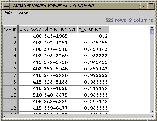
Then refer to Figure 3-1 in Chapter 3 in the MineSet User's Guide Addendum, and the subsequent text should you wish to sort records, filter data, and renumber columns.
The Confusion Matrix displays differently now, so please replace Figure 4-14 on page 51 in the Tutorial and the subsequent text with the following:
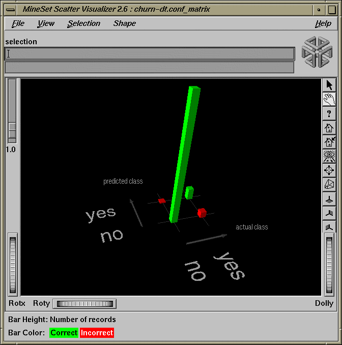
In the window shown in Figure 2, the two green bars (one tall and one short) represent correct classifications. The two red bars represent misclassifications. Substantial misclassification occurs in the category represented by the larger of the two red bars —Predicted Class: no, Actual Class: yes. These customers were predicted not to churn, but actually did so, a costly mistake even at 4.6%. You can try to reduce that error by constructing a Loss Matrix based on what you now know about the data, and weight the errors represented by this particular red bar more heavily.