This chapter discusses the features and capabilities of the Map Visualizer. It provides an overview of this database visualization tool, then explains the Map Visualizer's functionality when working with the follwing elements:
main window
viewing modes
external controls
pulldown menus
Finally, it lists and describes the sample files provided for this tool.
The Map Visualizer is a graphical interface that displays data as a three-dimensional “landscape” of arbitrarily specified and positioned “bar chart” shapes. This tool displays quantitative and relational characteristics of your geographically oriented data.
Data items are associated with graphical “bar chart” objects in the visual landscape. However, the objects have recognizable geographical shapes and positions. The landscape can consist of a collection of these geographical objects, each with individual heights and colors (see Figure 5-1). You can dynamically navigate through this landscape by

The landscape can also consist of a flat plane of these geographical objects drawn as simple outlines, with “bar chart” cylinders placed at specific locations (see Figure 5-2).

Another landscape possibility is lines with endpoints at specific point locations, all with individual widths and colors (see Figure 5-3). Lines have width and color properties, instead of the height and color properties of the arbitrarily shaped objects and cylinders.

The Map Visualizer requires the following files:
A data file consisting of rows and tab-separated fields. Typically, the Tool Manager creates this file (see Chapter 3). You can also generate this file without using the Tool Manager (for the required file format, see Appendix B, “Creating Data, Configuration, Hierarchy, and GFX Files for the Map Visualizer”).
Data files are the result of extracting raw data from a source (such as an Oracle, INFORMIX, or Sybase database) and formatting it specifically for use by the Map Visualizer. Data files have user-defined extensions (the sample files provided with the Map Visualizer have a .data extension).
A gfx file consisting of a description of the shapes and locations of the 1-, 2-, or 3-dimensional objects to be displayed.
Gfx files must have a .gfx extension. MineSet includes various .gfx files, including the United States to the granularity of counties, telephone area codes, and postal zip codes, as well as Canada to the granularity of provinces. You can also manually generate .gfx files (see Appendix B, “Creating Data, Configuration, Hierarchy, and GFX Files for the Map Visualizer” for the required file format).
A hierarchy file consisting of a description of
the column names of the various graphical objects to be displayed
the filenames of the .gfx files that describe the locations and shapes of the graphical objects
an optional description of the hierarchical relationship of the graphical objects, which is used for the drill-down and drill-up functions.
Hierarchy files enable drill down and drill up. This means that information associated with objects at one level can be aggregated (or, conversely, shown in greater detail) and displayed at a different level. For example, a hierarchy file defining the relationships between states and regions comprising multiple states allows values such as population levels to be displayed at both the individual state level as well as at regional levels. The gfx_files/usa.states.gfx file, for example, describes the shapes of the 50 United States; the gfx_files/usa.states.hierarchy file describes the hierarchy grouping individual states into regions, regions into East-West areas, and the East-West areas into an aggregated United States.
For more information, see Appendix B, “Creating Data, Configuration, Hierarchy, and GFX Files for the Map Visualizer.”
A configuration file describing the format of the input data and how these are to be displayed. Typically, this file is created using the Tool Manager (see Chapter 3). You also can use an editor (such as jot, vi, or Emacs) to produce this file without using the Tool Manager (see Appendix B, “Creating Data, Configuration, Hierarchy, and GFX Files for the Map Visualizer”).
Configuration files should have a .mapviz extension. If they do not, they are not listed when selecting the Open option from the File pulldown menu. When starting the Map Visualizer, or when opening a file, specify the configuration file, not the data file.
There are five ways to start the Map Visualizer:
Use the Tool Manager to configure and start the Map Visualizer. See Chapter 3 first for details on most of the Tool Manager's functionality, which is common to all MineSet tools; see below for details about using the Tool Manager in conjunction with the Map Visualizer.
Double-click the Map Visualizer icon, which is in the MineSet page of the icon catalog. The icon is labeled mapviz. Since no configuration file is specified, the start-up screen requires you to select one by using File > Open.
Starting the Map Visualizer without specifying a configuration file causes the main window to show the copyright notice for this tool. Only the File and Help pulldown menus can be used. For the main window to be fully functional, open a configuration file by selecting File > Open (Figure 5-4).
If you know what configuration file you want to use, double-click the icon for that configuration file. This starts the Map Visualizer and automatically loads the configuration file you specified. This only works if the configuration filename ends in .mapviz (which is always the case for configuration files created for the Map Visualizer using the Tool Manager).
Drag the configuration file icon onto the Map Visualizer icon. This starts the Map Visualizer and automatically loads the configuration file you specified. This works even if the configuration filename does not end in .mapviz.
Start the Map Visualizer from the UNIX shell command line by entering this command at the prompt:
mapviz [ configFile ]
where configFile is optional and specifies the name of the configuration file to use. If you don't specify a configuration file, you must use File > Open to specify one (see Figure 5-4).

This section describes how the Map Visualizer can be configured using the Tool Manager. Although the Tool Manager greatly simplifies the task of configuring the Map Visualizer, you can construct a configuration file manually for this tool using a text editor (see Appendix B, “Creating Data, Configuration, Hierarchy, and GFX Files for the Map Visualizer”).
Note that the steps required to connect to a data source are described in Chapter 3.
To use the Map Visualizer, you must provide the application with two files that define the graphical objects to be displayed:
One or more .gfx files, which define the shapes of the graphical objects displayed.
A.hierarchy file, which describes the relationship of multiple, interrelated map (.gfx) files.
These files are not created by the Tool Manager; they must already exist as part of MineSet (residing in the /usr/lib/MineSet/mapviz/gfx_files directory), or they must be created by the user. For instructions on their creation, see Appendix B, “Creating Data, Configuration, Hierarchy, and GFX Files for the Map Visualizer.”
The .gfx and .hierarchy files that are part of the MineSet package include
the individual states of the United States
the individual counties of the United States
the individual five-digit ZIP codesof the United States
the telephone area codes of the United States
the individual provinces and territories of Canada
the individual states of Mexico
the individual states and territories of Australia
the individual countries of Western and Central Europe
regional subdivisions of both France and The Netherlands
The Map Visualizer requires a data file with
One column indicating geographical objects (for example, states). Each row in this column must indicate a unique geographical object (staying with the example, this means one row for each state).
At least one column with numeric values mapped (using arithmetic expressions) to the heights and/or colors of each geographic bar. These columns can be scalar, a 1D array, or a 2D array. If the column is an array, a slider must be used to select specific data points for this mapping to heights and colors.
If both heights and colors are mapped to 1D or 2D arrays, the arrays must have the same indexes (see Appendix B, “Creating Data, Configuration, Hierarchy, and GFX Files for the Map Visualizer”).
Select the Viz Tools tab in the Data Destination panel of the Tool Manager's main screen (Figure 5-5). From the popup list of tools, select Map Visualizer. The mapping requirements for the Map Visualizer are displayed in the window on the right side of this panel. Items in the Visual Elements list that are preceded by an asterisk are optional.
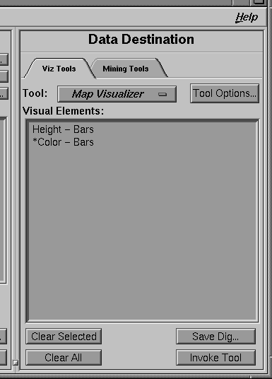
Height - Bars—This key lets you specify the heights of the geographic bars on the map.
*Color - Bars—This optional key lets you assign the colors of the geographic bars. See “Color Options for the MineSet Visualizers” in Chapter 3 for a more detailed explanation of how to choose and change colors.
A column in the Current Columns window should be mapped to the Visual Element Height - Bars by clicking the column first, then Height - Bars. Optionally, another column (perhaps even the same column) can be mapped to the Visual Element *Color - Bars.
To undo a mapping, select the mapping in the Requirements: window, then click the Clear Selected button. To undo all mappings, click the Clear All button.
Clicking the Tool Options button causes a new dialog box to be displayed (Figure 5-6). This lets you change some of the Map Visualizer options from their default values.
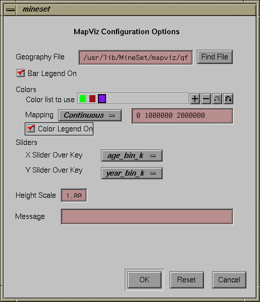
The following sections describe the buttons and fields of the Map Visualizer's Options dialog box.
This option lets you specify a .hierarchy file to be used for the representation of the geographical objects in the Map Visualizer's main window.
The Find File button lets you browse your files to find the .hierarchy file to be used.
Note that the Geography File field is optional. If not supplied, the Map Visualizer expects the first column in the Current Columns window to be a string column, and presumes that that column contains the names of various geographical objects. Since no specific description of the size and shape of these geographical objects is identified, the Map Visualizer displays these objects as simple rectangles, arbitrarily sized and placed in the main viewing window.
The Bar Legend On button lets you determine whether a legend that describes the graphical object heights is displayed or hidden.
To use these Colors options, you must have mapped a column to the *Color - Bars requirement of the Data Destination panel. See “Color Options for the MineSet Visualizers” in Chapter 3 for a more detailed explanation of how to choose and change colors.
Color list to use—You can specify the color list using the + button next to the color list label. This brings up a color editor that lets you specify a color to be added to the list.
Mapping—You can specify whether the color change that is shown in the graphic display is Continuous or Discrete. If you choose Continuous, the color values shift gradually between the colors entered in the “Color list to use” field as a function of the values that are mapped to those colors in the “Mapping” field.
The field to the right of the popup button lets you enter specific values to which the colors are mapped. You must have the same number of values in this field as there are colors entered in the “Color list to use” field.
If you
used the Color Browser to choose gray and red
selected Discrete for the Mapping
entered the values 0 150000
then the display shows the population of the United States across the time period 1770-1990. States with more than 150,000 square miles are shown in red, the rest are in gray.
If you
used the Color Browser to choose gray and red
selected Continuous for the Mapping
entered the values 0 300000
then the display shows the population of the United States across the same time period. The states' colors vary from gray to red, depending on their size; the largest states are shown with the greatest density of red.
You can enter as many colors into this field as you think are necessary for your display. If the number of values in the column that maps to *Color - Bars exceeds the number of distinct colors you have chosen, the Map Visualizer adds an appropriate number of randomly chosen colors at runtime.
If an array of values are mapped to the height or color requirements, you must specify an X or Y slider. If the array is a 2D array, you must specify a Y slider. The popup buttons next to these options provide a list of available array keys over which the sliders operate. If both the X and Y sliders have None selected as their key, the resulting display does not include animation.
This field lets you enter a value by which the height values are scaled in the display. Normally, the height variable is mapped directly to the height of the graphical objects, so that the tallest object (with the largest numeric value) rises towards the top of the view window. Entering a scale value in this field causes all objects in the display to be multiplied by that value.
This lets you specify the message displayed when an entity is selected. For a listing and description of format types that can be entered in this field, see the “Message Statement” section in Appendix B, “Creating Data, Configuration, Hierarchy, and GFX Files for the Map Visualizer”
The Tool Manager stores information for the Map Visualizer in several files, all sharing the same prefix:
<prefix>.mapviz.data contains data.
<prefix>.mapviz.schema describes the data file.
<prefix>.mapviz contains information needed by the Map Visualizer.
<prefix>.mineset contains all the information needed to create the other files.
To specify a prefix, use the Save ... menu option in the File menu of the Tool Manager's main window. If you do not specify a prefix, the default untitled is used.
When you use the Invoke Tool button, the .data, .schema, and .mapviz files are updated, if necessary.
If you started the Map Visualizer without specifying a configuration file, the main window shows the copyright notice for the Map Visualizer. Only the File and Help pulldown menus can be used. For the main window to show all menus and controls, open a configuration file. Use File > Open (Figure 5-4) to see a list of configuration files.
When a valid configuration file has been specified, its geographical landscape is visible. For example, Figure 5-7 shows the results of specifying population.usa.mapviz and moving the Year slider to the far right.
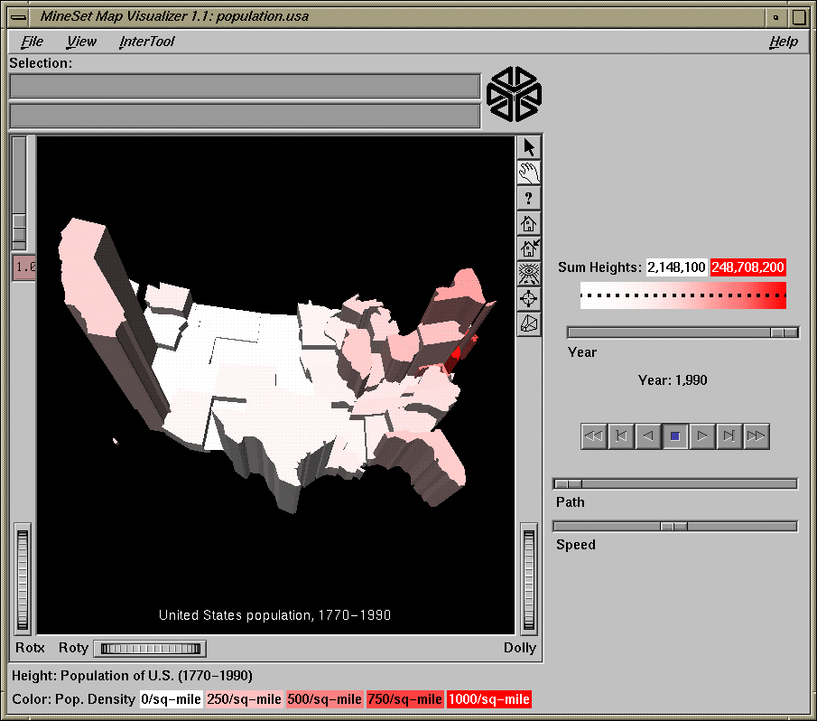
This shows the population and population density for each state of the United States.The population of each state is represented by the height of the state's graphical shape. Heights are relative to each other across the entire range of the animation controls.
The two modes of viewing are grasp and select. To toggle between these modes, move the cursor into the main window, and press the Esc key. You can also change from one mode to the other by clicking the appropriate button: to enter select mode, left-click the arrow button (to the top-right of the main window); to enter grasp mode, left-click the hand button (immediately below the arrow button, near the top right of the main window).
In grasp mode, the cursor appears as a hand. This mode supports panning, rotating, and scaling the scene's size in the main window.
To pan the display, press the middle mouse button and drag it in the direction you want the display panned.
To rotate the display, press the left mouse button and move the mouse in the direction you want to rotate.
To move the viewpoint forward, press the left and middle mouse buttons simultaneously and move the mouse downwards. To move the viewpoint backward, press the left and middle mouse buttons simultaneously and move the mouse upwards. This is equivalent to the functions provided by the Dolly thumbwheel.
In select mode, you can highlight an object by positioning the cursor over that object. Information about that object then appears at the top of the view area. This information remains visible in the window only as long as the pointer cursor remains over the object. If you position the pointer cursor over an object and click the left mouse button, the same information appears in the Selection Window, which is above the main window, under the “Selection” label (Figure 5-8).
Figure 5-8. Example of a highlighted (information in the viewing window) and selected (information in the Selection: window) object

This Selection information remains visible until you select another object or click the black background. Using the mouse, you can cut and paste this text into other applications, such as reports or databases.
Drill down and drill up functionality—To view a finer level of geographical granularity for an object (if the .data and .hierarchy files support it), click the right mouse button while the cursor is over that object. This is called “drilling down.” You can repeat this down to the finest level of granularity supported by the data. If the cursor is positioned over a specific object when drilling down, only the more detailed sub-objects of that object appear. If, instead, the cursor is positioned on the black background at the time of the mouse click, then the more detailed sub-objects of the entire set of objects appear. This might produce a display with a large number of individual objects. The greater the number of objects, the longer the Map Visualizer takes to construct the scene, and the slower the performance when moving the animation controls.
To move up one level and view a coarser geographical granularity (“drill up”), click the middle mouse button. If the cursor is positioned on the black background when you click, all the higher-level objects appear. If the cursor is positioned on a specific object in the scene, then the scene “returns” to the group of higher-level objects visible when you last drilled down with the right mouse button.
 | Note: By default, the Map Visualizer initially displays objects at the lowest level of detail; thus, initially, only drill-up (to coarser granularity) is active. |
Several external controls surround the graphics window. These consist of buttons, sliders, and a summary window. Each of these controls is described in this section.
At the top right of the image area are eight buttons, each of which is selectable with the left mouse button, as shown in Figure 5-9.

Arrow puts you in select mode. When in this mode, the cursor shape is an arrow. Select mode lets you highlight graphical objects in the main window, as well as drill down or drill up to different levels of geographical granularity.
Hand puts you in grasp mode. When in this mode, the cursor shape is a hand. Grasp mode lets you rotate, zoom, and pan the display in the main window.
Viewer help (symbolized by a question mark) brings up a help window describing the viewer itself.
Home takes you to a designated location. Initially, this location is the first viewpoint shown after invoking the Map Visualizer and specifying a configuration file. If you have been working with the Map Visualizer and have clicked the Set Home button, then clicking Home returns you to the viewpoint that was current when you last clicked Set Home.
Set Home makes your current location the Home location. Clicking the Home button returns you to the last location where you clicked Set Home.
View All lets you view the entire Map Visualizer display, keeping the angle of view. To get an overhead view of the scene, rotate the camera so that you are looking directly down on the display, then click the View All button.
Seek takes you to the point or object you click after selecting this button. This changes the perspective and angle of your viewpoint.
Perspective lets you view the scene in 3D perspective (closer objects appear larger, farther object appear smaller). Clicking this button toggles 3D perspective on (default setting) or off.
Note: If Perspective is off, the Dolly thumbwheel becomes the Zoom thumbwheel.
To the left of the Map Visualizer's main window is a vertical height adjust slider and, below it, a label containing a numeric value between 0.1 and 100. This slider lets you change the absolute heights of all the graphical objects in the main window. Moving the slider up increases the heights of the objects; moving it down decreases their heights. The numeric value in the label changes accordingly. This value indicates the height multiplier, the default value of which is 1.0. The height adjust slider is useful for accentuating relative height differences between objects in the view window.
Three thumbwheels appear around the lower part of the main window border (see Figure 5-10). They let you dynamically move the viewpoint.
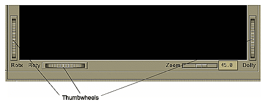
The vertical thumbwheel Rotx (rotate about the x axis), on the left, rotates the display up and down.
The horizontal thumbwheel Roty (rotate about the y axis), at the bottom left, rotates the scene in the main window around its centerpoint left and right.
The vertical Dolly thumbwheel, on the right, moves the viewpoint forward and backward. Note that as you use the Dolly thumbwheel to magnify the scene in the main window, additional detail can appear. This is not the case with the Zoom slider, which merely enlarges the scene without adding detail.
Note: If Perspective is off, the Dolly thumbwheel becomes the Zoom thumbwheel, and the Zoom slider and Zoom factor box disappear.
To the right of the Map Visualizer's main window are several external controls, depending on the type of data being displayed (see Figure 5-11). These controls can include
sliders for independent dimensions
a summary window containing a color density profile.
a color legend showing the color density value limits
buttons and sliders for animation
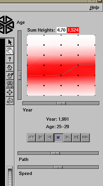
The number of sliders appearing adjacent to the summary window is dependent on the dataset displayed in the Map Visualizer's main window. Datasets can have two, one, or no independent dimensions.
If the dataset has two dimensions of independently varying data (such as nl.births.mapviz), the animation control panel to the right of the main graphics window becomes visible (as in Figure 5-11).
Within this animation control panel are the 2D summary window and two sliders. The summary window has a horizontal slider below it for selecting data points of the first independent dimension, and a vertical slider to the left for selecting data points of the second independent dimension. The horizontal slider's dimension is identified by a label below it. The vertical slider's dimension is identified by a label above it.
For datasets with one independent dimension (such as population.usa.mapviz), only the slider below the summary window appears, and the summary window is compressed (see Figure 5-12). This slider's dimension is identified by a label below it.
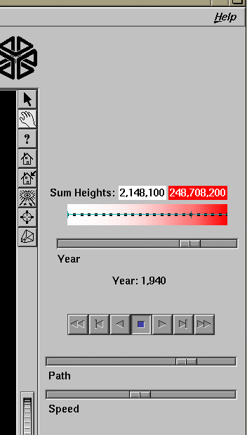
For datasets with no independent dimensions (such as population.europe.mapviz), no animation control panel appears (see Figure 5-13).
The summary window provides a 2D representation of the aggregation of values that the main window displays in 3D. Above this window is a label, Sum Heights, followed by two rectangles: the first white, the second red. Within the rectangles are numbers; each is the respective value for the maximum density of that color. This summary color legend provides a visual and numeric comparison to the densities in the summary window.
The whiter the areas of the summary window, the lower the total values represented by the heights of the objects in the main window. The greater the density of red shown in areas of the summary window, the higher the total of those values. The density of these colors in the summary window provides a summary of the data across the one or two independent dimensions in the dataset, which is useful for guiding your exploration through the data.
By default, the summary window also contains a set of black dots, evenly spaced across the one or two dimensions of data. These dots indicate the precise positions of the discrete datapoints of the data. You can turn off the dots using the View > Show Data Points menu option.
After opening the population.usa.mapviz file, for example, the 2D summary window shows a color range from white (on the left) to red (on the right). White corresponds to the low aggregate population in the early years of the United States; red represents the higher aggregate population in later years. In this example, the greater the density of red, the higher the total population of United States.
For a more complex example, open perhouse.perage.mapviz. This dataset has two independent dimensions: time and age. The summary window displays these dimensions as a complex pattern of colors. Place the cursor on the horizontal lines with the greatest density of red, which runs horizontally across the summary window (this means the age group making the greatest number of purchases). Click the left mouse button. The information displayed in the field below the horizontal slider shows that this represents purchases made by 30- to 39-year-olds.
Now place the cursor at the junction of the densest red horizontal (age group) and vertical (time frame) parts of the summary window, and click the left mouse button. The information displayed in the field below the horizontal slider shows that most purchases were made by 30- to 39-year-olds in May-June 1989 and May-June 1990.
If the dataset loaded into the Map Visualizer has at least one independent dimension, it is possible to view all or any part of that dataset via animation. This is done by first creating a path in the summary window, then activating the animation controls described in the next section.
The three ways to draw a path in the summary window are as follows:
Define a starting point by clicking and holding down the left mouse button, then draw an arbitrary path by dragging the cursor over the window. End the path by releasing the left mouse button.
Define a starting point by clicking the left mouse button, then define an endpoint by moving the cursor to another part of the window and clicking the middle mouse button. A path appears between those two endpoints, passing through the intermediate discrete data point(s) that are closest to the hypothetical straight line between the endpoints. To add more line segments, continue with repeated middle mouse clicks.
Define a starting point by clicking the left mouse button, then drag one of the independent dimension sliders to draw a straight line along this dimension. If there are two sliders, then using the second slider will continue to draw a straight line along the axis controlled by this second slider.
The path you draw can only go through the well-defined discrete data points, identified by the black dots in the summary window.
Use the seven VCR-like buttons and two sliders (Path and Speed) below the 2D summary window to control animation.
Once a path is drawn in the summary window (see “Creating a Path in the Summary Window,” above), you can use the VCR-like buttons to control animation along this path. The middle Stop button is highlighted in blue to indicate an initial state. Use the adjacent Play Forward button (to the right of Stop) or Play Reverse (to the left) to begin simple movement along the drawn path in a forward or reverse direction. Forward and Reverse are defined by the sequence in which the path was drawn, not by a sense of left-to-right or right-to-left movement.
To stop and restart the animation, click the Stop button, then use the Play Forward or Reverse button. When you use the Stop button, the animation continues in the current direction until the position falls on a discrete data point.
Adjacent to the Play buttons are the Single-Step buttons, also Forward and Reverse. Clicking one of these buttons causes the current path position to change to the next discrete data point.
On the outside are the Fast Forward and Fast Reverse buttons. Clicking one of these Fast buttons while in Stop state changes the path position to the end (for Forward) or to the beginning (for Reverse) of the path. Clicking a Fast button when in Play state increases the animation speed.
While animation is stopped, you can move the Path slider to reset the position along the path. Note that when you use the Path slider, the cursor in the summary window moves across the drawn path, and the 1D sliders (below and to the left of the drawing area) move consistently with the cursor position. Then use the Play or Reverse button to restart the animation from the newly specified point.
You can drag the Path slider to an arbitrary position on the path between discrete data points; however, when you release the slider, the path position changes to a stop at the nearest discrete data point.
Use the Speed slider to adjust the speed of the animation along the path.
As animation proceeds, the variables mapped to height and color in the Map Visualizer also change. However, the variables displayed in the “Selection:” message box show only the data values of the nearest discrete data position, not intermediate (interpolated) data values.
The animation is produced in the following manner: Assume you have data for 10 years, on a per-year basis (that is, 10 data values) and that these correspond to the height of one state in the Map Visualizer. If the years are 1991 to 2000, the height for 1991 is 20, and the height for 1992 is 40. As you move the year slider from 1991 to 1992, the height changes by being uniformly interpolated between 20 and 40. For example, midway between 1991 and 1992, the height appears to be 30. As you approach 1992, the height approaches 40. However, you cannot Stop an animation between discrete data points, and you cannot drag the Path slider to a stationary position between discrete data points.
The data points in the summary window represent the slider positions corresponding to the actual data from the data file. For example, the heights 20 and 40 are representations of actual data, but the height 30 is not. In this example, there would be data points in the summary window at the slider positions corresponding to each year.
Note that not all variables are required to vary with a slider. For example, in the Map Visualizer, the area and name of the state do not vary with the slider (for example, year). If there are two sliders, some variables can vary with only one of the sliders, while other variables vary with both.
Four pulldown menus let you access additional Map Visualizer functions. These are labeled File, View, InterTool, and Help. If you start the Map Visualizer without specifying a configuration file, only the File and the Help menus are available. The View menu is available after a valid dataset is loaded.
The File menu (Figure 5-14) contains six options. This section describes those options.
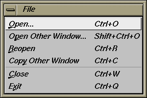
Open loads and opens a configuration file. This causes it to be displayed in the main window. Previously displayed data is discarded. Use Open to view a new dataset, or to view the same dataset after changing its configuration.
Open Other Window opens a configuration file and displays its results in a different window. The current dataset in the first window remains open.
Copy Other Window opens a new window displaying the same dataset. You can interact with these windows independently, or you can synchronize these windows using the InterTool pulldown menu.
Close closes the current window and all its associated panels. If no other windows are open, Close exits the application.
The View menu (Figure 5-15) contains five options. This section describes those options below.
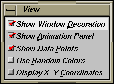
Show Window Decoration causes the buttons around the main window to be displayed. Default for this option is on. Toggle this option to make the window decoration disappear.
Show Animation Panel causes the animation control panel to be displayed to the right of the main view. Click this option again to deselect it. When this option is deselected, the animation panel is not displayed. Not displaying the animation panel can be useful when you have applied the InterTool menu's Synchronize All Mapviz Sliders option (described in the “The InterTool Menu”) and need only a single animation control panel on the screen.
Show Data Points causes a grid of black dots to appear (or disappear) in the 2D summary window. Each dot denotes the precise position of a discrete data value in the input dataset. For example, if the input dataset has 10 data values across one independent dimension, then you see heights and colors of the graphical objects in the main window vary continuously, based on data values that are interpolations between these discrete data points. These data point dots in the summary window help you better understand when the heights and colors are derived directly from the input data values, and when they are derived indirectly from interpolated values.
Use Random Colors causes the configuration file's color mapping specifications (for example, white-to-red shadings representing population density) to be ignored. Random, constant colors are assigned to the graphical objects. Click this option again to deselect it.
Display X-Y Coordinates puts the Map Visualizer into a special mode that lets you identify X-Y vertex pairs at specific points of the scene in the main window. In this mode, the Map Visualizer resets the cursor to select mode and displays 3D objects as flat background lines. Clicking the left mouse button on various parts of the displayed scene causes the corresponding X-Y vertex pair values to appear in the Selection Details window. You can also enter the vertex pair points into the .gfx file to identify point objects or the endpoints of line objects for subsequent display. Note that displaying X-Y coordinates is used for developing and refining .gfx files, not for data analysis.
When Display X-Y Coordinates mode is initially enabled, or when a point in the background is selected, the selection window shows the minimum and maximum X-Y pairs of the currently displayed image in the main window. Add these two value pairs to the new .gfx file you are generating. The first record in the file gfx_files/usa.cities.gfx shows an example of how the min-max pairs of the usa.states.gfx file were entered into the associated usa.cities.gfx file. This ensures that the X-Y coordinate pairs in usa.cities.gfx share the same coordinate system as the X-Y coordinate pairs in usa.states.gfx.
The InterTool menu has one option, as shown Figure 5-16.
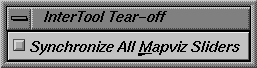
Selecting Synchronize All Mapviz Sliders identifies this Map Visualizer window as one in a “synchronized sliders” cooperative: changing the current slider positions in one Map Visualizer window causes/produces the same change in all others currently open. Click this option again to deselect it. This menu option must be selected in every Mapviz main window that is to be part of the synchronization.
Note that currently only the sliders' physical positions are synchronized, not the underlying meanings of those positions. For example, synchronizing population.usa.mapviz (with dates ranging from 1770 to 1990) and population.canada.mapviz (with dates ranging from 1871 to 1991) probably is not useful, since the slider physical midpoint position represents 1880 in the United States and 1931 in Canada. Generally, synchronization is useful only when the sliders of each dataset represent the same range of independent variables.
The Help menu (see Figure 5-17) provides access to five help functions. This section describes those functions.
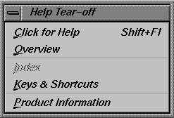
Click for Help turns the cursor into a question mark. Placing this cursor over an object in the Map Visualizer's main window and clicking the mouse causes a help screen for that object to appear. Closing the help window restores the cursor to its arrow form and deselects the help function. The keyboard shortcut for this function is Shift+F1. (Note that it also is possible to place the arrow cursor over an object and press the F1 function key to access a help screen about that object.)
Overview provides a brief summary of the major functions of this tool, including how to open a file and how to interact with the resulting view.
Index provides an index of the complete help system. This option is currently disabled.
Keys & Shortcuts provides the keyboard shortcuts for all of Map Visualizer's functions that have accelerator keys.
Product Information brings up a screen with the version number and copyright notice for the Map Visualizer.
MineSet User's Guide invokes the IRIS Insight viewer with the online version of this manual.
Nulls represent unknown data (see Appendix G, “Nulls in MineSet”).
In the Map Visualizer, nulls can occur when any of the following are true:
The database or data file contains a null.
The Tool Manager is used to make an array based on bins and no data falls into a specific bin. For example, if there is no data for the 30-40-year-old population, that bin is null.
The Tool Manager is used to make an array and the null enum option is specified. In this case, an extra array element is created to represent the aggregation of all the values for which the bin value is null. The Tool Manager assigns the question mark (?) character to this extra bin. To view the values of this bin, move the corresponding slider to its left-most position. If there are no data for that null bin, the values associated with it are null as well, and the Map Visualizer represents the corresponding graphical object(s) as a “null object.”
Expressions and aggregations of nulls can generate nulls (see Appendix G, “Nulls in MineSet”).
Mapping a null value to a visual attribute, special representations are used in the Map Visualizer. A null height results in a dark grey object with zero height; a null color results in an object with appropriate height (as defined by the value mapped to height), but with a dark gray color (see Figure 5-18).
Figure 5-18. Representation of a Null Value Mapped to Height (Top Middle Object) and to Color (Bottom Right Object)

When selecting an object with a null value, it is shown as a question mark (?) in the selection field.
The provided sample configuration and data files demonstrate the Map Visualizer's features and capabilities. The .data and .mapviz files are in the directory /usr/lib/MineSet/mapviz/examples; the .gfx and .hierarchy files are in the directory /usr/lib/MineSet/mapviz/gfx_files.
blocks.mapviz, blocks.data, blocks.gfx, and blocks.hierarchy
This simple example shows four adjacent blocks. The height and color of each block varies based on the underlying data in blocks.data. You can drill up using the middle mouse button (see the “Select Mode” section) to see the upper pair and the lower pair of blocks aggregate; then drill up again to see these upper and lower blocks aggregate into a single block. You can drill down using the right mouse button to see the objects of finer granularity reappear.population.australia.mapviz, population.australia.data, australia.states.gfx, and australia.states.hierarchy
The data file contains one row for each Australian state and territory. Each row contains three tab-separated items: a keyword name for the state or territory, the population value, and the size of the territory.This sample graphically displays the 1991 population and population density of the Australian states and territories. Heights of the graphical objects represent the relative population; color represents the relative population density. A legend at the bottom of the display describes the color range and the associated values.
population.canada.mapviz, population.canada.data, canada.provinces.gfx, and canada.provinces.hierarchy
The data file contains one row for each Canadian province and territory. In this example, each row contains 13 blank-separated values (one for each decade between 1871 and 1991).This sample graphically displays the population and population density of the Canadian provinces and territories from 1871 to 1991, in 10-year increments. The animation control panel lets you dynamically view the datasets across a range of time. Animation operation is explained in “Sliders Controlling Independent Dimensions”.
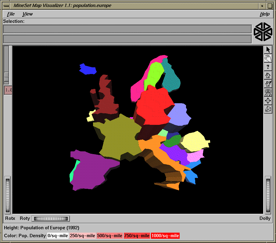
population.europe.mapviz, population.europe.data, europe.countries.hierarchy, and europe.countries.gfx
When graphically displayed, this shows the 1992 population and population density of countries in Western and Central Europe.population.usa.mapviz, population.usa.data, usa.states.gfx, and usa.states.hierarchy
When graphically displayed, this shows the population and population density of the United States from 1770 to 1990. The animation controls let you dynamically view population and density changes across time.population.usa.cities.mapviz, population.usa.cities.data, usa.states.gfx, usa.states.hierarchy, and usa.cities.gfx and usa.cities.hierarchy
The usa.states.gfx file specifies the United States, which is displayed as a background. The usa.cities.gfx file specifies the location of the cities on this background. The .data file specifies the population of each city.This sample graphically displays the population of the 48 largest U.S. cities from 1950 to 1990. No data has been mapped to the colors. The animation controls let you dynamically view changes across time.
perhouse.perage.mapviz, perhouse.perage.data, usa.states.gfx, and usa.states.hierarchy
This sample graphically displays consumer household spending data from July-August 1988 to May-June 1991. Color is mapped to the gender of the spending household member; height represents the average dollar spent per household for a given time period and age group. This data has two independent dimensions: time and age. The highest spending is indicated in the summary window (see “The Summary Window”) by the areas with the greatest color density, namely “May-June 1989 (Age: 30-39)” and “May-June 1990 (Age: 30-39).”telecom.mapviz, telecom.data, usa.cities.lines.gfx, usa.cities.lines.hierarchy, usa.states.gfx, and usa.states.hierarchy
This sample graphically displays a flat map with arched lines on it. These lines connect two endpoints. The lines can have variable width and color. In this example, the widths and colors are random; however, they could relate to the volume and duration of the connections between the endpoints.fasta.m.data, fasta.m.mapviz, fasta.m.gfx, and fasta.m.hierarchy
The data file for this example contains the partial results of a full biological sequence comparison between two complete genomes (courtesy of Dr. Tom Flores, European Bioinformatics Institute). When graphically displayed, scientists can quickly identify and locate the regions of similarity between the two genomes. The ability to display such large amounts of information in a visual data exploration method such as this could be extended to include much more information about the individual genomes. Scientists could explore this data more easily and thereby perhaps better understand the function and purpose of the similar genetic sequences.
In this example, the “map” is the circular-shaped genome of a biological organism called Mycoplasma genitalium (MG). The MG genome is divided into 500 equal segments, each representing a 1000-nucleotide sequence in the genome. The slider selects one of the segments of the second genome, called Haemophilus influenzae (HI), for cross-comparison between the two genomes. The Summary Window in the Animation Control Panel indicates which segments show the greatest similarities, and you can move the slider to examine those particular segments of interest. The bar heights and colors on the “map” therefore indicate the relative similarity of each MG segment to each HI segment, where higher bars correspond to greater measures of similarity. This similarity is measured by the “Reciprocal Evalues,” which ranges from 0.0 to 1.0.