The purpose of this appendix is to give you a better understanding of the kinds of information that can be distilled from data with the MineSet visual tools. Stepping through the following examples can help you apply the visual tools to your data.
This appendix consists of two parts.
“Starting Up MineSet” describes what you must do before trying the examples.
The second part consists of one demonstration script for each MineSet visual tool.
All examples begin with Parts A and B (which are performed only once). You must perform parts C, D, and E each time MineSet is invoked.
Set up MineSet as described in Chapter 2.
Installed on the server in /usr/lib/MineSet/DBexamples are
all the sample data, along with a brief description of what it contains.
directions on how to load the data using the provided scripts. (This is in the README.server file as well as in step B.)
Load the sample datasets into an Oracle database that has been set up on your server. The data and these directions (README.server) are installed in /usr/lib/MineSet/DBexamples on the server.
The /usr/MineSet/DBexamples directory contains scripts for loading the complete set of data files into one of the supported databases. To load the complete set of data, run one of the following loader scripts, depending on which database you have. (This assumes your database and environment are already set up.)
sh load_all_Oracle.sh <userid> <passwd> sh load_all_Sybase.sh <userid> <passwd> |
If you are going to work with an INFORMIX database, use the dbaccess interface to select
create_all_Informix.sql |
followed by
load_all_Informix.sql |
Alternatively, you can load, or reload, the sample data separately. Each data directory in /usr/lib/MineSet/DBexamples on the server contains files necessary to load the data into any of the supported databases. These files are:
*.sql - sets up an Oracle table
*.ctl - control file for loading into Oracle
*_syb.sql - sets up a Sybase table
*.bcf.fmt - Sybase format file
*_inf.sql - sets up an INFORMIX table
*_load.sql - loads the data into the INFORMIX table
In the *.ctl file, the separator is declared in the line
" fields terminated by X'20' " |
The separator is specified in ASCII hexadecimal; thus:
X'20' is used for ` '
X'2c' is used for `,'
X'09' is used for `\t'
Perform the following steps on the server with an Oracle database:
Ensure the following environment variables are set correctly:
ORACLE_HOME
ORACLE_SID
Type
sqlplus <userid>/<passwd>
SQL> @<dataset>.sql
Where dataset is the name of the dataset being loaded, and userid/passwd are your assigned username and password for the Oracle database.
To delete an already existing table, type
SQL> drop table dataset;Type
sqlload control = <dataset>.ctl userid = <userid>/<passwd>
log = /tmp/<dataset>.log  direct = true
Check the resulting dataset.log to ensure the data was loaded correctly.
Perform the following steps on the server with a Sybase database:
Ensure that the following environment variables are set:
SYBASE
DSQUERY
To create the table, type
isql -U<userid> -P<passwd> -i <dataset>_syb.sql
Where dataset is the name of the dataset being loaded, and userid/passwd are your assigned username and password for the Sybase database.
To delete an already existing table, type
isql -U<userid> -P<passwd>
drop table <dataset>
go
To load the data, type
bcp <dataset> in <dataset>.data -U<userid> -P<passwd> -f <dataset>.bcp.fmt
where dataset is the table name (created via <dataset>_syb.sql), in means "load into the dbms," <dataset>.data refers to the name of the ASCII data file, and -f points to the already-created format file. (When reading in from a file, the data types are character.)
Perform the following steps on the server with an INFORMIX database:
Ensure the following environment variables are set:
ONCONFIG
INFORMIXSERVER
INFORMIXTERM
To create the table, type
dbaccess
If necessary, log into the appropriate database.
Choose Query-language, then choose the appropriate database from those listed.
Choose <dataset>_inf.sql, and run it.
Choose <dataset>_load.sql, and run it (where <dataset> is the name of the dataset being loaded).
At the UNIX prompt on your workstation, start the MineSet Tool Manager by typing the command mineset. The MineSet Tool Manager screen comprises four panels:
Server Name panel (upper left)
Data Source panel (lower left)
Data Transformations panel (middle)
Data Destination panel (right)
To log on to the server and database:
Type the server name in the upper left panel.
Click Log in to Server.
Enter your server user name and password.
Click OK.
Use the DBMS dropdown menu to choose the appropriate database that is installed on the server.
Enter your database username and password.
Click OK.
If necessary, choose a database using the Database dropdown menu.
This example uses the Map Visualizer to view a data file with three interrelated components: birth rates, population sizes, and geographical region.
To retrieve the data file, choose the nlb table from the Table dropdown menu.
The Current Columns list (middle) shows columns for the nlb table, which contains the following information about birth rates in the Netherlands from 1989 to 1993:
regions—three letter acronym for state in Netherlands
sqkm—the area of the state
year—the year
population—the population of the state that year
age—age of the mother
birthrate—the number of births for that age of mother
 | Note: To use sliders in tools, arrays of data are required. |
To make arrays, you need binned columns to act as indexes. To bin the year and age columns:
Click Bin Columns... The Bin Columns dialog box appears.
Choose “year” from the list of columns at the top of the dialog box.
Choose the Automatic Thresholds tab.
Check Group into:.
Enter 5 so it reads Group into: 5 bins.
Choose Uniform from the Use Approach dropdown menu
Click Apply. This creates one-year bins for each year 1989, 1990, 1991, 1992, and 1993. A new column, year_bin, appears when you close this dialog.
To bin the age column:
Click age in the Columns to Bin list.
Check Group into:.
Enter 6. This field should read Group into: 6 bins.
Click Apply. This creates the age bins. The boundaries of the bins are: 22, 27, 32, 37, and 42.
Click Close.
The original year and agebin columns are replaced with year_bin and age_bin.
Specify the three arrays of data to be created.
Click Aggregate...
Of the list in the dialog box, select sqkm, population, and birthrate. This can be done by holding down the Ctrl key while you select all three.
Click the left arrow (on the left of the "Group-By columns" panel) to shift these columns to the "Columns to Aggregate panel."
Set the first Index drop down menu to age_bin.
Set the Index2 drop down menu to year_bin.
Accept the default “sum” aggregation by clicking OK.
In the current columns list, note that the binned columns have now been removed because they were used as indices.
Note also that the sqkm, birthrate, and population columns have been replaced by columns with the same names suffixed by “[ ]” and prefixed by the type of aggregation performed.
In the Data Destination panel (right), under the Viz Tools tab, choose Map Visualizer from the option menu for which the default is Tree Visualizer. Note that the Visual Elements list changes to show only two items, Height - Bars and *Color - Bars.
Map the birthrate to the bar height.
In the current columns list, click sum_birthrate[ ].
In the requirements list, click the Height-Bars item.
Note that the height item in the Visual Elements list now indicates that birthrate data values are mapped to bar height in the Map Visualizer display.
sum_birthrate[] -> Height-Bars
Similarly, map sum_population[ ] to bar color:
sum_population[] -> *Color - Bars
To set the tool options in this example for the Map Visualizer:
In the Data Destination panel, click Tool Options. The Map Visualizer configuration options dialog box appears.
A geography file must be specified. Click Find File next to the Geography File text field. Choose the file /usr/lib/MineSet/mapviz/gfx_files/netherlands.regions.hierarchy.
Choose Bar Legend On.
Specify a mapping from population values to colors:
In the “Color list to use” text field, green and gray already appear as defaults. To add a third color, blue, click the "+" to the right. When the color wheel appears, chose blue.
From the Mapping option menu, select Continuous (the default).
In the text field next to the Mapping option menu, type "0 1000000 2000000" (that's zero, one million, and two million).
Choose Color Legend On.
Enter a message:
"%,.2f births per 1000 %,.0f total population",
     `sum_birthrate[]`, `sum_population[]`
These two lines must be entered in the Message field as a single line. The variable names sum_birthrate[ ] and sum_population[ ] must be enclosed by single back-quotes because the bracket characters are special characters in the Map Visualizer grammar. In this example, the brackets are an integral part of the variable name, and the single back-quotes tell the Map Visualizer not to treat the brackets as special characters.
Click OK to accept the tool options.
To invoke the Map Visualizer, click Invoke Tool. The tool appears on the screen.
A dialog box briefly appears while the data is retrieved. About 420 records are initially retrieved from the database. The array aggregations specified above cause those records to be aggregated, creating a data file with 12 records (or lines), each containing a long array.
The following notes apply to the visualization shown in Figure H-1.
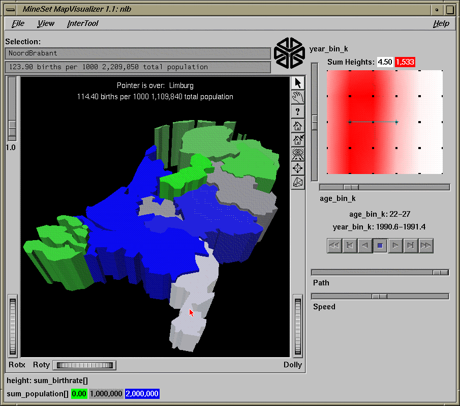
The red vertical strip in the summary slider shows that the birthrate for women in the Netherlands is greatest around age 27, and that birthrates by age do not change much over time.
In the scroll area on the right side of the Map Visualizer window, move the X slider (age group values) left and right while the Y slider (year values) stays at “-1990.” Observe that the green region in the middle (Flevoland) shows high birthrates for young women. Green indicates a region with low population, gray indicates medium population, and blue indicates high population
If you move the Y slider (year) up, there is an anomaly in the data for the state of Drenthe in the last two years. The birthrate stays low for all ages. The state is very high in the second to last year, and NULL (indicated by dark gray) in the final year. This is because the data for the last year was mistakenly dated as the second to last year. This is a case where the visualization helps point out an error in the data.
If you click an individual region, the relevant information about the object appears at the top.
This example uses the Scatter Visualizer to understand relationships among education level, age, race, income, and hours worked in a sample of working adults in the United States in 1994. This data was extracted from the census database at http://www.census.gov/ftp/pub/DES/www/welcome.html.
Choose the adult94 table from the Table dropdown menu.
-
Click Bin Columns. The binning dialog box appears.
Select age from the Select columns to bin at the top.
Under the User Specified Thresholds tab, check Use Evenly spaced bins.
Fill in range start: 20.
Fill in range end: 60.
Fill in bin size: 5. This specifies five-year increments.
Note: This places different categories of people into different age bins; it does not track the same people over time. Click Apply, then Close. A new column, age_bin, appears at the bottom of the list of Current Columns.
Click Remove Column for workclass, education, marital_status, relationship, race, sex, capital_gain, capital_loss, and native_country. You may select all of them while holding down the Ctrl key and then clicking Remove Column once.
Specify the three arrays of data to be created.
Click Aggregate...
In the dialog that appears, choose: final_weight, gross_income, education_num, and hours_per_week. Do this by holding down the Ctrl key and clicking each column.
Move these columns to the “Columns to aggregate” panel by clicking the left arrow to the left of the center panel.
Change the first Index drop down menu from “none” to “age_bin”. The age_bin column disappears because that will be the column used to index the aggregated columns on the left.
The four columns under the “Columns to aggregate heading” use the “sum” aggregation by default. Change this from “sum” to “average” for gross_income, education_num, and hours_per_week. Do this by selecting these three columns then checking the Average check box at the bottom, and unchecking the Sum check box.
Similarly change the aggregation of “final_weight” from Sum to Count.
Leave occupation as Group By.
Click OK.
Under the Viz Tools tab of the Data Destination panel, choose the Scatter Visualizer from the top menu.
Set the following mappings:
Axis 1 <- avg_grossincome[]
Axis 2 <- avg_education_num[]
Axis 3 <- avg_hours_per_week[]
Entity <- occupation (this allows filtering on this variable)
Entity-size <- count_final_weight[]
Entity-color <- occupation
Entity-label <- occupation
Summary <- count_final_weight[]
To invoke the Scatter Visualizer, click Invoke Tool. A dialog box briefly appears while the data is retrieved (about 48,000 records, reduced to 15 records, each having columns that are arrays indexed by age_bin).
The Scatter Visualizer appears.
The following notes apply to the visualization shown in Figure H-2.
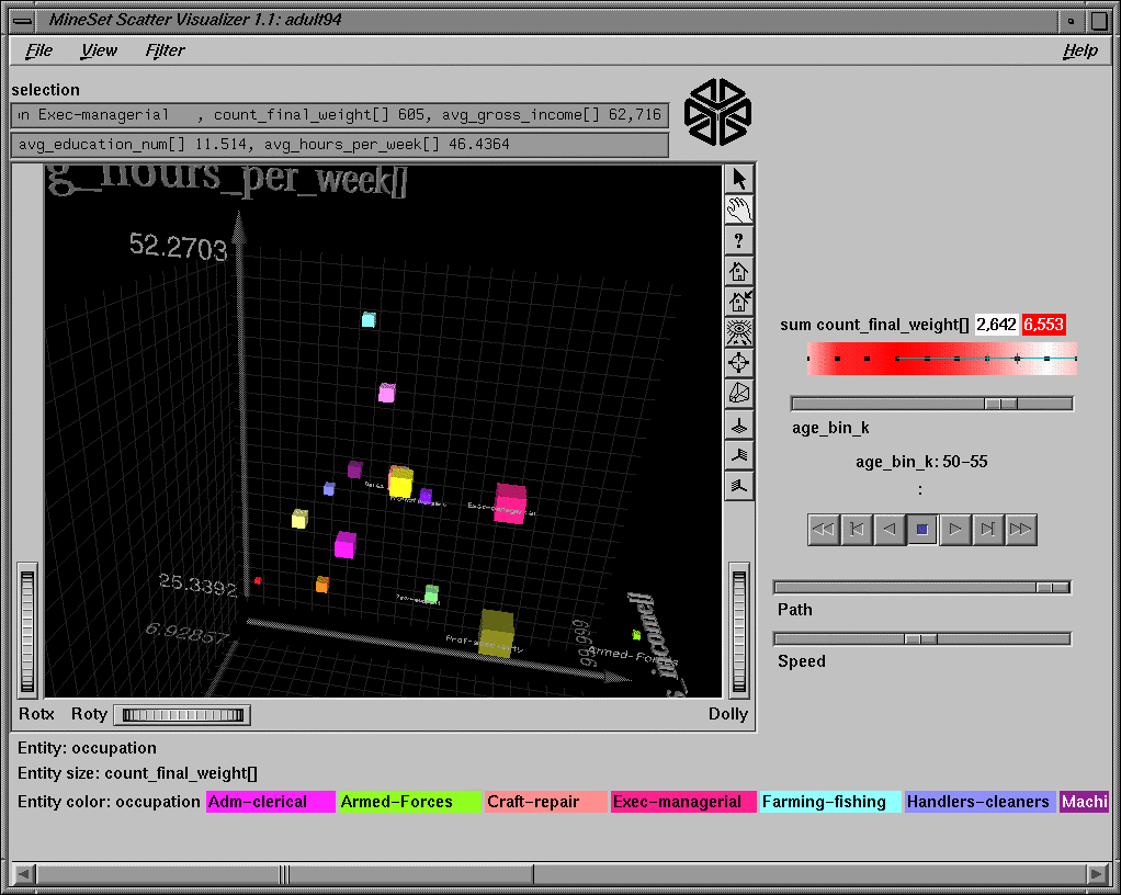
The three axes show income, education level, and hours worked per week. The entity size is proportional to the number of records in that group. The entity size is the volume of the cube used to represent an aggregate. There is a distinct color for each occupation aggregate (entity). The colors at the bottom correspond to all the unique occupations represented in the data. The more volatile data points represent far smaller sample sizes. If the size of an entity goes to zero, it means there is no data in that particular age bin.
The summary slider on the right shows count. Redder regions indicate ages where there is more data. Clearly there are fewer people in the work force that have ages less than 20 or greater than 50.
Move the summary slider all the way to the left. The entities now represent ages below 20. In grasp mode, examine the entities. Note that although everyone's income is uniformly low, there are several occupations where the amount of education achieved is relatively high. The Machine operators/inspectors work the longest hours in this age group.
Rotate so that the avg_education_num[ ] and avg_gross_income[ ] axes are parallel to the screen. Compare the cubes (entities) representing the occupations of Professional-Specialty and Executive-Managerial as you move the slider on the right. There are roughly the same number of each over time judging from the size. The ranks of both increase slightly as the population ages. Interestingly, those of Professional-Specialty have considerably more education than Executive-Managerial, but their income is equal.
For any age group look at the relationship between education and salary. There is a roughly linear correspondence, but there are some outliers. For example, older people in the transport-moving business get paid a lot relative to their education level.
Go back, using the Table History, and reaggregate. This time do a “group by” on sex and occupation. This yields twice as many entities. You can now compare salaries of men versus women in the same occupation. Or you might try "group by" on race and occupation to see if some ethnicities prefer certain occupations.
This example uses the Tree Visualizer to look at the same data just explored with the Scatter Visualizer. The resulting visualization looks much different and can be used to show different things.
Choose the adult94 table.
Delete the columns working_class, final_weight, education, occupation, relationship, capital_gain, capital_loss, and native_country using the Remove Column button.
Under the Viz Tools tab of the Data Destination panel, choose Tree Visualizer.
Set the following mappings:
Key - Bars <- race
Height - Bar <- gross_income
Height - Disk <- education_num
                           (this is a numeric value indicating level of education)
Height - Base <- gross_income
Color - Bar <- hours_per_week
Hierarchy Root Level <- sex
Hierarchy level2 <- marital_status
Click Tool Options.
In the Bars column, set the following:
Check "Normalize heights across all levels" box.
Max/Scale heights: 4
Height Aggregation - Average
Check Use Legend for height.
Color list to use: Select 3 colors by repeatedly pressing the "+" and selecting desired colors (for example, blue, gray, red).
Color mapping: 30 40 50 (hours worked per week). This means the color blue indicates that the average number of hours worked per week for the people represented by an object of this color is 30, gray indicates 40 hours per week, and red 50.
Color Aggregation - Average
Check Use Legend for color.
In the Node Bases column, set the following:
Check the “Normalize heights Across all levels” box.
Choose Height Aggregation - Count
Leave the color mappings empty. If no color mappings are specified, the node bases are colored the same as the bars.
Check Use Legend for the height.
In the Disks column, set the following:
Check the "Normalize heights across all levels" box.
Height Aggregation - Average.
Leave the color mappings empty. The same color mappings specified for the bars are used for the disks by default.
Accept the remaining defaults by clicking OK.
To invoke the Tree Visualizer, click Invoke Tool. The Tree Visualizer appears after the data is retrieved from the server.
The following notes apply to the visualization shown in Figure H-3.
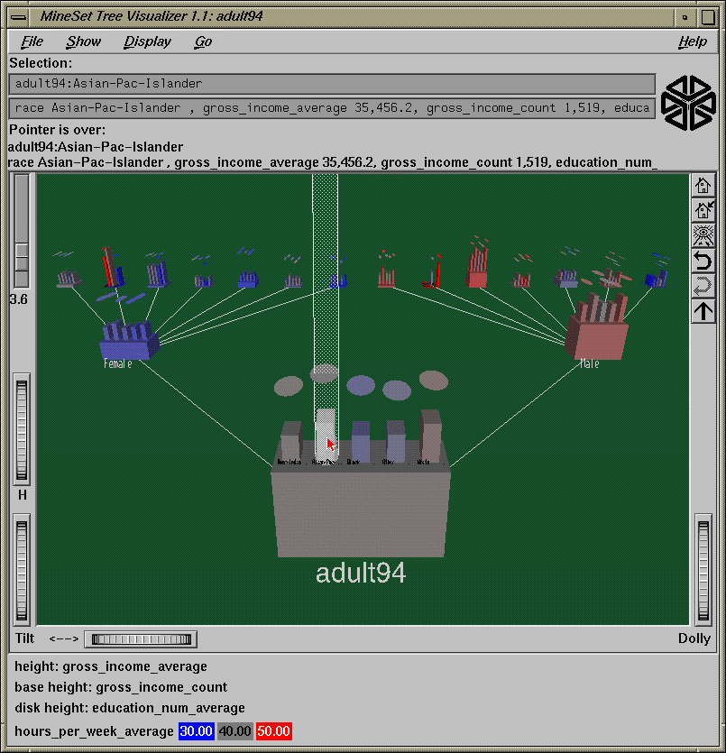
There is a bar and a disk for each race at each node. The bars show average income and the disks show average education levels. The color indicates number of hours per week worked. Tendency toward blue means fewer hours worked and tendency toward red means more hours worked.
Click the root node to see that White and Asian/Pacific-Islanders have the highest incomes. Although they have roughly equivalent incomes, Asians have higher education in general.
At the next level, compare the male and female nodes. The female node is far more blue, indicating fewer hours worked. To see the numbers for the average work week of each sex, move the cursor over the base. The text output window at the top shows 42.4 hours/week for males and 36.4 hours for female. Similarly, you can also see numbers for individual bars by placing the cursor over one. Another thing to note is that the education level for females (shown by the disks) is much higher than their income (shown by the bars). (This is probably because they work fewer hours.) The same is not true for males. Another thing to note from the node bases is that there are far more males in the dataset than females (32,650 males compared with 16,192 females).
Men who are Married-civilian-spouses earn considerably more than men who are divorced or separated.
The bright red bar at Female:Married-AF-spouse:Asian/Pacific-Islander is caused by a single female “married Armed Forces spouse” of that ethnic type, who happens to work long hours and is highly paid. Similarly the red bar at Male:Married-AF-spouse:White represents 10 people of this type whose average hours worked per week is 54.
There are 8 times more married men than divorced men, but only 2.6 times more married women than divorced women in the data.
This example uses a data mining tool, the Associations Rules Generator, to derive information (in the form of rules) from a table. It then uses the Rules Visualizer to display the results. The dataset contains statistics on cars made in the U.S., Europe, and Japan from 1970 to 1982.
Choose the cars table
Use Change Types to convert cylinders to int.
Click Bin Columns.
Hold down the Ctrl key and select every column but cylinders.
Under the Automatic Thresholds tab, check Group into: and enter 4 as the number of bins.
Accept the remaining default options (automatic discretization with respect to the label) by clicking Apply, then Close.
Under the Mining Tools tab in the Data Destination panel, choose the Associations tab. There are 3 steps to producing the files for the Rules Visualizer. Each corresponds to a section in this panel.
Under Creating/Selecting a Binary File, click Assoc Convert Options.
Click Map All (the rightmost button), then click OK.
Click Run Convert.
The message Binary File Created appears. Click OK to dismiss it.
To create a rules file:
Under Creating/Selecting a Rules File, click Assoc Options.
In the Association Rule Generation Options dialog, reduce the Prevalence to 0.5. Leave Predictability as 50. This means that rules that do not occur with at least a prevalence of 0.5 and predictability of 50 are not listed in the resulting rules file.
Click OK.
Click the Run Assoc button. A rules file is created.
The message Rules file received from server appears. Click OK to dismiss it.
Map the following columns to requirements:
Height-Bars <- prevalence Color-Bars <- pred_div_expected |
The pred_div_expected variable means this ratio:

Thus, pred_div_expected is a measure of the increase of predictive power due to the presence of the left-hand side (LHS) rule.
Click RuleViz Options at the bottom of the right panel.
For the bars, set the following color mapping:
color list: green, yellow, orange, red. If necessary, you may delete some of the default colors by using the middle mouse button to select a color then clicking the - (minus sign) button to the right of the color list.
Mapping, continuous: 0 2 4 6.
Make Item size 3, and the Hide distance 260. This increases the visibility of the text items.
Click OK.
To invoke the Rules Visualizer, click Run RuleViz. The Rules Visualizer appears.
The following notes apply to the visualization shown in Figure H-4.
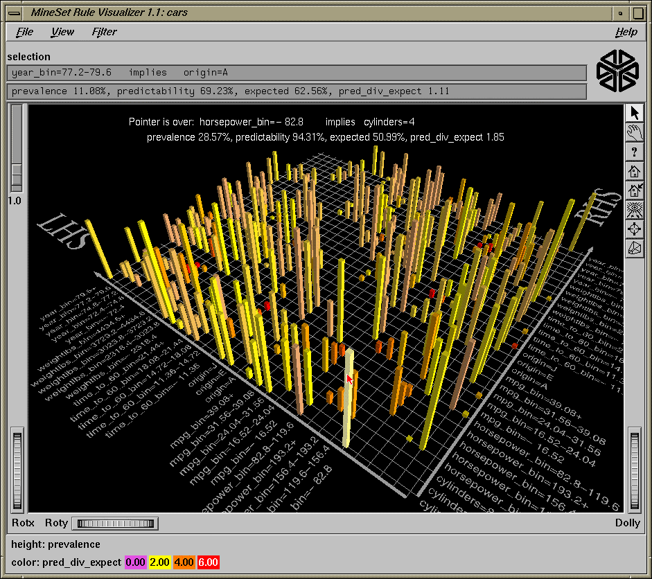
There are two very short red bars in the back. These show that it is very rare for cars with 3 or 5 cylinders to be manufactured. However, when it happens, those with 3 cylinders are made in Japan, and those with 5 cylinders are made in Europe.
To find out what a particular left-hand side implies use filtering:
From the Filter pulldown menu, choose the rule(s) you are interested in from the LHS.
Click Filter at the bottom.
For example, choose MPG < 16 (not fuel efficient). This implies:
Eight cylinders 95% of the time.
Weight is greater than 3,300 lbs (heavy) 96% of the time
For 93% of the time, the horsepower is >124.
Acceleration is faster than 14 seconds with 70% likelihood. Consider that out of the whole population of cars, acceleration is faster than 14 seconds only 25% of the time (the expected predictability).
All these very low gas mileage cars are made by the U.S.
Cars that have 3 cylinders always have fast acceleration (<14 seconds) whereas cars that have 8 cylinders have fast acceleration only 70% of the time.
High horsepower implies quick acceleration.
Europe, in addition to being the only producer of 5-cylinder cars, also makes many 4-cylinder cars. 90% of all the cars produced in Europe are 4-cylinder. The total occurrence of 4-cylinder cars in Europe, the U.S., and Japan, is 51%. Europe also makes more light cars than the U.S. or Japan (<2400 lbs 60% of the time, compared with the expected 33% of all cars in the dataset).
To find out what implies good gas milage, filter the RHS to MPG>31 and choose Select All on the LHS. One of the rules in the result shows plainly that cars made after 1979 were much more fuel efficient.
This example uses a data mining tool, the Decision Tree Classifier, to classify records according to a label. It then uses the Tree Visualizer to display the Classifier. The dataset contains information on 5882 sample mushrooms.
Choose the mushroom table.
Under the Mining Tools tab, choose the Classifiers subtab.
Using the Algorithm dropdown menu, choose Decision Tree (it is the default).
Using the Discrete Label dropdown menu, choose the column edibility (it is the default). The last column in the table always appears as the default label. If no discrete label is present, you must create one.
Click GO!.
A dialog showing statistics appears, and on top of this, the Decision Tree Visualizer appears.
The Tree Visualizer appears after the data is retrieved from the server.
The following notes apply to the visualization shown in Figure H-5.
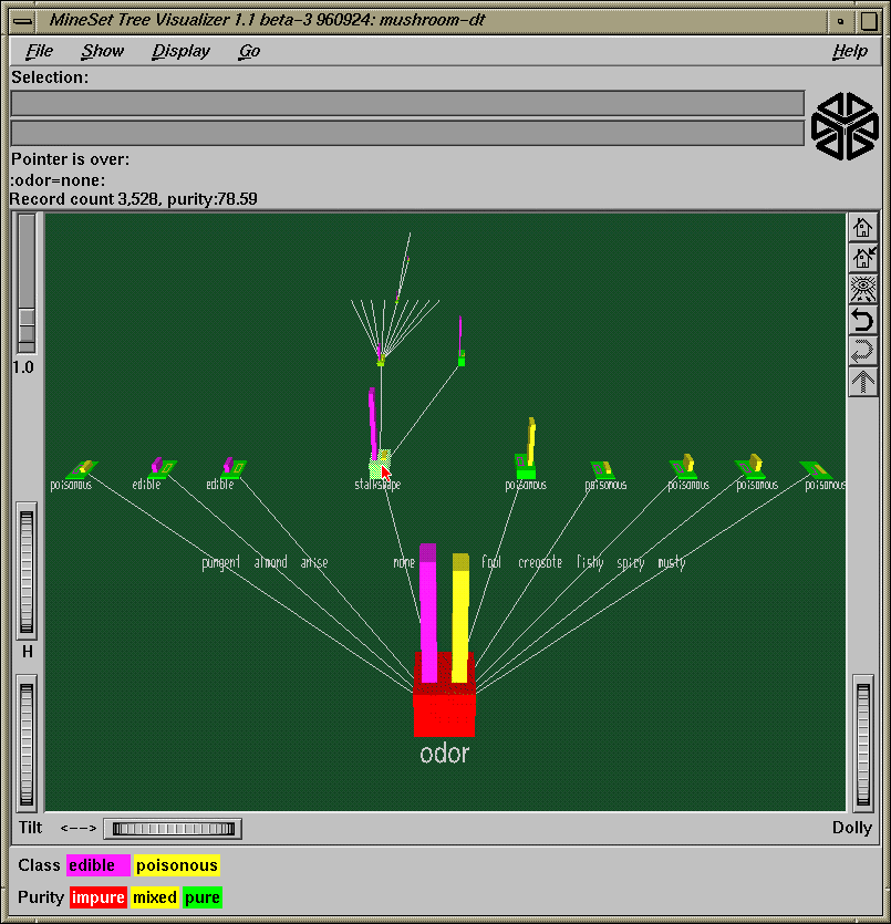
At each level in the tree a split is made on various attributes in order to separate the edible mushrooms from the poisonous ones. At the leaves the nodes should be 100% pure (green). This means they contain either all edible or all poisonous mushrooms. Impure nodes, where there is a mix, are colored red.
Odor is the best attribute to use when trying to predict whether or not a mushroom is edible.
The only time you cannot determine edibility just by smell is when it has none. In that case, stalk shape is the next best attribute to use. Even though the stalk shape node is showing green (almost all the mushrooms here are edible), there are still some poisonous mushrooms present, hence you should look at other attributes before feeling safe about eating one that has no odor.
Try running the classifier again after removing the odor column. Note that the tree looks much different. Now gill size is the best attribute to use for predicting edibility. Note that the next best attribute is different based on the value at the root. If the mushroom has broad gill size, then spore print color is used; if the mushroom has narrow gill size, then gill spacing is the next attribute to consider.
Try using feature selection to determine which combination of attributes gives the best results. This can be done by selecting the Feature selection tab under mining tools in the Data Destination panel. Specify the number of attributes you want to use. This tries all possible combinations of attributes to optimize for accuracy of classification.
For example, if you enter 6, it attempts to find which combination of six attributes provide the best accuracy for predicting the label. Fewer attributes are returned if 100% accuracy is reached with fewer than the specified number of attributes. For this example, assuming odor has been removed, the most important attributes are sporeprintcolor, gillsize, stalkroot, and bruises. Note that the accuracy is 100%; this is better than what would have been achieved had all attributes been used. Try building a decision tree based on these results.
This example uses a data mining tool, the Evidence Classifier, to classify records according to a label. It then uses the Evidence Visualizer to display the Classifier. The dataset contains information on 5882 sample mushrooms.
Choose the mushroom table
Under the Mining Tools tab, choose the Classifiers subtab.
Use the Algorithm dropdown menu to select Evidence.
Using the Discrete Label dropdown menu, choose the column edibility (it is the default). The last column in the table always appears as the default label. If no discrete label is present, you must create one by changing types or binning.
Click GO!.
A dialog showing statistics appears, and on top of this the Decision Tree Visualizer appears. You can see in the statistics window that the classifier is created using 5416 training instances. The remaining 2708 instances are “held out,” and used for checking accuracy. When the classifier is used to predict which class these 2708 instances fall into, only 92 are classified incorrectly. This implies the accuracy to be [95.85-97.22] with 95% confidence.
The following notes apply to the visualization shown in Figure H-6.
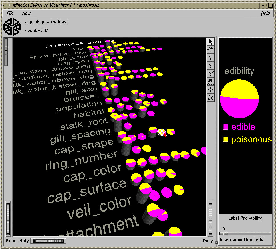
The viewer on the left shows the effect that each value of each attribute has on the likelihood of edibility. The display on the right shows the proportion of each label value in the data (in this case the proportion of edible mushrooms is roughly equal to the amount that are poisonous.)
The list of attributes (columns) has been sorted by importance (usefulness in predicting the label). Odor appears at the top of the list. As we saw with the decision tree, odor is the best attribute to use when trying to predict whether or not a mushroom is edible.
The height of each pie corresponds to the number of records that have that attribute value. The sum of the heights in each row is constant. The heights of the pies in each attribute row form a histogram (that is, they show the way the records are distributed over the values for each attribute). Moving the mouse over a pie shows the value and (count) at the top of the screen.
Since the Evidence Classifier assumes all attributes to be independent, it considers sporeprintcolor to be the next most important attribute for determining edibility. Note that the decision tree showed that if the mushroom has no odor, then stalk shape should be used. The reason the decision tree made that decision was because it was considering only those records with no odor.
Click the two values of gillsize to see how they affect the probability distribution in the big pie, on the right. If the gill size is narrow, the mushroom is very likely to be poisonous. If the gill size is broad, then the evidence tilts significantly toward edible.
When pies on the right-hand side are selected, their effect is accumulated by multiplication. The selected pies are multiplied. The result then is multiplied by the prior probability distribution; the outcome of this is the expected distribution (shown on the right). If a pie on the left has all equal-sized slices, selecting it has no effect on the pie on the right.
Since veiltype (at the bottom of the list) has only one binned value, it is not used by the classifier. If you move the Importance slider slightly to the right, the attributes at the bottom start to disappear because they have low importance values.
Try using feature selection (under the mining tools tab in the Data Destination window) to determine which combination of attributes give the best results. It is possible to actually improve accuracy by eliminating some of the attributes.
To see a characterization of poisonous mushrooms, click the button next to the label value poisonous on the right. All the values with high bars indicate strong evidence for poisonous. Moving the mouse over the values shows the probability that a mushroom has that value, given that it is poisonous.