This chapter describes in detail the function of each window, menu, and display in the IRIX IM Analyzer's graphical user interface (GUI).
This chapter contains the following sections:
Though the IRIX IM Analyzer is made up of several different examiner windows, a number of objects remain constant throughout window changes.
The Admin menu (see Figure 3-1) offers the following menu selections:
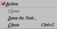
| “Active” toggle |
| |
| “Clone” | Creates a clone of the current window. This function is not supported in the current release, and the option is grayed out. | |
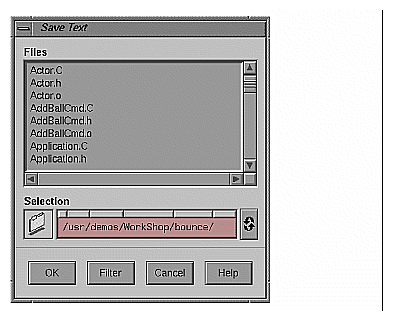
| “Save As Text...” |
| |
| “Close” | Closes the current window. |
The Examine menu (see Figure 3-3) offers the following menu selections:
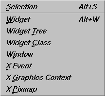
| “Selection” | Selects the currently highlighted object for examination. | |
| “Widget” | Uses the current selection as input to the widget examiner, then opens that examiner (see “Widget Examiner” for information). | |
| “Widget Tree” | Switches the window view to the widget tree examiner (see “Tree Examiner” for information). | |
| “Widget Class” | Switches the window view to the widget class examiner (see “Widget Class Examiner” for information). | |
| “Window” | Switches the window view to the window examiner (see “Window Examiner” for information). | |
| “X Event” | Switches the window view to the X Event examiner (see “Event Examiner” for information). | |
| “X Graphics Context” |
| |
| “X Pixmap” | Switches the window view to the X pixmap examiner (see “Pixmap Examiner” for information). |
In addition to access through the Examine menu, each examiner can be accessed through a tab at the bottom of each view (see Figure 3-4).

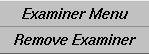
When first launched, the IRIX IM Analyzer has only four tabs: Breakpoints, Trace, Widget, and Tree. As you use new examiners through the Examine menu, new tabs are added for the new examiners. Any of these new tabs may be deleted at any time by selecting the tab, clicking the right mouse button, and then selecting “Remove Examiner” (see Figure 3-5). The initial four tabs may not be removed.
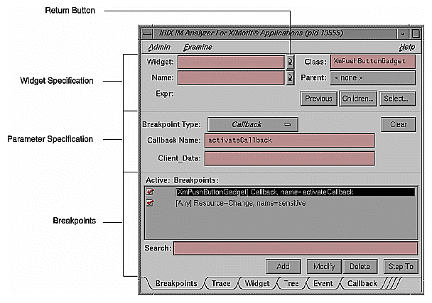
The “Widget” and “Name” text fields both have return buttons (see Figure 3-6) just to their right. Clicking these buttons causes the IRIX IM Analyzer to respond exactly as if you had pressed Return on your keyboard.
The Breakpoints examiner is not really an examiner, but a control area where you can set widget-level breakpoints. The breakpoints examiner is divided into three areas (see Figure 3-6):
The widget specification area, which contains the same information as that in the Widget examiner. You can select a widget address, name, or class in this area, as well as move to the widgets parents or children, or select a widget in the application. In cases where the breakpoint type does not apply to widgets (for example, input-handler breakpoints), this area is blank.
The parameter specification area, the contents of which vary according to the type of breakpoint you are setting. For example, for Callback breakpoints, this area contains the callback name and client data; for event-handler breakpoints, it contains the event type and the client data, and so on.
The breakpoint area, which contains the breakpoint name, a search field, and the Add, Modify, Delete, and Step To buttons.
The control area has eight different breakpoint types that it can examine. These types are set through the “Breakpoint Type” option button (see Figure 3-7). The options for the “Breakpoint Type” option button are described below:
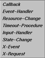
“Callback:” Widget callback installed by XtAddCallback. Parameters include callback name and client_data XtPointer value. See “Callback Breakpoints Examiner” for more information.
“Event-Handler:” Widget event handler installed by XtAddEventHandler. Parameters include X event type and client_data XtPointer value. See “Event-Handler Breakpoints Examiner” for more information.
“Resource-Change:” Resource change caused by XtSetValues or XtVaSetValues. Parameters include resource name and resource value, both strings. See “Resource-Change Breakpoints Examiner” for more information.
“Timeout-Procedure:” Timeout callback installed by XtAppAddTimeOut. Parameters include client_data XtPointer value. See “Timeout-Procedure Breakpoints Examiner” for more information.
“Input-Handler:” Input callback installed by XtAppAddInput. Parameters include client_data XtPointer value. See “Input-Handler Breakpoints Examiner” for more information.
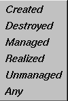
“State-Change:” Various widget state changes (for example, “managed” or “realized”). Parameters include widget state. See “State-Change Breakpoints Examiner” for more information.
“X-Event:” X event received by target application. Parameters include X event type. See “X-Event Breakpoints Examiner” for more information.
“X-Request:” X request received by target application. Parameters include X request type. See “X-Request Breakpoints Examiner” for more information.
When the “Callback” option of the “Breakpoint Type” option button in the Breakpoint Examiner is selected, the examiner appears as shown in Figure 3-8.
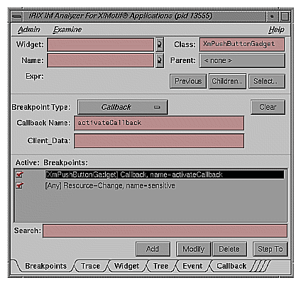
The Callback Breakpoints examiner contains the following items:
| “Widget” text field |
| |
| “Name” text field |
| |
| “Class” text field |
| |
| Parent button | Allows you to move the parent of the currently selected widget. | |
| Previous button | Moves you to the previously selected widget. | |
| Children... button |
| |
| Select... button | Allows you to select the widget in the target process. | |
| “Breakpoint Type” option button |
| |
| Clear button | Clears all the current breakpoint selections and text fields. | |
| “Callback Name” text field |
| |
| “Client_Data” text field |
| |
| “Search” text field |
| |
| Add button | Allows you to add a new breakpoint. | |
| Modify button | Allows you to change the selected breakpoint's settings. | |
| Delete button | Deletes the selected breakpoint. | |
| Step To button | Allows you to step to the next condition. Step To creates a temporary breakpoint, resumes the process, and waits until the process stops. This temporary breakpoint acts exactly like an ordinary breakpoint, save that the Step To button automatically resumes the process and puts up a busy cursor until the condition becomes true. |
When the “Event-Handler” option of the “Breakpoint Type” option button in the Breakpoint Examiner is selected, the examiner appears as shown in Figure 3-9.
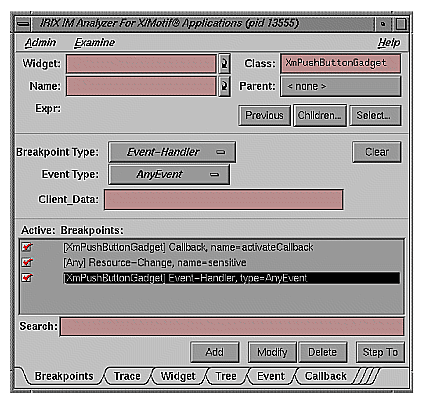
The Event-Handler Breakpoints examiner contains the following items:
| “Widget” text field |
| |
| “Name” text field |
| |
| “Class” text field |
| |
| Parent button | Allows you to move the parent of the currently selected widget. | |
| Previous button | Moves you to the previously selected widget. | |
| Children... button |
| |
| Select... button | Allows you to select the widget in the target process. | |
| “Breakpoint Type” option button |
| |
| Clear button | Clears all the current breakpoint selections and text fields. | |
| “Event Type” option button |
| |
| “Client_Data” text field |
| |
| “Search” text field |
| |
| Add button | Allows you to add a new breakpoint. | |
| Modify button | Allows you to change the selected breakpoint's settings. | |
| Delete button | Deletes the selected breakpoint. | |
| Step To button | Allows you to step to the next condition. Step To creates a temporary breakpoint, resumes the process, and waits until the process stops. This temporary breakpoint acts exactly like an ordinary breakpoint, save that the Step To button automatically resumes the process and puts up a busy cursor until the condition becomes true. |

When the “Resource-Change” option of the “Breakpoint Type” option button in the Breakpoint Examiner is selected, the examiner appears as shown in Figure 3-11.
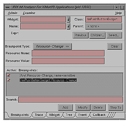
The Resource-Change Breakpoints examiner contains the following items:
| “Widget” text field |
| |
| “Name” text field |
| |
| “Class” text field |
| |
| Parent button | Allows you to move the parent of the currently selected widget. | |
| Previous button | Moves you to the previously selected widget. | |
| Children... button |
| |
| Select... button | Allows you to select the widget in the target process. | |
| “Breakpoint Type” option button |
| |
| Clear button | Clears all the current breakpoint selections and text fields. | |
| “Resource Name” text field |
| |
| “Resource Value” text field |
| |
| “Search” text field |
| |
| Add button | Allows you to add a new breakpoint. | |
| Modify button | Allows you to change the selected breakpoint's settings. | |
| Delete button | Deletes the selected breakpoint. | |
| Step To button | Allows you to step to the next condition. Step To creates a temporary breakpoint, resumes the process, and waits until the process stops. This temporary breakpoint acts exactly like an ordinary breakpoint, save that the Step To button automatically resumes the process and puts up a busy cursor until the condition becomes true. |
When the “Timeout Procedure” option of the “Breakpoint Type” option button in the Breakpoint Examiner is selected, the examiner appears as shown in Figure 3-12.
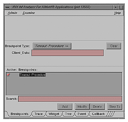
The Resource-Change Breakpoints examiner contains the following items:
| “Breakpoint Type” option button |
| |
| Clear button | Clears all the current breakpoint selections and text fields. | |
| “Client_Data” text field |
| |
| “Search” text field |
| |
| Add button | Allows you to add a new breakpoint. | |
| Modify button | Allows you to change the selected breakpoint's settings. | |
| Delete button | Deletes the selected breakpoint. | |
| Step To button | Allows you to step to the next condition. Step To creates a temporary breakpoint, resumes the process, and waits until the process stops. This temporary breakpoint acts exactly like an ordinary breakpoint, save that the Step To button automatically resumes the process and puts up a busy cursor until the condition becomes true. |
When the “Input-Handler” option of the “Breakpoint Type” option button in the Breakpoint Examiner is selected, the examiner appears as shown in Figure 3-13.
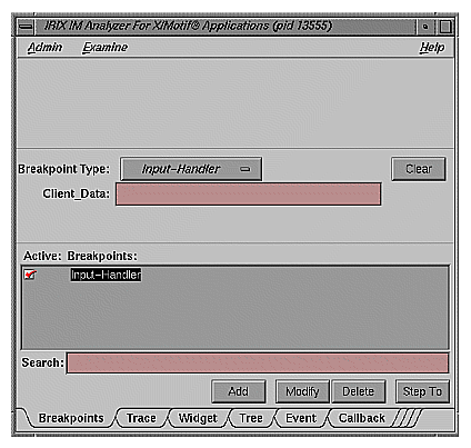
The Input-Handler Breakpoints examiner contains the following items:
| “Breakpoint Type” option button |
| |
| Clear button | Clears all the current breakpoint selections and text fields. | |
| “Client_Data” text field |
| |
| “Search” text field |
| |
| Add button | Allows you to add a new breakpoint. | |
| Modify button | Allows you to change the selected breakpoint's settings. | |
| Delete button | Deletes the selected breakpoint. | |
| Step To button | Allows you to step to the next condition. Step To creates a temporary breakpoint, resumes the process, and waits until the process stops. This temporary breakpoint acts exactly like an ordinary breakpoint, save that the Step To button automatically resumes the process and puts up a busy cursor until the condition becomes true. |
When the “State-Change” option of the “Breakpoint Type” option button in the Breakpoint Examiner is selected, the examiner appears as shown in Figure 3-14.
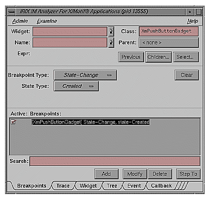
The Resource-Change Breakpoints examiner contains the following items:
| “Widget” text field |
| |
| “Name” text field |
| |
| “Class” text field |
| |
| Parent button | Allows you to move the parent of the currently selected widget. | |
| Previous button | Moves you to the previously selected widget. | |
| Children... button |
| |
| Select... button | Allows you to select the widget in the target process. | |
| “Breakpoint Type” option button |
| |
| Clear button | Clears all the current breakpoint selections and text fields. | |
| “State Type” option button |
| |
| “Search” text field |
| |
| Add button | Allows you to add a new breakpoint. | |
| Modify button | Allows you to change the selected breakpoint's settings. | |
| Delete button | Deletes the selected breakpoint. | |
| Step To button | Allows you to step to the next condition. Step To creates a temporary breakpoint, resumes the process, and waits until the process stops. This temporary breakpoint acts exactly like an ordinary breakpoint, save that the Step To button automatically resumes the process and puts up a busy cursor until the condition becomes true. |
When you select the “X-Event” option of the “Breakpoint Type” option button in the Breakpoint Examiner, the examiner appears as shown in Figure 3-16.
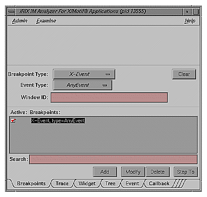
The X-Event Breakpoints examiner contains the following items:
| “Breakpoint Type” option button |
| |
| Clear button | Clears all the current breakpoint selections and text fields. | |
| “Event Type” option button |
| |
| “Window ID” text field |
| |
| “Search” text field |
| |
| Add button | Allows you to add a new breakpoint. | |
| Modify button | Allows you to change the selected breakpoint's settings. | |
| Delete button | Deletes the selected breakpoint. | |
| Step To button | Allows you to step to the next condition. Step To creates a temporary breakpoint, resumes the process, and waits until the process stops. This temporary breakpoint acts exactly like an ordinary breakpoint, save that the Step To button automatically resumes the process and puts up a busy cursor until the condition becomes true. |
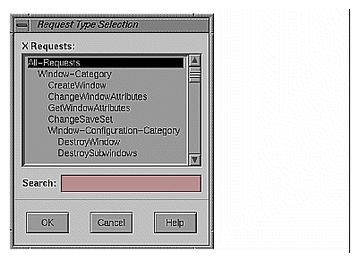
When the “X-Request” option of the “Breakpoint Type” option button in the Breakpoint Examiner is selected, the examiner appears as shown in Figure 3-18.
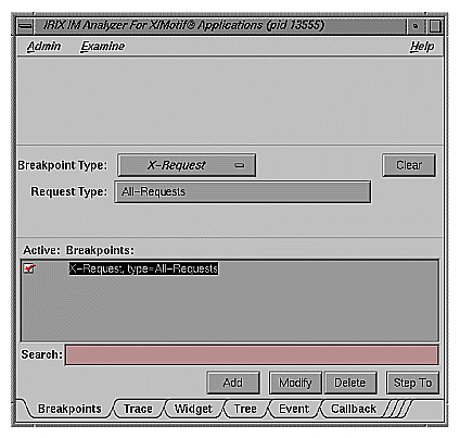
The X-Request Breakpoints examiner contains the following items:
| “Breakpoint Type” option button |
| |
| Clear button | Clears all the current breakpoint selections and text fields. | |
| Request Type button |
| |
| “Search” text field |
| |
| Add button | Allows you to add a new breakpoint. | |
| Modify button | Allows you to change the selected breakpoint's settings. | |
| Delete button | Deletes the selected breakpoint. | |
| Step To button | Allows you to step to the next condition. Step To creates a temporary breakpoint, resumes the process, and waits until the process stops. This temporary breakpoint acts exactly like an ordinary breakpoint, save that the Step To button automatically resumes the process and puts up a busy cursor until the condition becomes true. |
The Trace examiner (see Figure 3-20) is a control area where you can trace the execution of your application and collect various forms of data. The following data is collected:
X Server Events
X Server Requests
Widget Event Dispatch Information
Widget Resource Changes (through XtSetValues)
Widget State Changes (create, destroy, manage, realize, unmanage)
Xt Callbacks (widget, event handler, work proc, timeout, input, signal)
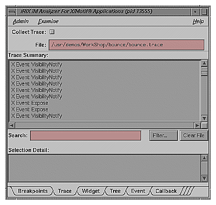
The Trace examiner contains the following items:
| “Collect Trace” toggle |
| |
| “File” text field | Allows you to select the filename for the trace. If no file is selected, a default filename for the trace is chosen. | |
| “Search” text field |
| |
| Filter... button | Launches a dialog that allows you to select the trace entry types you want displayed in the list. | |
| Clear File button |
|
The Widget examiner (see Figure 3-21) displays the internal Xt widget structure, as well as the Xt inheritance implemenation using nested C structs.
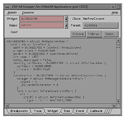
The Widget examiner contains the following items:
| “Widget” text field |
| |
| “Name” text field |
| |
| Parent button | Allows you to move the parent of the currently selected widget. | |
| Previous button | Moves you to the previously selected widget. | |
| Children... button |
| |
| Select... button | Allows you to select the widget in the target process. |
The Tree examiner (see Figure 3-22) displays the widget hierarchy.
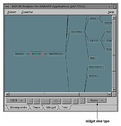
You may double-click a node to view that widget in the Widget examiner. Use the option menu in the bottom-right corner to switch the display among widget names, class names, and IDs.
If the Tree examiner is currently selected, it will not automatically fetch the current widget tree each time the process stops. To force retrieval of the widget tree, select another examiner and then go back to the Tree examiner. Or, click on the Tree tab.
You may display the tree according to widget name, class, or ID value. You can select this by choosing the appropriate option from the widget view type option button (see figure) in the lower-right portion of the examiner.

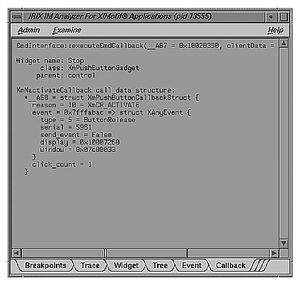
The Callback examiner (see Figure 3-24) automatically appears when the process is stopped somewhere in a callback. It first displays the callstack frame for the callback function. Next, it displays information about the widget in the callback. Finally, it displays the proper callback structure contained in the call_data argument to the callback procedure, based on the widget type and the callback name.
The Window examiner (see Figure 3-25) displays window attributes for an X window. These are the attributes returned by XGetWindowAttributes, with decoding of the Visual structure and enums and masks decoded. Additionally, the Window examiner shows the parent and children window IDs.
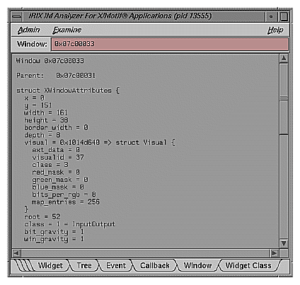
The Window examiner contains the “Window” text field, which displays the address of the window that is being examined. You may change to a different window by entering a new address and pressing the ENTER key.
The Event examiner (see Figure 3-26) displays the event structure for an XEvent pointer. The proper XEvent union member is used, and enums and masks are decoded.
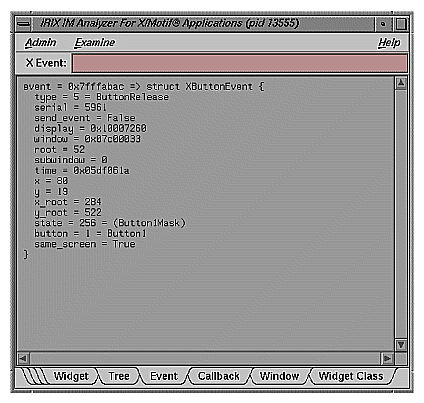
The Event examiner contains the “X Event” text field, which displays the address of the X event that is being examined. You may change to a different X event by entering a new address and pressing the ENTER key.
The Graphics Context examiner (see Figure 3-27) displays the X graphics context attributes that are cached by Xlib in the form of an XGCValues structure. Enums and masks are decoded.
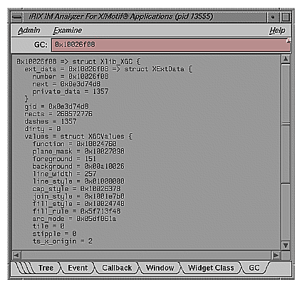
The Graphics Context examiner contains the “GC” text field, which displays the address of the graphics context that is being examined. You may change to a different context by entering a new address and pressing the ENTER key.
The Pixmap examiner (see Figure 3-28) displays basic attributes of an X pixmap, like size and depth. It also attempts to provide an ASCII display of small pixmaps, using the units digit of the pixel values.
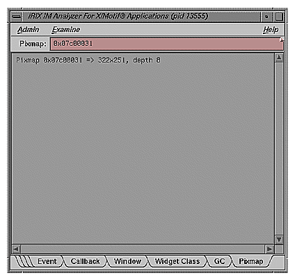
The Pixmap examiner contains the “Pixmap” text field, which displays the address of the pixmap that is being examined. You may change to a different pixmap by entering a new address and pressing the ENTER key.
The Widget Class examiner (see Figure 3-29) displays the Xt widget class structure, as well as the Xt inheritance implementation using nested C structs.
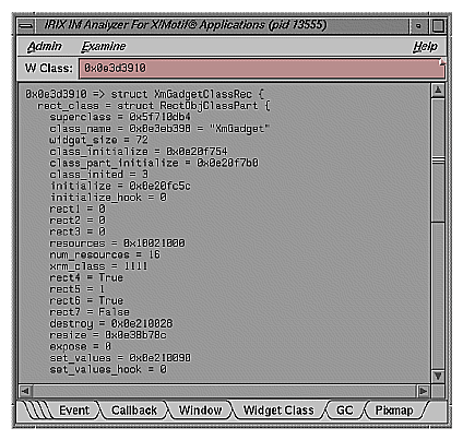
The Widget Class examiner contains the “W Class” text field, which displays the address of the widget class that is being examined. You may change to a different widget class by entering a new address and pressing the ENTER key.